 Subscribe
 Follow Us
Pure CSS3 animation Menu Navigation
 11 years ago
 33631
33631 6871
6871
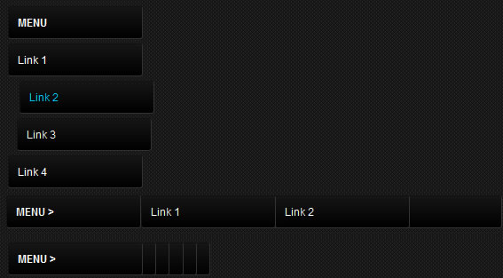
The example will only be visible in Firefox, Safari and Chrome because it uses the CSS3 Animation Property.
HTML
Now look carefully ... this markup is really easy, just create an unordered list and insert inside the links that we need, apply an .animation class every li that has a link and we will see later how the animation will apply to our links!
<ul id="panel">
     <li><h3>MENU</h3></li>
     <li class="animation"><a href="#">Link 1</a></li>
     <li class="animation"><a href="#">Link 2</a></li>
     <li class="animation"><a href="#">Link 3</a></li>
     <li class="animation"><a href="#">Link 4</a></li>
     <li class="animation"><a href="#">Link 5</a></li>
</ul>
CSS
In addition to the graphics menu, we simply set transition property and apply to the translateX property the value that should animate every time the mouse passes over the link. This example is very simple, but we got a nice effect.
/* CSS3 TRANSITION ONLY EFFECT */
#panel {
	width:300px;
	list-style:none;
	padding-top:30px;
	display:inline-block;
}

#panel li {
	border-radius:3px 3px 3px 3px;
	margin-top:5px;
	width:150px;
	background: #000000;
	background: -moz-linear-gradient(top, #161616 0%, #000000 100%);
	background: -webkit-linear-gradient(top, #161616 0%,#000000 100%);
	background: -o-linear-gradient(top, #161616 0%,#000000 100%);
	border-left:1px solid #111; border-top:1px solid #111; border-right:1px solid #333; border-bottom:1px solid #333;
}

#panel li a {
	color:#fff;
	display:block;
	padding:10px;
}

#panel li a:hover {
	color:#00c6ff;
}

#panel li.animation {
	-moz-transition: all 0.4s ease-in-out;
	-moz-transform:translateX(0px);
	-o-transition: all 0.4s ease-in-out;
	-o-transform:translateX(0px);
	-webkit-transition: all 0.4s ease-in-out;
	-webkit-transform:translateX(0px);
}

#panel li.animation:hover {
	-moz-transform:translateX(25px);
	-o-transform:translateX(25px);
	-webkit-transform:translateX(25px);
}
HTML
This second example is no different from the precedent for markup, except for the addition of the maskclass will be used to hide the links and appear this with CSS3 transition to hover over the mask class. Each link will have its own class, this will help us in the animation of each link with the different properties from each other.
<ul id="paneltwo">
     <li class="mask"><h3>MENU ></h3></li>
     <li class="linkOne"><a href="#">Link 1</a></li>
     <li class="linkTwo"><a href="#">Link 2</a></li>
     <li class="linkThree"><a href="#">Link 3</a></li>
     <li class="linkFour"><a href="#">Link 4</a></li>
     <li class="linkFive"><a href="#">Link 5</a></li>
</ul>
Read more:http://www.alessioatzeni.com/blog/css3-menu-navigation-effect/
You might also like
Tags
accordion accordion menu animation navigation animation navigation menu carousel checkbox inputs css3 css3 menu css3 navigation date picker dialog drag drop drop down menu drop down navigation menu elastic navigation form form validation gallery glide navigation horizontal navigation menu hover effect image gallery image hover image lightbox image scroller image slideshow multi-level navigation menus rating select dependent select list slide image slider menu stylish form table tabs text effect text scroller tooltips tree menu vertical navigation menu