 Subscribe
 Follow Us
Css3 tricks animation featured boxes
 11 years ago
 31357
31357 7042
7042
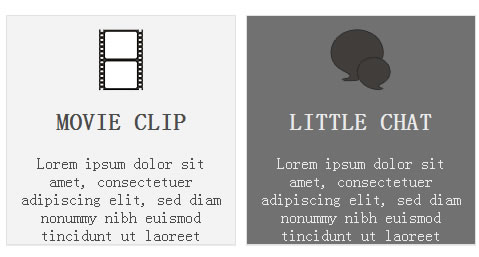
we will create a set of featured boxes that will create a nice text flying effect when you move your mouse over them. We will take advantage of the CSS3 custom animations and create a set of our own animations. I recommend that you download the source files first and check the live demo. Simply move your mose over the featured boxes to see the effect.
THE MARKUP
We will define four boxes that will use the same structure. Each box consists of an image, title and some description text. All the boxes are put inside one container. Syntax for one box is as follows:
<div class="one_fourth">
     <div class = "boxImage"><img src = "images/321.png"></div>
     <h2>MOVIE CLIP</h2>
     <div class = "boxDescription">Lorem ipsum dolor sit amet, consectetuer adipiscing elit, sed diam nonummy nibh euismod tincidunt ut laoreet</div>
</div>
... three other boxes...

</div>
The syntax for other three boxes is the same and all you need to do is copy the code three more times.
CSS
We will first define CSS for the whole container:
.homeBox {
     position: relative;
     float: left;
     display: block;
}
In next we need to design our containers. We will take advantage of CSS3 and create boxes with a nice subtle gradient. We will add a shadow effect at the bottom to make it look more realistic. Add the following code
.homeBox .one_fourth {
     text-align: center;
     overflow: hidden;
     background-image: linear-gradient(bottom, #F3F3F3 100%, #FAFAFA 0%);
     background-image: -o-linear-gradient(bottom, #F3F3F3 100%, #FAFAFA 0%);
     background-image: -moz-linear-gradient(bottom, #F3F3F3 100%, #FAFAFA 0%);
     background-image: -webkit-linear-gradient(bottom, #F3F3F3 100%, #FAFAFA 0%);
     background-image: -ms-linear-gradient(bottom, #F3F3F3 100%, #FAFAFA 0%);
     background-image: -webkit-gradient( linear, left bottom, left top, color-stop(1, #F3F3F3), color-stop(0, #FAFAFA) );
     border: 1px solid #E1E1E1;
     -moz-box-shadow: 0px 1px 0px #ecebeb;
     -webkit-box-shadow: 0px 1px 0px #ecebeb;
     height: 228px;
     width: 228px;
     margin-right: 10px;
    -webkit-transition: background 0.5s linear;
    -moz-transition: background 0.5s linear;
    -o-transition: background 0.5s linear;
    transition: background 0.5s linear;
}
Read more:http://premiumcoding.com/css3-tricks-jumping-featured-boxes/
You might also like


Tags
accordion accordion menu animation navigation animation navigation menu carousel checkbox inputs css3 css3 menu css3 navigation date picker dialog drag drop drop down menu drop down navigation menu elastic navigation form form validation gallery glide navigation horizontal navigation menu hover effect image gallery image hover image lightbox image scroller image slideshow multi-level navigation menus rating select dependent select list slide image slider menu stylish form table tabs text effect text scroller tooltips tree menu vertical navigation menu