 Subscribe
 Follow Us
Featured Content Slider Using jQuery
 13 years ago
 35587
35587 7966
7966
Add JavaScript Files
    <script type="text/javascript" src="http://ajax.googleapis.com/ajax/libs/jquery/1.3.2/jquery.min.js" ></script>
    <script type="text/javascript" src="http://ajax.googleapis.com/ajax/libs/jqueryui/1.5.3/jquery-ui.min.js" ></script>
The CSS Styles
    #featured{
       width:400px;
       padding-right:250px;
       position:relative;
       height:250px;
       background:#fff;
       border:5px solid #ccc;
  }
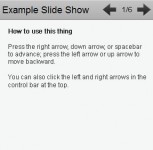
The navigation tabs are absolutely positioned to the right with following styles:
    #featured ul.ui-tabs-nav{
       position:absolute;
       top:0; left:400px;
       list-style:none;
       padding:0; margin:0;
       width:250px;
   }
   #featured ul.ui-tabs-nav li{
       padding:1px 0; padding-left:13px;
       font-size:12px;
       color:#666;
   }
   #featured ul.ui-tabs-nav li span{
       font-size:11px; font-family:Verdana;
       line-height:18px;
   }
The content panels are given following styles so as to fit them inside featured div container. The ui-tabs-hide class is essential to working of this script as it decides which content panels are hidden and which is displayed.
    #featured .ui-tabs-panel{
        width:400px; height:250px;
        background:#999; position:relative;
            overflow:hidden;
    }
    #featured .ui-tabs-hide{
       display:none;
    }
And the selected tab is given a background image with a left arrow. Here are the styles for selected tab.
 #featured li.ui-tabs-nav-item a{/*On Hover Style*/
     display:block;
     height:60px;
     color:#333;  background:#fff;
     line-height:20px;
     outline:none;
 }
 #featured li.ui-tabs-nav-item a:hover{
     background:#f2f2f2;
 }
 #featured li.ui-tabs-selected{ /*Selected tab style*/
     background:url('images/selected-item.gif') top left no-repeat;
 }
 #featured ul.ui-tabs-nav li.ui-tabs-selected a{
     background:#ccc;
 }
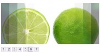
Since i used small thumbnail images in the navigation tabs, i applied following styles to them.
 #featured ul.ui-tabs-nav li img{
     float:left; margin:2px 5px;
     background:#fff;
     padding:2px;
     border:1px solid #eee;
 }
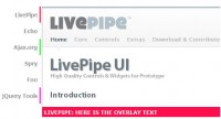
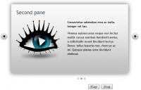
Also, in the content panel which is displayed, it has one image of size 400px x 250px and some relavent title and description inside the div with class info. To display .info div over the image i absolutely positioned it over the image with a transparent background to add some eye-candy.
 #featured .ui-tabs-panel .info{
     position:absolute;
     top:180px; left:0;
     height:70px; width: 400px;
     background: url('images/transparent-bg.png');
 }
 #featured .info h2{
     font-size:18px; font-family:Georgia, serif;
     color:#fff; padding:5px; margin:0;
     overflow:hidden;
 }
 #featured .info p{
     margin:0 5px;
     font-family:Verdana; font-size:11px;
     line-height:15px; color:#f0f0f0;
 }
 #featured .info a{
     text-decoration:none;
     color:#fff;
 }
 #featured .info a:hover{
     text-decoration:underline;
 }
The JavaScript Code
 $(document).ready(function(){
     $("#featured > ul").tabs({fx:{opacity: "toggle"}}).tabs("rotate", 5000, true);
 });
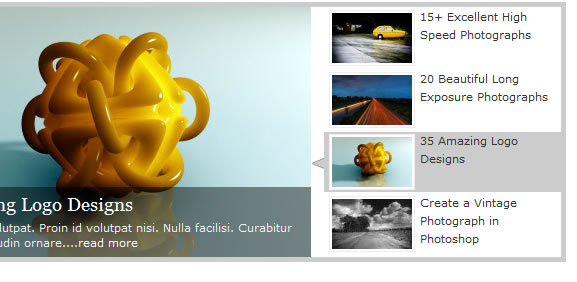
You might also like
Tags
accordion accordion menu animation navigation animation navigation menu carousel checkbox inputs css3 css3 menu css3 navigation date picker dialog drag drop drop down menu drop down navigation menu elastic navigation form form validation gallery glide navigation horizontal navigation menu hover effect image gallery image hover image lightbox image scroller image slideshow multi-level navigation menus rating select dependent select list slide image slider menu stylish form table tabs text effect text scroller tooltips tree menu vertical navigation menu