 Subscribe
 Follow Us
Super Cool jQuery and CSS3 Nifty Dynamic Shadow
 13 years ago
 21456
21456 3597
3597
Step 1: Creating the transparent PNG’s
First we need to prepare all PNG files we’re going to use. We’ll need following image elements:
- The on/off switch (needs two states)
- The light source (in this case, a sexy light bulb – also with two states)
- The object which is going to drop the shadow (here it’s going to be a logo)
- and last but not least, the matching shadow of our logo
We’re going to use the CSS sprite technique for reducing HTTP requests. So we’ll need 3 images (otherwise we would need 6 separate images and twice as much HTTP requests).
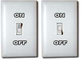
1st PNG Image: The Light-Switch Sprite
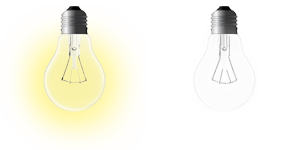
2nd PNG Image: The Light-Bulb Sprite
3rd PNG Image: The Logo Sprite
I’m not going to explain how to create those images, as I’ll concentrate on the source code. If you want to use your own images, just make sure to save your images as PNG 24 , so your transparency gets saved too.
Step 2: Preparing our HTML, CSS & JS files
To make your files well-arranged, we’re going to create following folder structure for our files now:
The root folder (dynamicShadow) will contain our index.html with all layout containers inside of it. Inside of the img folder, you should put all three PNG image files you created or copied from step 1 above. Inside the css folder create a file named style.css. There we’ll style all layout elements we used in the html file. And the magic will happen inside of the js folder. There we’ll create a file named script.js. It will contain our jQuery JavaScript code.
If you have done those two steps above, we are now ready to go on and finally let the magic happen!
Step 3: Writing the HTML file with all containers we will use
First we need to include the files we created in the previous step, into the header part of our HTML.
First our stylesheet file:
<link type="text/css" rel="stylesheet" href="css/style.css" media="all" />
Now we’ll attach the latest version of jQuery itself and jQuery UI from Google’s AJAX Libraries repository:
<script type="text/javascript" src="http://ajax.googleapis.com/ajax/libs/jquery/1.4.2/jquery.min.js"></script>
<script type="text/javascript" src="http://ajax.googleapis.com/ajax/libs/jqueryui/1.7.2/jquery-ui.min.js"></script>
Last but not least we need to attach our JavaScript file (script.js):
<script type="text/javascript" src="js/script.js"></script>
Our header should look something like this now:
<head>
 <link type="text/css" rel="stylesheet" href="css/style.css" media="all" />
 <script type="text/javascript" src="http://ajax.googleapis.com/ajax/libs/jquery/1.4.2/jquery.min.js"></script>
 <script type="text/javascript" src="http://ajax.googleapis.com/ajax/libs/jqueryui/1.7.2/jquery-ui.min.js"></script>
 <script type="text/javascript" src="js/script.js"></script>
</head>
We can start with the body part of our HTML now:
We’re going to need following div’s with the same id’s for the next step, where we are going to style our containers.
<body>
 <div id="switch"></div>
 <div id="light-bulb" class="off"><div id="light-bulb2"></div></div>
 <div id="logo"></div>
 <div id="logosh"></div>
 <div id="infobox"><p>Please activate JavaScript!</p></div>
</body>
For explanation:
- “switch” will be our element, which is going to turn the light bulb on and off.
- ”light-bulb” and “light-bulb2” are our containers with the actual light bulb (I’ll explain later why we need it twice). Just make sure you don’t forget to add the “off” class to the outer light-bulb container.
- ”logo” is our element which is going to drop the shadow.
- ”logosh” will contain the appropriate shadow for the object.
- ”infobox” is just a bonus and not mandatory for our effect. It will contain some status messages. Additionally it contains a message for all (bad, bad) users, who are visiting your site with deactivated JavaScript. You can write them a message there. Take care at your diction, don’t be too evil to them ;).
Step 4: Let’s get some colors into our HTML file!
Now we’re ready to style our HTML with the CSS file we included into our header.
We will start with the info box. If you have chosen to include it, here is a styling suggestion:
body {
background:#3B4D61 url(../img/bg.jpg) repeat 0 0; }
#infobox {
 position:absolute;
 width:300px;
 bottom:20px;
 left:50%;
 margin-left:-150px;
 padding:0 20px;
 background:rgba(0,0,0,0.5);
 -moz-border-radius:15px;
 -webkit-border-radius:15px;
 z-index:999;
}
#infobox p {
 display:block;
 color:#D1D8DF;
 font:bold 15px/10px Tahoma, Helvetica, Arial, Sans-Serif;
 text-align:center;
}
For body, an image is used to enhance the effect of shadow.For the #infobox we are using some CSS3 to make it prettier. The background is black and 50% transparent with the awesome rgba attribute and the corners are rounded with a 15px wide diameter through the Mozilla and WebKit specific attributes. The box will be 340 pixels wide (300 + 2 x 20) and placed centered on the bottom of our page. With the z-index set to 999 it will be the topmost element in our page so it does not get covered from our logo, the shadow or the light bulb.
Next is our switch:
#switch {
 position:absolute;
 bottom:50px;
 left:50px;
 width:80px;
 height:120px;
 background:url(../img/light-switch.png) -80px 0 no-repeat;
 cursor:pointer;
 z-index:100;
}
It will be absolute positioned to the bottom left corner of our page. The backgrounds X position is set to –80px. There we are using the CSS sprite technique the first time. The cursor is going to be a pointer, so the user knows that he can click it. z-index to 100. The logo, the shadow and the light bulb must get a higher z-index, so they don’t disappear behind the switch.
Now let’s style our two light bulb containers:
#light-bulb {
 position:absolute;
 top:20%;
 left:70%;
 width:150px;
 height:150px;
 background:url(../img/lightbulb.png) -150px 0 no-repeat;
 cursor:move;
 z-index:800;
}
#light-bulb2 {
 width:150px;
 height:150px;
 display:none;
 background:url(../img/lightbulb.png) 0 0 no-repeat;
}
The backgrounds X position of the main light bulb container is set to –150px. This is the “turned off” state of our sprite-image. The “inner light bulb” (light-bulb2) is set to “top left” (0 0), so it is the “turned on” state of the sprite. Later we will animate the opacity of it from 0% to 100% and create a smooth blend effect from the on to the off state and reverse. z-index to 800: It will be above the switch, above the logo and above the shadow but behind the info box. The cursor attribute is set to “move”. This way the user will get a nice, OS-based cursor which tells him he can move this object around.
Our last two containers are the logo with his shadow:
#logo {
 position:absolute;
 top:40%;
 left:20%;
 width:450px;
 height:150px;
 background:url(../img/logo.png) 0 0 no-repeat;
 cursor:move;
 z-index:700;
}
#logosh {
 position:absolute;
 width:450px;
 height:150px;
 display:none;
 background:url(../img/logo.png) 0 -150px no-repeat;
 z-index:600;
}
The main logo containers gets also the “move” cursor and the background position is set to “top left” again. This will show the main part of our logo sprite. z-index to 700. It’ll be above the shadow and above the switch, but behind the light bulb and the info box.
The shadow container gets z-index of 600 and the backgrounds Y position is set to –150px. It’s the shadow part of our logo sprite-image.
If you came this wide, your index.html file should look something like this in your browser (of course only, if you used the same image files of this tutorial):
Now let’s get this party started and add some spice to our page. We will write some JavaScript now!
Step 5: The magic starts to happen now!
Ok now let’s go with the interesting part of this whole tutorial. First we start with the jQuery’s main function:
$(function(){

});
This is the short hand code for jQuery’s document.ready(). Our whole script needs to be inside of this function, so it gets loaded, as soon as the DOM is ready.
Next we’ll define some variables and set the default text of our info box. The descriptions are inline as comments:
// shadow offset
var shadowOffset = 1.08;

// the light switch
var lightswitch  = $("#switch");

// outer light bulb
var lightbulb  = $("#light-bulb");

// inner light bulb
var lightbulb2  = $("#light-bulb2");

// center of light - X-axis
var lightCenterX = parseInt(lightbulb.width()/2);

// center of light - Y-axis
var lightCenterY = parseInt(lightbulb.height()/2);

// logo container
var logo   = $("#logo");

// light and logo containers
var lightAlogo  = $("#light-bulb, #logo");

// center of logo - X-axis
var logoCenterX  = parseInt(logo.width()/2);

// center of logo - Y-axis
var logoCenterY  = parseInt(logo.height()/2);

// shadow container
var logoshadow  = $("#logosh");

// center of shadow - X-axis
var logoShdwCenterX = parseInt(logoshadow.width()/2);

// center of shadow - Y-axis
var logoShdwCenterY = parseInt(logoshadow.height()/2);

// info-box text container
var statustext  = $("#infobox p");

// info-box default text
var defaulttxt  = "Drag the light-bulb or the logo!";

// info-box text for hovering switch while state is "off"
var ontxt   = "Let there be light!";

// info-box text for hovering switch while state is "on"
var offtxt   = "Switch off the light!";

// set info-box text to default text
statustext.text(defaulttxt);

// start our main function (will be used later)
moveShadow();
For now, you can comment the last line out. moveShadow(); will be our main function which will change the position of the shadow.
Now let’s get dynamic and let us make the light bulb and the logo draggable. We’re going to use jQuery UI’s draggable interaction element to keep things easy.
// making the light and the logo draggable
lightAlogo.draggable({
 drag: function(event, ui){

  // change the statustext to "dragging + element id" state
  statustext.text("dragging " + $(this).attr("id"));

  // our main function which will move the shadow
  moveShadow();

 },
 stop: function(event, ui){

  // switching to default text when stopped dragging
  statustext.text(defaulttxt);

 }
});
While dragging, we’re going to set the status text of our info box to “dragging” + the id of the current element. So in our case it will be logo or light-bulb. When we release the mouse and stop dragging the current object, we revert the text to our default value.
Our two objects should now be draggable! Isn’t it easy with jQuery UI? :)
(There comes the “write less, do more” from, which is jQuery’s slogan.)
Again you can comment out the moveShadow(); function for now, if you want to try your code in the browser. This will be the main function which makes the dynamic shadow moving, while you drag either the light bulb or the logo.
With the following function, we’re going to change the default text of the info box to our on or off text when hovering:
// changing the info text when hovering the switch
lightswitch.hover(function(){

 if(lightbulb.hasClass("off")){

  // when lightbulb has the class "off" show this text
  statustext.text(ontxt);

 }else{

  // otherwise show this text
  statustext.text(offtxt);

 }
},function(){

 // hovering out will show the default text again
 statustext.text(defaulttxt);

});
If the light bulb has the class “off”, then show the “on text”, else show the “off text”. When hovering out, the default text will be shown again. Still easy, right?
Next is our function for calculating the opacity of our logo shadow, according to the distance of the light source. In our case the light bulb:
// calculating the shadow opacity according to the light bulb distance
function setOpacity(getDistance){

 if(lightbulb.hasClass("off")){

  // if the lightbulb has the class "off", opacity = 0 (no shadow)
  return 0;

 }else{

  // otherwise we calculate a suitable shadow opacity with this formula
  return (1.2 - getDistance /1000);

 }
}
If our light bulb has the class “off”, we’ll return “0″, which stands for zero opacity. No light, no shadow. Sounds logical, right? More interesting is the “else” part, where we’re going to use this formula “1.2 – getDistance / 1000” to calculate a shadow which will look quite good. getDistance /1000 will just move the decimal point 3 points to the left, giving us a usable number for the next calculation, where we are going to subtract it from 1.2 (which would be 120% theoretically).You can experiment with this value, if you are not satisfied with the results.
The next what we are going to do is to assign the things which should happen, when the user clicks on our light switch:
// assign the things, which should happen, when clicking the light switch
lightswitch.click(function(){

 // when the light bulb has the class "off" do following:
 if(lightbulb.hasClass("off")){

  // first remove the class "off"
  lightbulb.removeClass("off");

  // change the background position of the CSS sprite
  lightswitch.css("backgroundPosition","0 0");

  // showing the shadow of the logo with a fading animation
  logoshadow.stop().fadeTo(750,setOpacity(shadowDistance));

  // fade in the inner light bulb container (light is turned on!)
  lightbulb2.stop().fadeTo(750,1);

  // changing the status text to the "off text"
  statustext.text(offtxt);

 // else do following:
 }else{

  // adding the class "off"
  lightbulb.addClass("off");

  // move the background position of the switch back to original position
  lightswitch.css("backgroundPosition","-80px 0");

  // fade out the logo shadow
  logoshadow.stop().fadeTo(750,0);

  // fade out the turned on light (no more lights now)
  lightbulb2.stop().fadeTo(750,0);

  // changing the status text to the "on text"
  statustext.text(ontxt);

 }
});
A few things are happening now. Let’s get through it line by line.
First we need to differentiate if the lights should be turned on or off. For this we will check once again if the light bulb has the class “off” or not. If it has it, we’ll do following:
- We will remove it right again.
- Then we make use of our sprite image of the light switch and move it to the “on” position, which is “0 0″ / “top left”.
- After this we are going to fade in the shadow of the logo. We are doing this with the setOpacity function, described before. For now you have to change “shadowDistance” to “1”, if you want to try it. We will get the variable “shadowDistance” in the next function.
- Last things to do is to fade in our inner light bulb which is positioned via our CSS to get the “energized” part of the sprite image
- and change the status text to the “off state”.
If the light bulb has not a class named “off”, we will do the opposite of above which is following:
- add class “off” to our light bulb
- move the image of the light switch up by 80 pixels, so it is turned off again
- fade out the shadow
- fade out the inner light bulb (the lighten up one)
- and changing the status text to the “on state”
The last function we need is finally the one, which will move our shadow (and probably the most interesting one):
// the main function - our shadow mover
function moveShadow(){

 // save the current X position of the light bulb
 lightX   = parseInt(lightbulb.offset().left) + lightCenterX;

 // save the current Y position of the light bulb
 lightY   = parseInt(lightbulb.offset().top) + lightCenterY;

 // save the current X position of the logo
 logoX   = parseInt(logo.offset().left) + logoCenterX;

 // save the current Y position of the logo
 logoY   = parseInt(logo.offset().top) + logoCenterY;

 // save the value how far the logo is away from the light bulb on the X-axis
 distanceX  = logoX - lightX;

 // save the value how far the logo is away from the light bulb on the Y-axis
 distanceY  = logoY - lightY;

 // calculating and saving the value of the square root of those two distance values
 distance  = Math.sqrt(Math.pow(distanceX, 2) + Math.pow(distanceY, 2));

 // calculating and saving the shadow distance with the offset we defined in our variables
 shadowDistance = distance * shadowOffset;

 // preparing the CSS value to put into the "left" attribute of the shadow container
 shadowPosLeft = (distanceX / distance * shadowDistance + lightX - logoShdwCenterX) + "px";

 // preparing the CSS value to put into the "top" attribute of the shadow container
 shadowPosTop = (distanceY / distance * shadowDistance + lightY - logoShdwCenterY) + "px";

 // finaly using the results of all above calculations to position our shadow and set the opacity
 logoshadow.css({ "left": shadowPosLeft, "top": shadowPosTop, "opacity": setOpacity(shadowDistance) });

}
This may looks a little bit weird and strange to you on the first sight, but it’s really not so difficult to understand and I used only some basic math formula for the calculations which I will describe you now.
Let’s get through it, line by line again:
- lightX: Getting the current X position of our light bulb
- lightY: Getting the current Y position of our light bulb
- logoX: Same like 1. only with the logo container
- logoY: Same like 2. only with the logo container
- distanceX: Calculating how far the logo is away from the light bulb on the X-axis
- distanceY: Calculating how far the logo is away from the light bulb on the Y-axis
- distance: Calculating the square root of distanceX and distanceY using the Math.sqrt(); function and for the two values the Math.pow(); function, which stands for exponential power. The first parameter, in our case distanceX or distanceY is the parameter for the base and the second parameter stands for the power. For making it clear: On the paper you would write: distanceX² and distanceY²
- shadowDistance: Multiplying the actual distance with the offset we defined at the top of our script where the variables are defined. We used this variable on click function of the light switch. So if you changed “shadowDistance” to “1”, you can now change it back to this variable.
- shadowPosLeft: Making the left offset of the shadow ready, to use it in our last line.
- shadowPosTop: Making the top offset of the shadow ready, to use it in our last line.
- logoshadow.css(): finally we are changing the CSS of our shadow container so it gets correct positioned and has the proper opacity
That’s it!
You might also like


Tags
accordion accordion menu animation navigation animation navigation menu carousel checkbox inputs css3 css3 menu css3 navigation date picker dialog drag drop drop down menu drop down navigation menu elastic navigation form form validation gallery glide navigation horizontal navigation menu hover effect image gallery image hover image lightbox image scroller image slideshow multi-level navigation menus rating select dependent select list slide image slider menu stylish form table tabs text effect text scroller tooltips tree menu vertical navigation menu