 Subscribe
 Follow Us
Pretty nice Slide Out Navigation Revised
 13 years ago
 25619
25619 5128
5128
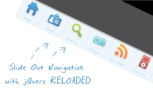
1. The HTML Structure
The only thing we will need for the navigation is a simple unordered list with links and spans inside of the list elements:
The spans will carry the names of your menu items.
The list is getting an ID because we want to refer to it later in the JavaScript. With jQuery, we will make the link items slide out whenever we hover over the li elements of the list.
2. The CSS
First, we define the CSS properties for the list:
ul#navigation {
     position: fixed;
     margin: 0px;
     padding: 0px;
     top: 0px;
     right: 10px;
     list-style: none;
     z-index:999999;
     width:721px;
 }
Now, let’s look at the list element properties:
ul#navigation li {
     width: 103px;
     display:inline;
     float:left;
 }
For the links in the list elements, we define the following CSS properties:
ul#navigation li a {
     display: block;
     float: left;
     margin-top: -2px;
     width: 100px;
     height: 25px;
     background-color: #E7F2F9;
     background-repeat: no-repeat;
     background-position: 50% 10px;
     border: 1px solid #BDDCEF;
     text-decoration: none;
     text-align: center;
     padding-top: 80px;
 }
Let’s add some rounded borders (they don’t work in Internet Explorer, though) and make the items semi-transparent:
ul#navigation li a {
     display: block;
     float:left;
     margin-top: -2px;
     width: 100px;
     height: 25px;
     background-color:#E7F2F9;
     background-repeat:no-repeat;
     background-position:50% 10px;
     border:1px solid #BDDCEF;
     text-decoration:none;
     text-align:center;
     padding-top:80px;
     -moz-border-radius:0px 0px 10px 10px;
     -webkit-border-bottom-right-radius: 10px;
     -webkit-border-bottom-left-radius: 10px;
     -khtml-border-bottom-right-radius: 10px;
     -khtml-border-bottom-left-radius: 10px;
     opacity: 0.7;
     filter:progid:DXImageTransform.Microsoft.Alpha(opacity=70);
 }
The last filter property will make this work for Internet Explorer as well.
These were the common properties of all the link elements in the list. Now we will define the background image for the links in the specific list items:
ul#navigation .home a{
     background-image: url(../images/home.png);
 }
 ul#navigation .about a      {
     background-image: url(../images/id_card.png);
 }
 ul#navigation .search a      {
     background-image: url(../images/search.png);
 }
 ul#navigation .podcasts a      {
     background-image: url(../images/ipod.png);
 }
 ul#navigation .rssfeed a   {
     background-image: url(../images/rss.png);
 }
 ul#navigation .photos a     {
     background-image: url(../images/camera.png);
 }
 ul#navigation .contact a    {
     background-image: url(../images/mail.png);
 }
When hovering over the elements, we want to change the background color in order to make them stand out a little bit more:
ul#navigation li a:hover{
      background-color:#CAE3F2;
 }
Now we just need to add some style to the spans:
 ul#navigation li a span{
     letter-spacing:2px;
     font-size:11px;
     color:#60ACD8;
     text-shadow: 0 -1px 1px #fff;
 }
The JavaScript
 $(function() {
     var d=300;
     $('#navigation a').each(function(){
         $(this).stop().animate({
             'marginTop':'-80px'
         },d+=150);
     });

     $('#navigation > li').hover(
     function () {
         $('a',$(this)).stop().animate({
             'marginTop':'-2px'
         },200);
     },
     function () {
         $('a',$(this)).stop().animate({
             'marginTop':'-80px'
         },200);
     }
 );
 });
You might also like

Tags
accordion accordion menu animation navigation animation navigation menu carousel checkbox inputs css3 css3 menu css3 navigation date picker dialog drag drop drop down menu drop down navigation menu elastic navigation form form validation gallery glide navigation horizontal navigation menu hover effect image gallery image hover image lightbox image scroller image slideshow multi-level navigation menus rating select dependent select list slide image slider menu stylish form table tabs text effect text scroller tooltips tree menu vertical navigation menu