 Subscribe
 Follow Us
CSS Star Rating System
 13 years ago
 20308
20308 3608
3608

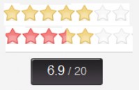
I have ploughed through several pure CSS star rating systems, only to find that many use either unnecessarily large images (defining every state) or bloated mark-up in both HTML and CSS. Below I have an example of a new and elegant approach that uses some CSS trickery and a single image defining the three states of static, hover and active.
How to?
The trick to achieving this effect without an image defining every state lies in the use of positioning and negative margins; generally unpredictable properties unless used cautiously; we will come to these later.
Firstly prepare your external/internal CSS and HTML documents with an ‘images’ folder relative to your documents. Save the image displayed below into the ‘images’ directory (as star.jpg) to prepare your star rating system’s different states.
Then create a simple unordered list with 5 list items as displayed below.
<ul class="rating">

<li><a href="#" title="1 Star">1</a></li>

<li><a href="#" title="2 Stars">2</a></li>

<li><a href="#" title="3 Stars">3</a></li>

<li><a href="#" title="4 Stars">4</a></li>

<li><a href="#" title="5 Stars">5</a></li>

</ul>
In the CSS we firstly need to reset the margin, padding and list-style properties to remove unwanted formatting in our list. The asterisks applies the formatting to all elements within the page but if you want the formatting to just target the star rating, first put the unordered list in a div with a class, then add that class before the asterisks in the CSS (i.e. .classname *).
* {

padding:0;

margin:0;

list-style:none;

}
Now we define the height and width of the unordered list as well as the default star state (the grey star). The width and height of this is essential with the height being equal to the height of 1 x star and the width being equal to the width of 5 x stars. We also add an overflow property of hidden to accommodate some older browsers.
ul.rating{

background:url(images/star.jpg) bottom;

height:21px;

width:115px;

overflow:hidden;

}
We make the list-items inline so they sit neatly next to each other.
ul.rating li{

display:inline

}
Then we define height and width (equal to a stars height and width) and remove the unwanted text from the page using text-indent. We also apply relative positioning which results in the hover area of each star always being in front of the stars that are currently being hovered over (i.e. it allows you to hover over previously highlighted stars).
.rating a {

display:block;

width:23px;

height:21px;

float:left;

text-indent:-9999px;

position:relative;

}
We now need to define the hover and active states of our beautiful stars through adding a background image and changing its position. We also create a negative left margin to create the illusion of the stars increasing and decreasing as the cursor hovers over them. The static position allows for the hover area to drop behind previous stars so you can move your cursor back again.
.rating a:hover {

background:url(images/star.jpg) center;

width:115px;

margin-left:-92px;

position:static;

}

.rating a:active {

background-position:top;

}
So there you have it; an elegant, practical and javascript-free CSS star ratings system that is easily customisable, uses only three stars as images and doesn’t have any unnecessary span’s or classes in the HTML.
You might also like
Tags
accordion accordion menu animation navigation animation navigation menu carousel checkbox inputs css3 css3 menu css3 navigation date picker dialog drag drop drop down menu drop down navigation menu elastic navigation form form validation gallery glide navigation horizontal navigation menu hover effect image gallery image hover image lightbox image scroller image slideshow multi-level navigation menus rating select dependent select list slide image slider menu stylish form table tabs text effect text scroller tooltips tree menu vertical navigation menu