 Subscribe
 Follow Us
jQuery CSS3 a Mega Drop-Down Menu
 13 years ago
 31513
31513 5186
5186
Mega drop-down menus are not actually new, but more and more we see them on popular websites and blogs. With the ever increasing quantity of content on the web we have to figure out solutions to display content and navigation but still keep everything usable and provide a good user experience. It’s no wonder mega drop-downs are now used more often.
we’ll take a look at creating a simple HTML site with a horizontal navigation bar where a menu item will have a mega drop-down attached to it. I used jQuery for the drop-down and some CSS3 for the rounded corners.
Step 1 – The Markup
Before we can start working on the mega drop-down menu we will need a working site so let’s write our HTML. Of course for the purpose of this tutorial the links in the menu won’t work.
Let’s start with the header. We’ll include our style.css file and the jQuery library
<!DOCTYPE html PUBLIC "-//W3C//DTD XHTML 1.0 Transitional//EN" "http://www.w3.org/TR/xhtml1/DTD/xhtml1-transitional.dtd"> <html xmlns="http://www.w3.org/1999/xhtml"> <head> <meta http-equiv="Content-Type" content="text/html; charset=utf-8" /> <title>Mega Drop-Down Menu Demo</title> <link rel="stylesheet" href="style.css" type="text/css" media="screen" /> <script type="text/javascript" src="js/jquery-1.3.2.min.js"></script> </head>
Then we will add a H1 and a paragraph that explains what the demo site is about:
<body>
<h1>Mega Drop-Down Menu Demo Site</h1>
<p>This page is an example of a mega drop-down menu, but with more options than the usual suckerfish drop downs. We used jQuery, CSS3 and HTML to create this mega drop down menu.</p>
And then our navigation bar (without the drop-down for now):
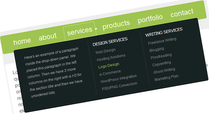
<div> <ul> <li><a href="#">home</a></li> <li><a href="#">about</a></li> <li><a href="#">services</a></li> <li><a href="#">products</a></li> <li><a href="#">portfolio</a></li> <li><a href="#">contact</a></li> </ul> </div>
We have 6 menu items and we will use the ‘services’ tab and attach our drop-down to it. But before we do that let’s add some content to our site. We’ll put 2 paragraphs with some Lorem Ipsum inside a div.
<div>
<p>Lorem ipsum dolor sit amet, consectetur adipiscing elit. Ut eget eros libero. Fusce tempus quam sit amet erat mollis a fermentum nibh imperdiet. Fusce iaculis sapien in turpis aliquet porta. Donec tincidunt gravida tortor, vel dignissim augue convallis sit amet. Aliquam auctor ornare accumsan. Cras convallis elit tincidunt arcu semper egestas. Mauris interdum fringilla nisi. Cras a dapibus lectus. Praesent blandit ullamcorper ornare. Nam hendrerit sollicitudin urna non ultricies. Phasellus condimentum auctor risus, at accumsan tellus tempor vel. Nunc mattis eleifend dolor at adipiscing.</p>

<p>Ut purus metus, fermentum vitae pulvinar vel, elementum eget nulla. Pellentesque posuere, enim ut dapibus vestibulum, leo nunc porttitor neque, sed pulvinar orci sem eleifend sapien. Nullam at odio nibh, eu pharetra ipsum. Pellentesque eget ante nec ante consequat ullamcorper a vitae mauris. Integer lacus lorem, sollicitudin vulputate posuere at, commodo a sapien. Vivamus lobortis vehicula imperdiet. Donec a congue tortor. Fusce augue tortor, pretium pharetra pellentesque ornare, laoreet nec sapien. Ut eget magna tellus. Pellentesque posuere accumsan condimentum.</p>
</div>
And then we can end our document with the closing body and html tags.
Before we dive into the CSS, let’s add our drop-down. Here’s the new markup for the menu. I added a class to the ‘services’ list item since this is the one that will have the mega drop-down and I added a div with some content in it.
<div> <ul> <li><a href="#">home</a></li> <li><a href="#">about</a></li> <li><a href="#">services</a></li> <div class="servicesdropped"> <p>Here's an example of a paragraph inside the drop-down panel. We placed this paragraph in the left column. Then we have 2 more columns on the right with a H3 for the section title and then we have unordered lists.</p> <ul> <h3>Design Services</h3> <li><a href="#">Web Design</a></li> <li><a href="#">Hosting Solutions</a></li> <li><a href="#">Logo Design</a></li> <li><a href="#">e-Commerce</a></li> <li><a href="#">WordPress Integration</a></li> <li><a href="#">PSD/PNG Conversion</a></li> </ul> <ul> <h3>Writing Services</h3> <li><a href="#">Freelance Writing</a></li> <li><a href="#">Blogging</a></li> <li><a href="#">Proofreading</a></li> <li><a href="#">Copywriting</a></li> <li><a href="#">Ghost Writing</a></li> <li><a href="#">Marketing Plan</a></li> </ul> </div> <li><a href="#">products</a></li> <li><a href="#">portfolio</a></li> <li><a href="#">contact</a></li> </ul> </div>
As you can see the whole mega drop-down panel is contained within the div=”servicesdropped”. I put a paragraph and some unordered lists in there (later styled using CSS)
Part 2 – jQuery
Now let’s work on the jQuery part. It’s actually very simple. I want the ‘services’ tab to open up a mega drop-down panel when clicked. And I want the panel to close the ‘services’ tab is clicked again.
Let’s insert this code in the head of our document:
<script type="text/javascript">
$(document).ready(function(){
$(".downservices").click(function(){
$(".servicesdropped").toggle("fast");
});
});
</script>
This will tell the browser to toggle the panel with a class of .servicesdropped up and down when the list item with a class of .downservices is clicked. Simple huh?
Step 3 – CSS3
I used some CSS3 to give our divs and paragraphs some rounded corners. Of course the rest of the CSS file is pretty straight forward
body {
background:#eee;
text-align:left;
color:#666;
width:700px;
font-size:16px;
font-family:georgia, 'time new romans', serif;
margin:0 auto;
padding:0;
}

h1 {
font-size:46px;
font-family:'Trebuchet MS', helvetica, arial, sans-serif;
letter-spacing:-1px;
color:#000;
font-weight:400;
padding:20px 0 0;
}

h2 {
font-size: 34px;
font-family: 'Trebuchet MS', helvetica, arial, sans-serif;
color:#21211f;
font-weight: 400;
padding: 20px 0 10px; 0
}

h3 {
font-size:14px;
font-family:verdana, helvetica, arial, sans-serif;
letter-spacing:-1px;
color:#fff;
font-weight:400;
text-transform:uppercase;
margin:0;
padding:8px 0 8px 15px;
}

p {
color:#aaa;
font-style:italic;
line-height:22px;
padding:0 0 30px;
}

img {
border:none;
}

.content {
margin:10px 0 50px;
padding:0;
}

.content p {
font-style:normal;
font-family:helvetica, arial, verdana, sans-serif;
color:#676767;
background:#fff;
border:1px solid #fff;
-moz-border-radius:5px;
-webkit-border-radius:5px;
margin:35px 0;
padding:20px;
}

.megamenu {
background:#9FC54E;
border:1px solid #9FC54E;
-moz-border-radius:5px;
-webkit-border-radius:5px;
font-family:helvetica, arial, sans-serif;
font-size:24px;
width:698px;
height:60px;
color:#FFF;
margin:0;
padding:0;
}

.megamenu ul {
text-align:center;
list-style-type:none;
margin:0;
padding:16px;
}

.megamenu ul li {
list-style-type:none;
display:inline;
margin:0;
padding:0;
}

.megamenu ul li a,.megamenu ul li a:visited {
text-decoration:none;
color:#fff;
margin:0;
padding:10px;
}

.megamenu ul li a:hover,.megamenu ul li a:visited:hover {
text-decoration:none;
color:#CEFF65;
margin:0;
padding:10px;
}

.megamenu ul li.downservices {
background:url(images/arrow.png) 100% 55% no-repeat;
margin:0;
padding:10px 8px 10px 10px;
}

.servicesdropped {
display:none;
text-align:left;
position:absolute;
background:#172323;
font-size:12px;
width:590px;
-moz-border-radius:5px;
-webkit-border-radius:5px;
border:1px solid #000;
margin:10px 0 0 20px;
padding:10px 20px 20px;
}

.servicesdropped p.textleft {
float:left;
font-size:12px;
width:200px;
margin:10px 0 0;
padding:0 20px 15px 10px;
}

.servicesdropped ul.middle {
text-align:left;
float:left;
border-right:1px solid #333;
border-left:1px solid #333;
font-size:12px;
width:180px;
margin:0;
padding:0;
}

.servicesdropped ul.right {
text-align:left;
float:left;
font-size:12px;
width:178px;
margin:0;
padding:0;
}

.servicesdropped ul.right li a,.servicesdropped ul.middle li a {
list-style-type:none;
display:block;
color:#888;
font-size:12px;
margin:0;
padding:5px 0 5px 20px;
}

.servicesdropped ul.right li a:hover,.servicesdropped ul.middle li a:hover {
list-style-type:none;
color:#9FC54E;
display:block;
font-size:12px;
margin:0;
padding:5px 0 5px 21px;
}
Our rounded corners are styled using the border-radius property (the W3C validator doesn’t like this, but it looks good and doesn’t impact usability at all). Something like this:
border:1px solid #000;
-moz-border-radius:5px;
-webkit-border-radius:5px;
Of course I changed the border color to match the color of my divs and paragraphs. The rounded corners won’t work in IE6
You might also like

Tags
accordion accordion menu animation navigation animation navigation menu carousel checkbox inputs css3 css3 menu css3 navigation date picker dialog drag drop drop down menu drop down navigation menu elastic navigation form form validation gallery glide navigation horizontal navigation menu hover effect image gallery image hover image lightbox image scroller image slideshow multi-level navigation menus rating select dependent select list slide image slider menu stylish form table tabs text effect text scroller tooltips tree menu vertical navigation menu