 Subscribe
 Follow Us
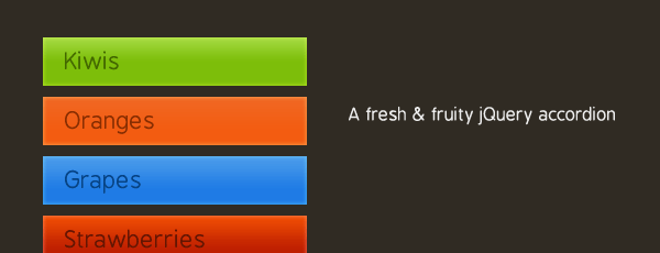
jQuery Colorful Content Accordion menu
 13 years ago
 24946
24946 4943
4943
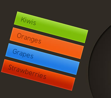
We are making a simple, yet eye-catching accordion with the help of CSS, jQuery and the easing plug-in for some fancy effects.
Step 1 – XHTML
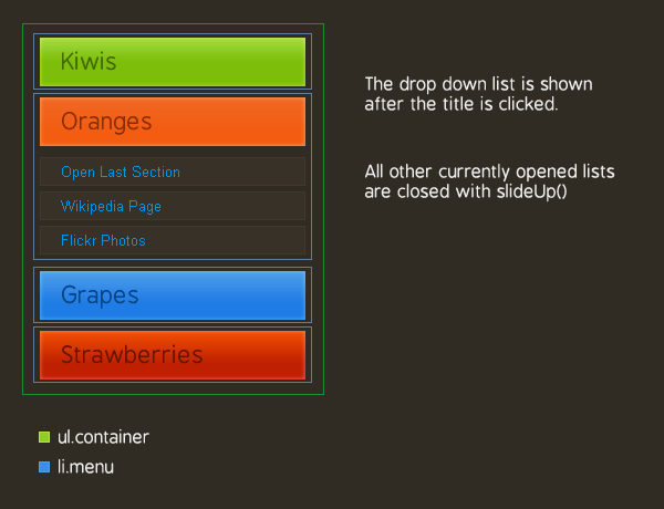
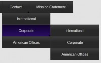
As you can see from the demo, the accordion is divided into four sections, each defined by a LI element with a class name of menu. They are positioned inside the main unordered list (ul.container) and share a common XHTML structure:
demo.html
<li class="menu"> <!-- This LI is positioned inside the main UL -->
<ul> <!-- This UL holds the section title and content -->
<!-- The click-able section title with a unique background: -->
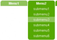
<li class="button"><a href="#" class="green">Kiwis <span></span></a></li>
<!-- The dropdown list, hidden by default and shown on title click: -->
<li class="dropdown">
<ul> <!-- This list holds the options that are slid down by jQuery -->
<!-- Each option is in its own LI -->
<li><a href="http://en.wikipedia.org/wiki/Kiwifruit">Read on Wikipedia</a></li>
<li><a href="http://www.flickr.com/search/?w=all&q=kiwi&m=text">Flickr Stream</a></li>
</ul> <!-- Closing the elements -->
</li>
</ul>
</li>
Each menu LI contains another UL, which forms a title area (li.button), and a content area (li.dropdown).
We then have an anchor element positioned inside li.button (button being the assigned class name) . This hyperlink is later bound to a jQuery event handler, which slides open the section’s drop down list once the link is clicked.
It is also worth noting that the dropdown list elements are hidden by default with the display:none CSS property as you will see in a moment.
Step 2 – CSS
If styled properly, even the simplest idea can make a big difference in the overall feeling your site gives to the visitors.
It is important to take extra care so that the CSS code you produce is valid and that it works well across different browsers. I’ve included all the styles used in the demo below:
demo.css – part 1
body{
 /* Setting default text color, background and a font stack */
 color:#cccccc;
 font-size:13px;
 background: #302b23;
 font-family:Arial, Helvetica, sans-serif;
}

ul{
 margin:0;
 padding:0;
}

ul.container{
 /* The main UL */
 width:240px;
 margin:0 auto;
 padding:50px;
}

li{
 list-style:none;
 text-align:left;
}

li.menu{
 /* The main list elements */
 padding:5px 0;
 width:100%;
}

li.button a{
 /* The section titles */
 display:block;
 font-family:BPreplay,Arial,Helvetica,sans-serif;
 font-size:21px;
 height:34px;
 overflow:hidden;
 padding:10px 20px 0;
 position:relative;
 width:200px;
}
Here we style the main UL – ul.container, which holds the rest of the elements. Lastly, we define the looks of the hyperlinks that act as section titles (notice that the actual background images are not yet assigned).
demo.css – part 2
li.button a:hover{
/* Removing the inherited underline from the titles */
text-decoration:none;
}
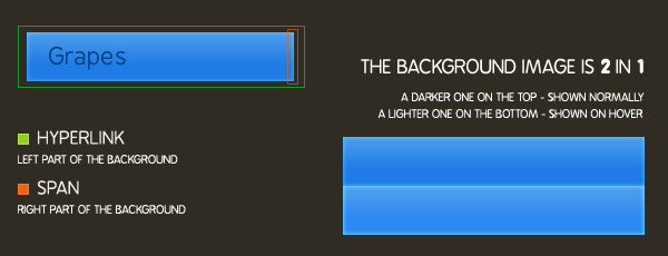
li.button a span{
/* This span acts as the right part of the section's background */
height:44px;
position:absolute;
right:0;
top:0;
width:4px;
display:block;
}
/* Setting up different styles for each section color */
li.button a.blue{background:url(img/blue.png) repeat-x top left; color:#074384;}
li.button a.blue span{ background:url(img/blue.png) repeat-x top right;}
li.button a.green{background:url(img/green.png) repeat-x top left; color:#436800;}
li.button a.green span{ background:url(img/green.png) repeat-x top right;}
li.button a.orange{background:url(img/orange.png) repeat-x top left; color:#882e02;}
li.button a.orange span{ background:url(img/orange.png) repeat-x top right;}
li.button a.red{background:url(img/red.png) repeat-x top left; color:#641603;}
li.button a.red span{ background:url(img/red.png) repeat-x top right;}
/* The hover effects */
li.button a:hover{ background-position:bottom left;}
li.button a:hover span{ background-position:bottom right;}
.dropdown{
/* The expandable lists */
display:none;
padding-top:5px;
width:100%;
}
.dropdown li{
/* Each element in the expandable list */
background-color:#373128;
border:1px solid #40392C;
color:#CCCCCC;
margin:5px 0;
padding:4px 18px;
}
The most interesting part here is how we specify the individual background property for every section color. We also provide a background for the span element, which holds the right part of the background image, as explained in the illustration below.
Step 3 – jQuery
After we’ve laid the layout of the accordion, it is time to make it tick. First we need to include a few scripts in the page (this code is put inside the head section of the document):
<script type="text/javascript" src="http://ajax.googleapis.com/ajax/libs/jquery/1.3.2/jquery.min.js"></script>
<script type="text/javascript" src="jquery.easing.1.3.js"></script>
<script type="text/javascript" src="script.js"></script>
We first include the jQuery library from Google’s CDN, which will help us write compact and compatible code. Later we include the easing plugin and lastly our own script file, which I’ve covered in detail below.
As you may have noticed from the demo, the slide down effect is not your regular linear movement, but more bounce-like and lively. This is achieved with the help of the easing plug-in for jQuery. It provides a number of interesting effects which can put those lovely details in your web design.
Now lets continue with our own scripts file.
script.js
$(document).ready(function(){
 /* This code is executed after the DOM has been completely loaded */

 /* Changing thedefault easing effect - will affect the slideUp/slideDown methods: */
 $.easing.def = "easeOutBounce";

 /* Binding a click event handler to the links: */
 $('li.button a').click(function(e){

  /* Finding the drop down list that corresponds to the current section: */
  var dropDown = $(this).parent().next();

  /* Closing all other drop down sections, except the current one */
  $('.dropdown').not(dropDown).slideUp('slow');
  dropDown.slideToggle('slow');

  /* Preventing the default event (which would be to navigate the browser to the link's address) */
  e.preventDefault();
 })

});
We first set the easing method that is going to be used by the slideUp/slideDown effects, and then bind a specially crafted function to the click event of the li.button hyperlink. When this link is clicked, we get the corresponding li.dropDown and show it, hiding all the others.
I am using the slideToggle jQuery method, which checks to see if the element is already visible on the page, and decides whether to show or hide it. This way, when you click on an open section of the accordion, it is contracted instead of just staying opened.
After this, we use e.preventDefault() to prevent the browser from navigating away from the page (after all we’ve just clicked a link and this is the normal behavior).
With this our fruity CSS & jQuery accordion is complete!
You might also like

Tags
accordion accordion menu animation navigation animation navigation menu carousel checkbox inputs css3 css3 menu css3 navigation date picker dialog drag drop drop down menu drop down navigation menu elastic navigation form form validation gallery glide navigation horizontal navigation menu hover effect image gallery image hover image lightbox image scroller image slideshow multi-level navigation menus rating select dependent select list slide image slider menu stylish form table tabs text effect text scroller tooltips tree menu vertical navigation menu