 Subscribe
 Follow Us
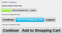
Chrome, Safari Fancy menu with CSS3 and jQuery
 13 years ago
 21550
21550 4565
4565
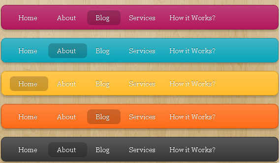
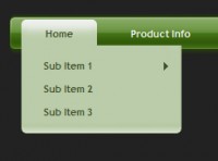
Fancy menu was made popular by devthought, it is develop on top of the Mootools library. And later a jQuery version of this menu called lavalamp was made popular by Ganesh. This time I will show you how to achieve the same effect using the CSS3 new features.
Note: Best viewed in a WebKit Browser (Safari and Chrome). This sample is just to demonstrate the capabilities of the new CSS3 features.
The HTML Markup
<div class="lavalamp" >
<ul>
<li class="active"><a href="">Home</a></li>
<li><a href="">About</a></li>
<li><a href="">Blog</a></li>
<li><a href="">Services</a></li>
<li><a href="">Portfolio</a></li>
<li><a href="">Contacts</a></li>
<li><a href="">Back to Article</a></li>
<li><a href="">How it Works?</a></li>
</ul>
<div class="floatr"></div>
</div>
As best practice we have to use the list elements for the menu item. The <div class="floatr"></div> is the element we have to animate.
The CSS
The following block of code is used for styling our div with the class of lavalamp. Some of the CSS3 features used to style the element such as border-radius, box-shadow, rgba and gradient.
.lavalamp {
    position: relative;
    border: 1px solid #d6d6d6;
    background: #fff;
    padding: 15px;
    -webkit-box-shadow: 0 3px 6px rgba(0,0,0,.25);
    -moz-box-shadow: 0 3px 6px rgba(0,0,0,.25);
    border-radius : 10px;
    -moz-border-radius : 10px;
    -webkit-border-radius : 10px;
    background : -webkit-gradient(linear, left top, left bottom, from(rgb(240,240,240)), to(rgb(204,204,204)));
    background : -moz-linear-gradient(top, rgb(240,240,240), rgb(204,204,204));
    height: 18px;
}
The CSS code for the menu item.
ul {
    margin: 0;
    padding: 0;
    z-index: 300;
    position: absolute;
}

ul li {
    list-style: none;
    float:left;

    text-align: center;
    }

ul li a {
    padding: 0 20px;
    text-align: center;
    }
The CSS code for our floating/animated div element.
.floatr {
    position: absolute;
    top: 10px;
    z-index: 50;
    width: 70px;
    height: 30px;
    border-radius : 8px;
    -moz-border-radius : 8px;
    -webkit-border-radius : 8px;
    background : rgba(0,0,0,.20);
    -webkit-transition: all .4s ease-in-out;
    -moz-transition: all .4s ease-in-out;
}
Normally when the value of a CSS property changes, the rendered result is instantly updated, with the affected elements immediately changing from the old property value to the new property value. The transition properties are used to animate smoothly from the old state to the new state over time.
Transition property syntax:
transition: property duration timing;
Property specifies the name of the CSS property to which the transition is applied. Duration defines the length of time that a transition takes and timing more like an easing function.
The Javascript
The javascript role in this example is to get the current position of the active element and the mouse position when you are hovering our menu and apply the necessary css with corresponding value to our element we are going to animate.
$(document).ready(function () {

 //get the current position of the active item
    var dleft = $('.lavalamp li.active').offset().left - $('.lavalamp').offset().left;
    var dwidth = $('.lavalamp li.active').width() + "px";

    //apply the current position of active item to our floatr element
    $('.floatr').css({
        "left": dleft+"px",
        "width": dwidth
    });

    $('.lavalamp li').hover(function(){

        var left = $(this).offset().left - ($(this).parents('.lavalamp').offset().left + 15);
        var width = $(this).width() + "px";
        var sictranslate = "translate("+left+"px, 0px)";

        $(this).parent('ul').next('div.floatr').css({
            "width": width,
            "-webkit-transform": sictranslate,
            "-moz-transform": sictranslate
        });

    },

    function(){

        var left = $(this).siblings('li.active').offset().left - ($(this).parents('.lavalamp').offset().left + 15);
        var width = $(this).siblings('li.active').width() + "px";

        var sictranslate = "translate("+left+"px, 0px)";

        $(this).parent('ul').next('div.floatr').css({
            "width": width,
            "-webkit-transform": sictranslate,
            "-moz-transform": sictranslate

        });

    }).click(function(){

        $(this).siblings('li').removeClass('active');

        $(this).addClass('active');

        return false;

    });

});
Add more variety of colors to our menu.
.magenta {
 background : rgb(190,64,120);
 background : -webkit-gradient(linear, left top, left bottom, from(rgb(190,64,120)), to(rgb(177,24,91)));
 background : -moz-linear-gradient(top,rgb(190,64,120), rgb(177,24,91));
 border: 1px solid #841144;

}

.cyan {
 background : rgb(64,181,197);
 background : -webkit-gradient(linear, left top, left bottom, from(rgb(64,181,197)), to(rgb(7,165,187)));
 background : -moz-linear-gradient(top, rgb(64,181,197), rgb(7,165,187));
 border: 1px solid #2f8893;

}

.yellow {
 background : rgb(255,199,79);
 background : -webkit-gradient(linear, left top, left bottom, from(rgb(255,199,79)), to(rgb(255,188,43)));
 background : -moz-linear-gradient(top, rgb(255,199,79), rgb(255,188,43));
 border: 1px solid #c08c1f;

}

.orange {
 background : rgb(255,133,64);
 background : -webkit-gradient(linear, left top, left bottom, from(rgb(255,133,64)), to(rgb(255,107,24)));
 background : -moz-linear-gradient(top, rgb(255,133,64), rgb(255,107,24));
 border: 1px solid #c04f11;

}

.dark {
 background : rgb(89,89,89);
 background : -webkit-gradient(linear, left top, left bottom, from(rgb(89,89,89)), to(rgb(54,54,54)));
 background : -moz-linear-gradient(top, rgb(89,89,89), rgb(54,54,54));
 border: 1px solid #272727;

}
.magenta li a , .cyan li a, .yellow li a , .orange li a, .dark li a{
 color: #fff;
 text-shadow: 0 -1px 0 rgba(0,0,0,.40);

}
Our menu is now ready. See the menu in action or download the code for you to experiment.
You might also like

Tags
accordion accordion menu animation navigation animation navigation menu carousel checkbox inputs css3 css3 menu css3 navigation date picker dialog drag drop drop down menu drop down navigation menu elastic navigation form form validation gallery glide navigation horizontal navigation menu hover effect image gallery image hover image lightbox image scroller image slideshow multi-level navigation menus rating select dependent select list slide image slider menu stylish form table tabs text effect text scroller tooltips tree menu vertical navigation menu