 Subscribe
 Follow Us
Cross browser gradient buttons with CSS3
 13 years ago
 15605
15605 4204
4204
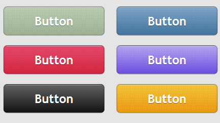
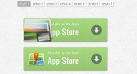
This is a set of gradient buttons just with CSS (no images).
That’s what you may say but, oh yes … This is another buttons set, powered by almighty CSS3 (and IE gradient filters).
Features
- Scalability – Scale the buttons using font-size.
- Adjustability – Change padding and font-size and there you go.
- Flexibility – Apply the styles to any HTML elements.
- Fallback styles – Graceful degradation for other browsers.
- Usability – Normal, hover and active states are available.
The CSS
.button
{
    margin: 10px;
    text-decoration: none;
    font: bold 1.5em 'Trebuchet MS',Arial, Helvetica; /*Change the em value to scale the button*/
    display: inline-block;
    text-align: center;
    color: #fff;

    border: 1px solid #9c9c9c; /* Fallback style */
    border: 1px solid rgba(0, 0, 0, 0.3);

    text-shadow: 0 1px 0 rgba(0,0,0,0.4);

    box-shadow: 0 0 .05em rgba(0,0,0,0.4);
    -moz-box-shadow: 0 0 .05em rgba(0,0,0,0.4);
    -webkit-box-shadow: 0 0 .05em rgba(0,0,0,0.4);

}

.button, .button span
{
    -moz-border-radius: .3em;
    border-radius: .3em;
}

.button span
{
    border-top: 1px solid #fff; /* Fallback style */
    border-top: 1px solid rgba(255, 255, 255, 0.5);
    display: block;
    padding: 0.5em 2.5em;

    /* The background pattern */

    background-image: -webkit-gradient(linear, 0 0, 100% 100%, color-stop(.25, rgba(0, 0, 0, 0.05)), color-stop(.25, transparent), to(transparent)),
                      -webkit-gradient(linear, 0 100%, 100% 0, color-stop(.25, rgba(0, 0, 0, 0.05)), color-stop(.25, transparent), to(transparent)),
                      -webkit-gradient(linear, 0 0, 100% 100%, color-stop(.75, transparent), color-stop(.75, rgba(0, 0, 0, 0.05))),
                      -webkit-gradient(linear, 0 100%, 100% 0, color-stop(.75, transparent), color-stop(.75, rgba(0, 0, 0, 0.05)));
    background-image: -moz-linear-gradient(45deg, rgba(0, 0, 0, 0.05) 25%, transparent 25%, transparent),
                      -moz-linear-gradient(-45deg, rgba(0, 0, 0, 0.05) 25%, transparent 25%, transparent),
                      -moz-linear-gradient(45deg, transparent 75%, rgba(0, 0, 0, 0.05) 75%),
                      -moz-linear-gradient(-45deg, transparent 75%, rgba(0, 0, 0, 0.05) 75%);

    /* Pattern settings */

    -moz-background-size: 3px 3px;
    -webkit-background-size: 3px 3px;
}

.button:hover
{
    box-shadow: 0 0 .1em rgba(0,0,0,0.4);
    -moz-box-shadow: 0 0 .1em rgba(0,0,0,0.4);
    -webkit-box-shadow: 0 0 .1em rgba(0,0,0,0.4);
}

.button:active
{
    /* When pressed, move it down 1px */
    position: relative;
    top: 1px;
}
HTML structure
Let’s see how the HTML looks for the blue button for example:
<a href="#" class="button button-blue">
    <span>Button</span>
</a>
Multiple classes are used in order to have minimal HTML and CSS files.
The top border could have been achieved with an inset box-shadow but, this way the CSS3 buttons will degrade graceful, as you will see later in this article.
Blue button:
.button-blue
{
    background: #4477a1;
    background: -webkit-gradient(linear, left top, left bottom, from(#81a8cb), to(#4477a1) );
    background: -moz-linear-gradient(-90deg, #81a8cb, #4477a1);
    filter:  progid:DXImageTransform.Microsoft.gradient(GradientType=0,startColorstr='#81a8cb', endColorstr='#4477a1');
}

.button-blue:hover
{
    background: #81a8cb;
    background: -webkit-gradient(linear, left top, left bottom, from(#4477a1), to(#81a8cb) );
    background: -moz-linear-gradient(-90deg, #4477a1, #81a8cb);
    filter:  progid:DXImageTransform.Microsoft.gradient(GradientType=0,startColorstr='#4477a1', endColorstr='#81a8cb');
}

.button-blue:active
{
    background: #4477a1;
}
You might also like
Tags
accordion accordion menu animation navigation animation navigation menu carousel checkbox inputs css3 css3 menu css3 navigation date picker dialog drag drop drop down menu drop down navigation menu elastic navigation form form validation gallery glide navigation horizontal navigation menu hover effect image gallery image hover image lightbox image scroller image slideshow multi-level navigation menus rating select dependent select list slide image slider menu stylish form table tabs text effect text scroller tooltips tree menu vertical navigation menu