 Subscribe
 Follow Us
Very nice pure CSS3 menu
 12 years ago
 17258
17258 3768
3768

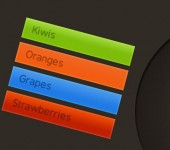
This is a good looking menu using some CSS3 magic.
The HTML
<nav>
        <ul>
                <li><a href="#"><span>Home</span></a></li>
                <li><a href="#"><span>Categories</span></a></li>
                <li><a href="#"><span>About</span></a></li>
                <li><a href="#"><span>Portfolio</span></a></li>
                <li><a href="#"><span>Contact</span></a></li>
        </ul>
</nav>
Pretty clean, except for the span element. You’ll see further why we need that span.
The CSS
The demo example contains also a header and a logo (so, extra styles), but I’ll list here only the styles used for this menu.
Removing the default list styles
nav ul
{
        padding: 0;
        margin: 0;
        list-style: none;
}

nav li
{
        float: left;
}
Style the anchor
nav a
{
    float: left;
    color: #eee;
    margin: 0 5px;
    padding: 3px;
    text-decoration: none;
    border: 1px solid #831608;
    font: bold 14px Arial, Helvetica;
    background-color: #831608;
    background-image: -moz-linear-gradient(#bb413b, #831608);
    background-image: -webkit-gradient(linear, left top, left bottom, from(#bb413b), to(#831608));
    background-image: -webkit-linear-gradient(#bb413b, #831608);
    background-image: -o-linear-gradient(#bb413b, #831608);
    background-image: -ms-linear-gradient(#bb413b, #831608);
    background-image: linear-gradient(#bb413b, #831608);
    -moz-border-radius: 5px;
    -webkit-border-radius: 5px;
    border-radius: 5px;
    text-shadow: 0 -1px 0 rgba(0,0,0,.8);
    -moz-box-shadow: 0 1px 0 rgba(255, 255, 255, 0.3), 0 3px 0 rgba(0, 0, 0, 0.7), 0 2px 2px rgba(0, 0, 0, 0.5), 0 1px 0 rgba(255, 255, 255, 0.5) inset;
    -webkit-box-shadow: 0 1px 0 rgba(255, 255, 255, 0.3), 0 3px 0 rgba(0, 0, 0, 0.7), 0 2px 2px rgba(0, 0, 0, 0.5), 0 1px 0 rgba(255, 255, 255, 0.5) inset;
    box-shadow: 0 1px 0 rgba(255, 255, 255, 0.3), 0 3px 0 rgba(0, 0, 0, 0.7), 0 2px 2px rgba(0, 0, 0, 0.5), 0 1px 0 rgba(255, 255, 255, 0.5) inset;
}

nav a:hover
{
    background-color: #bb413b;
    background-image: -moz-linear-gradient(#831608, #bb413b);
    background-image: -webkit-gradient(linear, left top, left bottom, from(#831608), to(#bb413b));
    background-image: -webkit-linear-gradient(#831608, #bb413b);
    background-image: -o-linear-gradient(#831608, #bb413b);
    background-image: -ms-linear-gradient(#831608, #bb413b);
    background-image: linear-gradient(#831608, #bb413b);
}

nav a:active
{
    background: #bb413b;
    position: relative;
    top: 2px;
    -moz-box-shadow: 0 0 3px rgba(0, 0, 0, 0.7) inset;
    -webkit-box-shadow: 0 0 3px rgba(0, 0, 0, 0.7) inset;
    box-shadow: 0 0 3px rgba(0, 0, 0, 0.7) inset;
}
Multiple CSS3 properties were used to create the above.
Style the span element
nav span
{
    border: 1px dashed #eba1a3;
    display: inline-block;
    padding: 4px 15px;
    cursor: pointer;
    background-color: #bb413b;
    background-image: -moz-linear-gradient(#d4463c, #aa2618);
    background-image: -webkit-gradient(linear, left top, left bottom, from(#d4463c), to(#aa2618));
    background-image: -webkit-linear-gradient(#d4463c, #aa2618);
    background-image: -o-linear-gradient(#d4463c, #aa2618);
    background-image: -ms-linear-gradient(#d4463c, #aa2618);
    background-image: linear-gradient(#d4463c, #aa2618);
}

nav a:hover span
{
    background-color: #bb413b;
    background-image: -moz-linear-gradient(#aa2618, #d4463c);
    background-image: -webkit-gradient(linear, left top, left bottom, from(#aa2618), to(#d4463c));
    background-image: -webkit-linear-gradient(#aa2618, #d4463c);
    background-image: -o-linear-gradient(#aa2618, #d4463c);
    background-image: -ms-linear-gradient(#aa2618, #d4463c);
    background-image: linear-gradient(#aa2618, #d4463c);
}
Advantages
Scalability
You can simply adjust its size by updating the anchor‘s font-size:
font: bold 14px Arial, Helvetica;
Conclusion
The menu we created using this tutorial isn’t a Sci-Fi one or a super mega complex one. The main purpose is to see how CSS3 can help us achieve interesting effects without needing images anymore.
I hope you enjoyed it.
The article source:http://www.red-team-design.com/sexy-css3-menu
You might also like
Tags
accordion accordion menu animation navigation animation navigation menu carousel checkbox inputs css3 css3 menu css3 navigation date picker dialog drag drop drop down menu drop down navigation menu elastic navigation form form validation gallery glide navigation horizontal navigation menu hover effect image gallery image hover image lightbox image scroller image slideshow multi-level navigation menus rating select dependent select list slide image slider menu stylish form table tabs text effect text scroller tooltips tree menu vertical navigation menu