 Subscribe
 Follow Us
Pure CSS3 Two Level Dark Menu
 12 years ago
 11961
11961 3692
3692
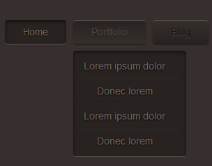
Now we are going to add the HTML content for our dark menu, and here we are using a simple unordered list with list items as you want and a sub menu using also an unordered list with list items as you wish. Here’s the HTML content:
<!-- Dark Menu Begin -->
<ul class="dark_menu">
    <li><a href="#" class="selected">Home</a></li>
    <li>
        <a href="#">Portfolio</a>
        <!-- Sub Menu Begin -->
        <ul>
            <li><a href="#">Lorem ipsum dolor</a></li>
            <li><a href="#">Donec lorem</a></li>
            <li><a href="#">Lorem ipsum dolor</a></li>
            <li><a href="#">Donec lorem</a></li>
        </ul>
        <!-- Sub Menu End -->
    </li>
    <li>
        <a href="#">Blog</a>
        <!-- Sub Menu Begin -->
        <ul>
            <li><a href="#">Lorem ipsum dolor</a></li>
            <li><a href="#">Donec lorem</a></li>
            <li><a href="#">Lorem ipsum dolor</a></li>
            <li><a href="#">Donec lorem</a></li>
        </ul>
        <!-- Sub Menu End -->
    </li>
    <li><a href="#">Contact</a></li>
</ul>
<!-- Dark Menu End -->
Now by looking at the HTML you will notice that it is a simple structure with links inside list items and all included inside unordered list. You’ll also notice that the main unordered list <ul> tag has a class name "dark_menu" to allow us to style the unordered list contents. The current page menu item is indicated by giving the link of that item a class name of "selected".
Styling First Level Menu Items
Now we add some CSS so that we can have a styled list items on the first level of the menu, to be exact we are styling all list items inside unordered list with class name "dark_menu". Here’ the CSS for first level menu items.
body {background: #362f2d;}

/* Main Dark Menu Unordered List First Level Style */
ul.dark_menu {
    list-style: none;
    padding: 0;
    font-family: Arial;
    font-size: 14px;
    line-height: 14px;
}

/* Clears all floated List Items */
ul.dark_menu:after {
    content: "";
    clear: both;
    display: block;
    overflow: hidden;
    visibility: hidden;
    width: 0;
    height: 0;
}

    /* First Level List Items Style */
    ul.dark_menu li {
        float: left;
        margin: 0 0 0 10px;
        position: relative;
    }

    /* First List Item in First Level Style */
    ul.dark_menu li:first-child {
        margin: 0;
    }
First I styled the body element with a dark brown color of "#362f2d", you go further by including a background image to add the noise from the PSD. Now, the <ul> element with class "dark_menu" is styled list style set to none so that we lose all list styling or bullets, padding is set to zero, font family is set to Arial, font size and line height both set to 14px.
Now the <li> element is styled with floating to the left, a left margin of 10px, and position is set to relative so that all absolutely positioned elements inside the list item is relative to it. If you notice now you will find that the first list item also has a left margin and we want it to have zero margins, in order to achieve that we are going to use a CSS pseudo selector ":first-child" which will style the first <li> element inside a <ul> element with class name "dark_menu" and we set margins to zero.
Off course you probably know that when we work with floating elements they affect the element that contains them (the parent element). The problem is when a parent element contains nothing but floated elements the height of this parent element collapses to zero and thus any box styling won’t work as it supposed to be (borders, background images and margins). This problem can be solved using many techniques and it’s called clearing floats. Each technique has it’s pros and cons, in our menu we are going to clear floats using a CSS pseudo selector ":after" on the parent element which in this case is the <ul> element with class name "dark_menu". We apply some content, which will be hidden using visibility set to hidden and clear all floats by setting clear to both.
Let’s now style the links’ normal state and for that we add the following CSS styles.
/* List Items Links Style */
ul.dark_menu li a, ul.dark_menu li a:link {
    color: #161312;
    text-decoration: none;
    display: block;
    padding: 10px 26px;

    /* Text Shadow */
    text-shadow: 0 1px 0 #4b433e;

    /* Gradient Background */
    background: #362f2c; /* Old browsers */
    background: -moz-linear-gradient(top, #362f2c 0%, #282321 100%); /* FF3.6+ */
    background: -webkit-gradient(linear, left top, left bottom, color-stop(0%,#362f2c), color-stop(100%,#282321)); /* Chrome,Safari4+ */
    background: -webkit-linear-gradient(top, #362f2c 0%,#282321 100%); /* Chrome10+,Safari5.1+ */
    background: -o-linear-gradient(top, #362f2c 0%,#282321 100%); /* Opera11.10+ */
    background: -ms-linear-gradient(top, #362f2c 0%,#282321 100%); /* IE10+ */
    filter: progid:DXImageTransform.Microsoft.gradient( startColorstr='#362f2c', endColorstr='#282321',GradientType=0 ); /* IE6-9 */
    background: linear-gradient(top, #362f2c 0%,#282321 100%); /* W3C */

    /* Border Radius */
    -webkit-border-radius: 4px;
    -moz-border-radius: 4px;
    border-radius: 4px;

    /* Box Shadows */
    -webkit-box-shadow: inset 0 1px 0 #564b46,
                        0 1px 1px #181514;
    -moz-box-shadow: inset 0 1px 0 #564b46,
                        0 1px 1px #181514;
    box-shadow: inset 0 1px 0 #564b46,
                0 1px 1px #181514;

    /* Transition Effect */
    -webkit-transition: all 1s ease;
	-moz-transition: all 1s ease;
	-o-transition: all 1s ease;
	-ms-transition: all 1s ease;
	transition: all 1s ease;
}
The links is styled with font color of "#161312", no text decoration, display set to block, a top and bottom padding of 10px, a left and right padding of 26px, with a text shadow of color "#4b433e" to bottom with 1px, a vertical gradient background with "#362f2c" color from top and "#282321" from bottom, with border radius of 4px, two box shadows one for the inner highlight and the other for the actual list item dark shadow and with a transition effects to add some animation on all properties with transition duration set to 1 second and timing function set to ease.
Now, let’s add the CSS style for the hover, active and selected states.
/* List Items Links Hover State Style */
ul.dark_menu li a:hover {
    color: #73635e;

    /* Text Shadow */
    text-shadow: 0 1px 1px #000;

    /* Gradient Background */
    background: #282321; /* Old browsers */
    background: -moz-linear-gradient(top, #282321 0%, #362f2c 99%, #362f2c 100%); /* FF3.6+ */
    background: -webkit-gradient(linear, left top, left bottom, color-stop(0%,#282321), color-stop(99%,#362f2c), color-stop(100%,#362f2c)); /* Chrome,Safari4+ */
    background: -webkit-linear-gradient(top, #282321 0%,#362f2c 99%,#362f2c 100%); /* Chrome10+,Safari5.1+ */
    background: -o-linear-gradient(top, #282321 0%,#362f2c 99%,#362f2c 100%); /* Opera11.10+ */
    background: -ms-linear-gradient(top, #282321 0%,#362f2c 99%,#362f2c 100%); /* IE10+ */
    filter: progid:DXImageTransform.Microsoft.gradient( startColorstr='#282321', endColorstr='#362f2c',GradientType=0 ); /* IE6-9 */
    background: linear-gradient(top, #282321 0%,#362f2c 99%,#362f2c 100%); /* W3C */

    /* Transition Effect */
    -webkit-transition: all 1s ease;
	-moz-transition: all 1s ease;
	-o-transition: all 1s ease;
	-ms-transition: all 1s ease;
	transition: all 1s ease;
}

/* List Items Links Active and Selected State Style */
ul.dark_menu li a.selected, ul.dark_menu li a:active {
    color: #73635e;
    background: #282321;

    /* Text Shadow */
    text-shadow: 0 1px 1px #000;

    /* Box Shadows */
    -webkit-box-shadow: inset 0 2px 4px rgba(0,0,0,0.6),
                        0 1px 0 #5e524f;
    -moz-box-shadow: inset 0 2px 4px rgba(0,0,0,0.6),
                        0 1px 0 #5e524f;
    box-shadow: inset 0 2px 4px rgba(0,0,0,0.6),
                0 1px 0 #5e524f;

    /* Transition Effect */
    -webkit-transition: all 1s ease;
    -moz-transition: all 1s ease;
    -o-transition: all 1s ease;
    -ms-transition: all 1s ease;
    transition: all 1s ease;
}
The hover state is styled with different text color, text shadow, different gradient and added the same transition effects for it. The active and selected states is also styled with different text color, text shadow, box shadow and with the same transition effects as in the normal state.
You’ll notice that the menu is cluttered and in this because the unstyled sub menu items is making everything go wrong.
Styling Second Level or Sub Menu Items
Now, we need to style the sub menu items so that they are normally hidden and they show up when you hover on their parent list item. In order to do so we need to add a style for the sub <ul> element, by hiding it. Here’s the CSS code.
/* Sub Menu Unordered List Second Level Style */
ul.dark_menu li ul {
    display: none;
}
Now, you should have a clean first level menu. Next, we need to make the sub menu appear when we hover over the parent list item by adding this CSS code. Remember, this style will only apply when the parent list item is in hover state.
/* Sub Menu Unordered List Second Level Style
    When Parent List Item is Hovered */
ul.dark_menu li:hover ul {
    position: absolute;
    display: block;
    z-index: 1000;
    left: 0;
    top: 44px;
    padding: 5px 0;
    list-style: none;
    background: #282321;

    /* Box Shadows */
    -webkit-box-shadow: inset 0 2px 4px rgba(0,0,0,0.6),
                        0 1px 0 #5e524f;
    -moz-box-shadow: inset 0 2px 4px rgba(0,0,0,0.6),
                        0 1px 0 #5e524f;
    box-shadow: inset 0 2px 4px rgba(0,0,0,0.6),
                0 1px 0 #5e524f;

    /* Border Radius */
    -webkit-border-radius: 4px;
    -moz-border-radius: 4px;
    border-radius: 4px;
}
We first set the position to absolute which will be relative to the parent list item where we used position relative, set display to block to undo the hiding effect we done earlier, we set z-index to 10000 or any big value positive integer so that the hover menu appear over any element, set its position zero from left of the parent element and 44px from top of the parent element, a top and bottom padding of 5px, set list style to none, give it a background color of "#282321", we add two box shadows one is an outer shadow which will act as the highlight on the bottom and an inner shadow and finally we make a rounded border of 4px radius.
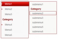
You, probably noticed that whenever you try to move your mouse over to sub menu it disappears. As we said the sub menu appears only when the parent list item is in hover state, which means that the mouse needs to be hovering either on the list item it self or on any content inside it which is considered a part from it. And since we set the sub menu position to be away from the parent list item we left a space that is considered not part of the list item which is highlighted with orange in the image below.
To fix this problem we will use a CSS pseudo selector ":before" on the sub menu <ul> element, we will style this selector to fill the space between the parent list item and the sub menu. Here’s the CSS code.
/* Before Second Level Unordered List Style */
ul.dark_menu li ul:before {
    content: " ";
    position: absolute;
    display: block;
    z-index: 1500;
    left: 0;
    top: -10px;
    height: 10px;
    width: 100%;
}
What we done here is set content to a character that is invisible when viewing a page in this case the space character, set position to absolute which will be relative to the sub menu <ul> element, display to block, and z-index to a positive integer value larger that the one we used for the <ul> element style, set position zero from left and -10px from top to place it right over the space, set height to 10px which is height of the space and finally set width to 100% so that the ":before" content fills all the sub menu width.
Now let’s add the style for the sub list items. Here’s the CSS code.
/* Second Level Menu List Items Style */
ul.dark_menu li ul li {
    float: none;
    margin: 0 10px;
    border-bottom: 1px solid #191614;
    border-top: 1px solid #3a3230;
}

/* First List Item in Second Level Menu Style */
ul.dark_menu li ul li:first-child {
    margin: 0 10px;
    border-top: 0 none;
}

/* Last List Item in Second Level Menu Style */
ul.dark_menu li ul li:last-child {
    border-bottom: 0 none;
}
We style the sub menu items with no floats, left and right margins of 10px and a top and bottom borders with different colors to create the separator between list items. Now using the CSS pseudo selector ":first-child" we add a left an right margin to override the zero margins we added for the parents list items ":first-child" style and remove top border. The ":last-child" selector is styled with no bottom border.
Now, you notice that the sub menu links still have the style from the first level menu links. So we need now to add the CSS styles for the sub menu links.
/* Second Level List Items Links Style */
ul.dark_menu li ul li a, ul.dark_menu li ul li a:link {
    color: #73635e;
    display: block;
    background: transparent none;
    padding: 10px 20px 10px 5px;
    white-space: nowrap;

    /* Text Shadow */
    text-shadow: 0 1px 2px #000;

    /* Box Shadows */
    -webkit-box-shadow: 0 0 0 rgba(0,0,0,0);
    -moz-box-shadow: 0 0 0 rgba(0,0,0,0);
    box-shadow: 0 0 0 rgba(0,0,0,0);

    /* Border Radius */
    -webkit-border-radius: 0px;
    -moz-border-radius: 0px;
    border-radius: 0px;
}

/* Second Level List Items Links Hover State Style */
ul.dark_menu li ul li a:hover {
    text-decoration: underline;
    background: #2a2523;
}
The normal link state is styled with text color of "#73635e", display set to block, background set to transparent and none to remove gradient background, top and bottom padding of 10px, right padding of 20px and left padding of 5px, white space is set to "nowrap" so that all the link text is displayed in a single line, added a black text shadow, removed all box shadows by resetting it to a transparent color using rgba(0,0,0,0.0) and finally set border radius to zero. The hover state is styled with underline text decoration and a slightly lighter background color.
Now if you followed the tutorial step by step correctly you should have a Pure CSS3 two level dark menu fully working. The menu have been tested to be working 100% on Firefox 4, Opera 11 and Chrome 11. It may work on other browsers or on older versions, so if you test it please let me know of the results.
The article source:http://www.ahmadhania.com/2011/06/dark-menu-pure-css3-two-level-menu-tutorial.html
You might also like


Tags
accordion accordion menu animation navigation animation navigation menu carousel checkbox inputs css3 css3 menu css3 navigation date picker dialog drag drop drop down menu drop down navigation menu elastic navigation form form validation gallery glide navigation horizontal navigation menu hover effect image gallery image hover image lightbox image scroller image slideshow multi-level navigation menus rating select dependent select list slide image slider menu stylish form table tabs text effect text scroller tooltips tree menu vertical navigation menu