 Subscribe
 Follow Us
Nice jQuery Sliding Image Gallery
 12 years ago
 24846
24846 3604
3604
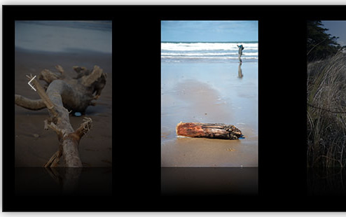
There are a lot of jQuery image galleries out there, some of which are quite lovely (Galleria springs to mind). However, I've yet to discover a really nice-looking, full-window sliding image gallery that is simple and elegant, and that also shows off the photos to good effect. So I decided to write one!
It looks best on WebKit browsers such as Safari and Chrome, but other modern browsers should work well too.
For best results, make your browser full-screen. Google Chrome gives the most immersive experience here — view the demo, then choose View > Enter Full Screen.
The gallery is simple to use. Click the left or right edge of the window to move around the pictures (or use the left and right arrow keys on your keyboard). Hover over the main image to view its caption.
I've also made the gallery work reasonably well on touch devices such as iPhones and iPads by adding touch and swipe events. (I haven't yet tested these on the Android browser so your mileage may vary there. Watch this space!)
So how do you make this gallery? In this tutorial I'll walk you through the process step-by-step, from creating the markup and CSS through to writing the JavaScript code to make the gallery function. If you'd rather just grab the code and get going, click the Download Code button above.
Step 1: Create the markup
First we need to create a webpage to hold our gallery's images, CSS and JavaScript. Here's the HTML for our gallery page's body element:
<body>
<button id="leftButton" onclick='moveLeft()'><</button>
<button id="rightButton" onclick='moveRight()'>></button>
<div id="galleryContainer">
<div id="gallery">
<img src="slides/BarbedWire.jpg" alt="Barbed Wire" />
<img src="slides/Feather.jpg" alt="Feather" />
<img src="slides/DriftStuff.jpg" alt="Drift Stuff" />
<img src="slides/Driftwood.jpg" alt="Driftwood" />
<img src="slides/DriftwoodGuy.jpg" alt="Driftwood and Guy" />
<img src="slides/GrassLight.jpg" alt="Grass and Light" />
<img src="slides/PebbleAndShells.jpg" alt="Pebble and Shells" />
<img src="slides/StickSea.jpg" alt="Stick and Sea" />
<img src="slides/SeaweedGasmask.jpg" alt="Seaweed Gasmask" />
<img src="slides/Surfers.jpg" alt="Surfers" />
</div>
<div id="caption">Photo Caption</div>
<div id="loading">Please wait...</div>
</div>
</body>
The markup contains:
-
2
buttonelements for the left & right buttons (leftButtonandrightButton).
We bind each button'sclickevent to a function that slides the gallery 1 image to the left or right (moveLeft()andmoveRight()respectively). Each button has an arrow (< or >) for a label. We'll use CSS later to style these buttons as large, transparent buttons that sit on the left and right sides of the gallery. -
A container for the gallery (
galleryContainer).
The sliding gallery sits inside thisdiv. -
The gallery itself (
gallery).
This is thedivthat contains the slide images. We will slide thisdivleft and right to show each photo. -
The slide images inside the
gallerydiv.
Each slide is simply animgtag containing the photo's URL, and somealttext which we'll display as a caption when the user hovers over the image. -
The photo caption container (
caption).
We'll position this just below the current gallery image. It will hold the caption text to display for the current image. -
The loading message (
loading).
Thisdivcontains the "Please wait.." text that will appear if the gallery images are taking a while to preload.
Step 2: Add the CSS
Now we'll add the CSS to our page to style the gallery. Here's the complete CSS:
<style>

body {
  margin: 0;
  padding: 0;
  background: #000;
  font-family: "Georgia", serif;
}


/*
  Container for the gallery:

  Absolutely positioned
  Stretch to fill the whole window width
  Fixed height
  Hide the overflow to prevent horizontal scrollbars

  Vertically centred in the viewport: http://css-discuss.incutio.com/wiki/Centering_Block_Element#Centering_an_absolutely_positioned_element
*/

#galleryContainer {
  width: 100%;
  height: 800px;        /* Image height + 200px */
  overflow: hidden;
  position: absolute;
  top: 0;
  bottom: 0;
  margin-top: auto;
  margin-bottom: auto;
  z-index: 1;
}


/*
  The gallery div that contains all the images

  We'll set the width dynamically in the JavaScript as the images load
*/

#gallery {
  width: 100px;
  height: 700px;        /* Image height + 100px */
  padding: 50px 0 50px 0;
  position: absolute;
  z-index: 1;
}


/*
  Individual slides within the gallery:

  Float them left so that they're all side by side
  Fixed height (the width will vary as required)
  Add some horizontal margin between the slides
  Add a bottom fading reflection for WebKit browsers
*/

#gallery img {
  float: left;
  height: 600px;
  margin: 0 100px;      /* Adjust the left/right margin to show greater or fewer slides at once */
  -webkit-box-reflect:
    below
    0
    -webkit-gradient(
      linear,
      left top,
      left bottom,
      color-stop(1, rgba(255, 255, 255, .5)),
      color-stop(.8, rgba(255, 255, 255, 0))
    );
}


/*
  Left and right buttons:

  Position them on the left and right sides of the gallery
  Stretch them to the height of the gallery
  Hide them by default
*/

#leftButton, #rightButton {
  position: absolute;
  z-index: 2;
  top: -100px;
  bottom: 0;
  padding: 0;
  margin: auto 0;
  width: 15%;
  height: 600px;        /* Image height */
  border: none;
  outline: none;
  color: #fff;
  background: transparent url(images/blank.gif);
  font-size: 100px;
  font-family: "Courier New", courier, fixed;
  opacity: 0;
  filter: alpha(opacity=0);
  -webkit-transition: opacity .5s;
  -moz-transition: opacity .5s;
  -o-transition: opacity .5s;
  transition: opacity .5s;
}

#leftButton {
  left: 0;
}

#rightButton {
  right: 0;
}

/* (Turn off dotted black outline on FF3) */

#leftButton::-moz-focus-inner, #rightButton::-moz-focus-inner {
  border: none;
}

/*
  Left and right button hover states:
  Fade them in to 50% opacity
*/

#leftButton:hover, #rightButton:hover {
  opacity: .5;
  filter: alpha(opacity=50);
  outline: none;
}


/*
  Image caption:

  Position just under the centre image
  Hide by default
*/

#caption {
  position: absolute;
  z-index: 2;
  bottom: 90px;
  width: 100%;
  color: #ffc;
  text-align: center;
  font-family: "Georgia", serif;
  font-size: 24px;
  letter-spacing: .1em;
  display: none;
}


/*
  Loading text:

  Position in the centre of the gallery container
  Hide by default
*/

#loading {
  position: absolute;
  z-index: 1;
  bottom: 50%;
  width: 100%;
  color: #ffc;
  text-align: center;
  font-family: "Georgia", serif;
  font-size: 36px;
  letter-spacing: .1em;
  opacity: 0;
  filter: alpha(opacity=0);
}

</style>


<!-- IE7 positions the buttons incorrectly; compensate -->

<!--[if lt IE 8]>
<style>
#leftButton, #rightButton {
  top: 50px;
}
</style>
<![endif]-->
Let's look at each rule in the CSS:
-
The page body
We remove all margin and padding on thebodyelement so that our gallery goes right to the edge of the window. We also give the body a black background and use Georgia for the font. -
The gallery container
#galleryContaineris thedivthat contains our sliding gallery. We stretch it across the width of the browser window and give it a height of 800 pixels — this should be 200 pixels more than the height of our image slides. We setoverflowtohiddenso that the slides outside the browser window don't create a horizontal scrollbar, and position the container in the vertical centre of the page. -
The gallery
#galleryis the sliding gallery itself. We give it an initial width of 100px (we'll adjust this later in the JavaScript), and a height of 700px — that is, 100px more than the height of the slide images. We also add some vertical padding to the gallery to position it nicely in the page. -
The slide images
#gallery imgselects the individual slide photos in the gallery. We float the images left so that they all sit side by side in a row; set the image height (600px); and add 100px of left and right margin to separate each slide. We also add a reflection effect below each image using the-webkit-box-reflectproperty (as you'd imagine, this only works in WebKit browsers such as Safari, Mobile Safari, and Chrome). We apply a semitransparent gradient mask to the reflection to fade the reflection towards the bottom.You can adjust the
marginproperty to suit. For example, change this value to0 50pxto put the images closer together. Or you could change it to0 1000pxto ensure that only 1 image is ever displayed onscreen at once. -
The left and right buttons
#leftButton&#rightButtonare the buttons on either side of the gallery. The user can click these buttons to slide left and right between the images.
We restyle thesebuttonelements quite drastically. We position them on the left and right sides of the page; give them az-indexof 2 so they sit above the gallery; centre them vertically in the page (moving them up 100 pixels to allow for the reflections below the images); and give them the same height as the images (600px).
We also turn off all borders and outlines that are usually applied to buttons, and give the buttons a white foreground colour and a transparent background. We set a large Courier font on the buttons so that the arrows (< and >) are large and nice-looking.
Finally, we make the buttons invisible by setting their opacity to zero, and add a :hover state to the buttons to bring up the opacity when the user moves the mouse over them. We use the transition property to fade the buttons in and out slowly over half a second.The
::-moz-focus-innerrules ensure that the outlines are properly turned off in Firefox 3. (Firefox 4 only requiresoutline: none.) -
The image caption
#captionis thedivcontaining the text caption that appears below the current slide image when the user hovers over the image. We position it 90px from the bottom of the gallery container, give it a tan colour, and centre it horizontally. We adjust the font size and letter spacing to make the text attractive, and hide the caption initially usingdisplay: none. -
The loading text
#loadingis the "Please wait..." text that appears if the slide images are taking a few seconds to preload. We position it in the centre of the window, and style and colour the text in a similar way to the image caption. We set its opacity to zero initially to hide it.
Internet Explorer 7 has a problem with vertically positioning the left and right buttons. We compensate for this by adding a conditional comment for IE7 to adjust the top property on the buttons.
I've also added CSS to style the "info" button and box in the bottom right-hand corner. Since this isn't part of the gallery we won't talk about it here.
Step 3: Include the JavaScript libraries
<script type="text/javascript" src="http://ajax.googleapis.com/ajax/libs/jquery/1.5.1/jquery.min.js"></script>
<script type="text/javascript" src="jquery.jswipe-0.1.2.js"></script>
I've used 2 JavaScript libraries for this gallery:
- jQuery (hosted on Google's CDN)
- jQuery Swipe, a jQuery plugin that we can use to detect swipe gestures on mobile devices. We'll use this to let users swipe left and right to move between the gallery images.
jQuery Swipe isn't available on a CDN, so you'll need to download it, then put the jquery.jswipe-0.1.2.js file in the same folder as your gallery page.
Step 4: Set up the configuration options
Our first chunk of JavaScript code creates some configuration settings, making it easy for us to adjust the look and feel of the gallery:
//  --- Begin Config ---
var preloadSlides = 3;                // Number of slides to preload before showing gallery
var loadingMessageDelay = 2000;       // How long to wait before showing loading message (in ms)
var loadingMessageSpeed = 1200;       // Duration of each pulse in/out of the loading message (in ms)
var loadingMessageMinOpacity = 0.4;   // Minimum opacity of the loading message
var loadingMessageMaxOpacity = 1;     // Maximum opacity of the loading message
var captionSpeed = 1200;              // Duration of the caption fade in/out (in ms)
var captionOpacity = 0.5;             // Maximum opacity of the caption when faded in
var swipeXThreshold = 30;             // X-axis minimum threshold for swipe action (in px)
var swipeYThreshold = 90;             // Y-axis maximum threshold for swipe action (in px)
var leftKeyCode = 37;                 // Character code for "move left" key (default: left arrow)
var rightKeyCode = 39;                // Character code for "move right" key (default: right arrow)
var currentSlideOpacity = 1.0;        // Opacity of the current (centre) slide
var backgroundSlideOpacity = 0.5;     // Opacity of the slides either side of the current slide
//  --- End Config ---
Read more:http://www.elated.com/articles/elegant-sliding-image-gallery-with-jquery/
You might also like


Tags
accordion accordion menu animation navigation animation navigation menu carousel checkbox inputs css3 css3 menu css3 navigation date picker dialog drag drop drop down menu drop down navigation menu elastic navigation form form validation gallery glide navigation horizontal navigation menu hover effect image gallery image hover image lightbox image scroller image slideshow multi-level navigation menus rating select dependent select list slide image slider menu stylish form table tabs text effect text scroller tooltips tree menu vertical navigation menu