 Subscribe
 Follow Us
Good Tabbed Slider with jQuery
 12 years ago
 34789
34789 9098
9098
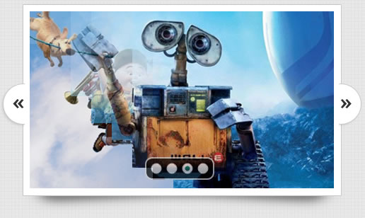
this demo as a “standalone” slider – meaning it’ll essentially be the only element on the page that we create… but using just a few extra steps after the fact, you should be able to add this to your own designs and position/resize it any way that you want!
we’re simply going to attempt to get an idea for how the Nivo Slider works. Every slider out there is going to work a little bit different, so it’s worth taking a few minutes to familiarize yourself with the particular script that you intend to use on a project.
If you take a quick look at the code for the Nivo Slider (inside the demo.html file), you’ll notice that all of the major styling and structure is being handled from the “style.css” file. In fact, the actual HTML code is pretty simple once you’ve referenced the appropriate scripts in the HEAD section of demo.html.
Let’s start our walkthrough by looking at the lines of code from the header. We won’t need to change these, but they need to be present in any file that we want to use the slider on:
<!-- Usually in the <head> section -->
<link rel="stylesheet" href="nivo-slider.css" type="text/css" media="screen" />
<script src="http://ajax.googleapis.com/ajax/libs/jquery/1.4.2/jquery.min.js"></script>
<script src="jquery.nivo.slider.pack.js"></script>
Next, let’s peek at the raw HTML that generates the slider:
<!-- Then somewhere in the <body> section -->
<div id="slider">
    <img src="images/slide1.jpg" alt="" />
    <a href="http://dev7studios.com">
    	<img src="images/slide2.jpg" alt="" title="#htmlcaption" />
    </a>
    <img src="images/slide3.jpg" alt="" title="This is an example of a caption" />
    <img src="images/slide4.jpg" alt="" />
</div>
Finally, we won’t be dealing with captions in this particular slider, so you can pretty much disregard the next lines (unless you want to do your own customization of the slider later on):
<div id="htmlcaption" class="nivo-html-caption">
    <strong>This</strong> is an example of a <em>HTML</em> caption with <a href="#">a link</a>.
</div>
So, really, all that’s required for you to understand is the basic HTML that generates the slider (shown above in the second block of code). Since we won’t be dealing with captions in our slider, you can further simplify the code to something like this:
<div id="slider-wrapper">
    <div id="slider">
        <img src="images/slide1.jpg" alt="" />
        <img src="images/slide2.jpg" alt="" />
        <img src="images/slide3.jpg" alt="" />
        <img src="images/slide4.jpg" alt="" />
    </div>
</div>
That’s not so bad right? It’s essentially just a couple wrapped DIV elements with images inside.
The CSS for the Nivo Slider
The CSS is what’s going to be doing the heavy lifting, so let’s take a peek at that:
/*============================*/
/*=== Custom Slider Styles ===*/
/*============================*/
#slider-wrapper {
    background:url(images/slider.png) no-repeat;
    width:998px;
    height:392px;
    margin:0 auto;
    padding-top:74px;
    margin-top:50px;
}

#slider {
	position:relative;
    width:618px;
    height:246px;
    margin-left:190px;
	background:url(images/loading.gif) no-repeat 50% 50%;
}
#slider img {
	position:absolute;
	top:0px;
	left:0px;
	display:none;
}
#slider a {
	border:0;
	display:block;
}

.nivo-controlNav {
	position:absolute;
	left:260px;
	bottom:-42px;
}
.nivo-controlNav a {
	display:block;
	width:22px;
	height:22px;
	background:url(images/bullets.png) no-repeat;
	text-indent:-9999px;
	border:0;
	margin-right:3px;
	float:left;
}
.nivo-controlNav a.active {
	background-position:0 -22px;
}

.nivo-directionNav a {
	display:block;
	width:30px;
	height:30px;
	background:url(images/arrows.png) no-repeat;
	text-indent:-9999px;
	border:0;
}
a.nivo-nextNav {
	background-position:-30px 0;
	right:15px;
}
a.nivo-prevNav {
	left:15px;
}

.nivo-caption {
    text-shadow:none;
    font-family: Helvetica, Arial, sans-serif;
}
.nivo-caption a {
    color:#efe9d1;
    text-decoration:underline;
}
If you’re new to CSS, this might look intimidating at first… but most of you will see this for a fairly simple bit of styling code. Everything you need to resize and reskin the slider is here… and we only need to change a handful of lines of script to get this thing looking exactly like our version.
First though, we need to locate and re-skin the images that are currently being used for the slider with our own. If you open up the “/demo/images/” folder, you’ll see there’s just a couple main images that we want to reskin:
- arrows.png (the Left / Right arrows)
- bullets.png (the Dot indicators)
- slider.png (the background frame)
- background.png (optional)
- loading.png (optional)
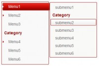
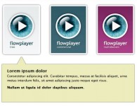
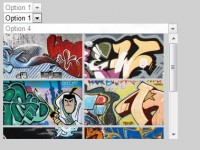
You might also like

Tags
accordion accordion menu animation navigation animation navigation menu carousel checkbox inputs css3 css3 menu css3 navigation date picker dialog drag drop drop down menu drop down navigation menu elastic navigation form form validation gallery glide navigation horizontal navigation menu hover effect image gallery image hover image lightbox image scroller image slideshow multi-level navigation menus rating select dependent select list slide image slider menu stylish form table tabs text effect text scroller tooltips tree menu vertical navigation menu