 Subscribe
 Follow Us
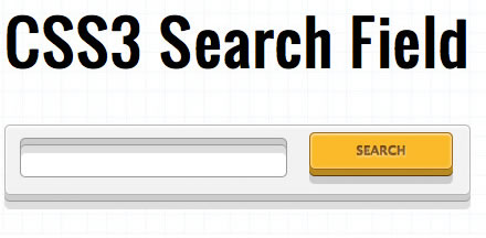
Stylish Rocking CSS3 Search Field
 12 years ago
 15303
15303 2681
2681
CSS3 is the next generation style sheet language. It introduces a lot of new and exciting features like shadows, animations, transitions, border-radius etc. Although the specifications have not been finalized yet, many browser manufacturers have already started supporting many of the new features.
we will explore some of these features like text-shadow, border-radius, box-shadows and transitions to create a rocking search field.
1. HTML5 Doctype
We’ll start with the HTML markup. It is very simple, after the <!DOCTYPE html> HTML5 doctype and the <head> declaration, we have a <section> with an ID called #wrapper inside <body>. This is done simply to define the width of the content box and to align it to the centre of the page.
This is followed by a <div> with an ID called #main. This ID contains the styles that define the big white box around the input field and the search button. This <div> has a <form> declared inside it. The form has the text input field and the search button. Here is how the form looks like without any styles applied to it:
Here’s how the code looks like:
<!DOCTYPE html>
<html>
<head>
	<title>CSS3 Search Field</title>
</head>
<body>
	<section id="wrapper">
		<h1>CSS3 Search Field</h1>
		<div id="main">
			<form>
				<input type="text" id="search">
				<input type="submit" class="solid" value="Search">
			</form>
		</div><!--main-->
	</section><!--wrapper-->
</body>
</html>
2. Creating the bounding box
To create the big box around the form, we will add styles to the <div> with the ID of #main. From the code shown below, you will notice that the box has been given a width of 400px and a height of 50px.
#main {
	width: 400px;
	height: 50px;
	background: #f2f2f2;
	padding: 6px 10px;
	border: 1px solid #b5b5b5;

	-moz-border-radius: 5px;
	-webkit-border-radius: 5px;
	border-radius: 5px;
	-moz-box-shadow: inset 0 0 3px rgba(255, 255, 255, 0.8), inset 0 2px 2px rgba(255, 255, 255, 1), 0 5px 0 #ccc, 0 6px 0 #989898, 0 13px 0 #dfdede;
	-webkit-box-shadow: inset 0 0 3px rgba(255, 255, 255, 0.8), inset 0 2px 2px rgba(255, 255, 255, 1), 0 5px 0 #ccc, 0 6px 0 #989898, 0 13px 0 #dfdede;
	box-shadow: inset 0 0 3px rgba(255, 255, 255, 0.8), inset 0 2px 2px rgba(255, 255, 255, 1), 0 5px 0 #ccc, 0 6px 0 #989898, 0 13px 0 #dfdede;
}
The important piece of code here is the border-radius declaration and the box-shadow declaration. For creating rounded corners, we have used the CSS3 border-radius declaration, "-moz-" and "-webkit-" browser prefixes have been used to ensure that this works in gecko and webkit based browsers. The box shadow declarations might look a bit confusing but it is actually very simple.
box-shadow: inset 0 0 3px rgba(255, 255, 255, 0.8), inset 0 2px 2px rgba(255, 255, 255, 1), 0 5px 0 #ccc, 0 6px 0 #989898, 0 13px 0 #dfdede;
Explanation: Here, the keyword inset specifies if the shadow will be inside the box. The first two zero’s indicate the x-offset and the y-offset and the 3px indicates the blur. Next is the color declaration. I have used rgba values here; rgba stands for red green blue and alpha (opacity). Thus the 4 values inside the parenthesis indicate the amount of red, green, blue and its alpha (opacity). You will notice that 5 sets of shadow declarations have been clubbed together. This can be done by separating them with a comma. The first two shadows define the white "inner glow" effect and the next there declarations gives the box its solid/chunky look.
3. Styling the input field
Now that the box is complete, lets move on to styling the input field.
input[type="text"] {
	float: left;
	width: 230px;
	padding: 15px 5px 5px 5px;
	margin-top: 5px;
	margin-left: 3px;
	border: 1px solid #999999;

	-moz-border-radius: 5px;
	-webkit-border-radius: 5px;
	border-radius: 5px;

	-moz-box-shadow: inset 0 5px 0 #ccc, inset 0 6px 0 #989898, inset 0 13px 0 #dfdede;
	-webkit-box-shadow: inset 0 5px 0 #ccc, inset 0 6px 0 #989898, inset 0 13px 0 #dfdede;
	box-shadow: inset 0 5px 0 #ccc, inset 0 6px 0 #989898, inset 0 13px 0 #dfdede;
}
The styles declared for the input field are pretty similar to those decared for the big box #main. We have used the same border radius (5px). Again, multiple box-shadows have been clubbed.
box-shadow: inset 0 5px 0 #ccc, inset 0 6px 0 #989898, inset 0 13px 0 #dfdede;
Explanation: You will notice that this time, the shadow blur has been kept at 0 to obtain a sharp shadow and a vertical offset of 5px is used. In the successive declarations, the blur has been kept at 0px but the color and the y-offset have been changed. Again, play around with these values to obtain different results.
4. Styling the submit button
Let’s style the search button.
input[type="submit"].solid {
	float: left;
	cursor: pointer;
	width: 130px;
	padding: 8px 6px;
	margin-left: 20px;
	background-color: #f8b838;
	color: rgba(134, 79, 11, 0.8);
	text-transform: uppercase;
	<a href="#" style="" target="_blank" rel="nofollow" onmouseover="self.status='#;" onmouseout="self.status=''">font</a>-weight: bold;
	border: 1px solid #99631d;

	-moz-border-radius: 5px;
	-webkit-border-radius: 5px;
	border-radius: 5px;

	text-shadow: 0 1px 2px rgba(255, 255, 255, 0.7), 0 -1px 0 rgba(64, 38, 5, 0.9);

	-moz-box-shadow: inset 0 0 3px rgba(255, 255, 255, 0.6), inset 0 1px 2px rgba(255, 255, 255, 0.7), 0 5px 0 #b8882a, 0 6px 0 #593a11, 0 13px 0 #ccc;
	-webkit-box-shadow: inset 0 0 3px rgba(255, 255, 255, 0.6), inset 0 1px 2px rgba(255, 255, 255, 0.7), 0 5px 0 #b8882a, 0 6px 0 #593a11, 0 13px 0 #ccc;
	box-shadow: inset 0 0 3px rgba(255, 255, 255, 0.6), inset 0 1px 2px rgba(255, 255, 255, 0.7), 0 5px 0 #b8882a, 0 6px 0 #593a11, 0 13px 0 #ccc;
	-webkit-transition: background 0.2s ease-out;
}
Apart from the colors, the search button has mostly the same styles as that of the outer box. Similar border-radius and box-shadows have been used on the button. The new feature introduced is the text-shadow.
text-shadow: 0 1px 2px rgba(255, 255, 255, 0.7), 0 -1px 0 rgba(64, 38, 5, 0.9);
Explanation: In the text-shadow declaration, the first three numeric values are the x-offset, y-offset and the blur respectively. The rgba values indicate the shadow color. In the next set of declaration (separated by a comma), the y-offset is given a value of -1. This is done to give the text an “inner shadow” effect.
The hover/focus state of the submit button has different values of background color and shadows.
"Active" state for button
The active state of the button has a bit more changes. In this, I have given the button a position of absolute and a ‘top’ value of 5px. This has been done to give it a more natural look, such that it feel that the button has actually been pushed down by 5 pixels. Other changes to the active state are that of background-color and shadows. Notice that I have reduced the y-offset of the shadows to give it a ‘pressed-down’ look. Here is the code for the active state of the submit button:
input[type="submit"].solid:active {
	background: #f6a000;
	position: relative;
	top: 5px;
	border: 1px solid #702d00;

	-moz-box-shadow: inset 0 0 3px rgba(255, 255, 255, 0.6), inset 0 1px 2px rgba(255, 255, 255, 0.7), 0 3px 0 #b8882a, 0 4px 0 #593a11, 0 8px 0 #ccc;
	-webkit-box-shadow: inset 0 0 3px rgba(255, 255, 255, 0.6), inset 0 1px 2px rgba(255, 255, 255, 0.7), 0 3px 0 #b8882a, 0 4px 0 #593a11, 0 8px 0 #ccc;
	box-shadow: inset 0 0 3px rgba(255, 255, 255, 0.6), inset 0 1px 2px rgba(255, 255, 255, 0.7), 0 3px 0 #b8882a, 0 4px 0 #593a11, 0 8px 0 #ccc;
}
The Complete (CSS) Code
This completes our search field. We have used quite a few of the new CSS3 features. Here is the complete CSS and HTML of this search field.
#main {
	width: 400px;
	height: 50px;
	background: #f2f2f2;
	padding: 6px 10px;
	border: 1px solid #b5b5b5;

	-moz-border-radius: 5px;
	-webkit-border-radius: 5px;
	border-radius: 5px;

	-moz-box-shadow: inset 0 0 3px rgba(255, 255, 255, 0.8), inset 0 2px 2px rgba(255, 255, 255, 1), 0 5px 0 #ccc, 0 6px 0 #989898, 0 13px 0 #dfdede;
	-webkit-box-shadow: inset 0 0 3px rgba(255, 255, 255, 0.8), inset 0 2px 2px rgba(255, 255, 255, 1), 0 5px 0 #ccc, 0 6px 0 #989898, 0 13px 0 #dfdede;
	box-shadow: inset 0 0 3px rgba(255, 255, 255, 0.8), inset 0 2px 2px rgba(255, 255, 255, 1), 0 5px 0 #ccc, 0 6px 0 #989898, 0 13px 0 #dfdede;
}

input[type="text"] {
	float: left;
	width: 230px;
	padding: 15px 5px 5px 5px;
	margin-top: 5px;
	margin-left: 3px;
	border: 1px solid #999999;

	-moz-border-radius: 5px;
	-webkit-border-radius: 5px;
	border-radius: 5px;

	-moz-box-shadow: inset 0 5px 0 #ccc, inset 0 6px 0 #989898, inset 0 13px 0 #dfdede;
	-webkit-box-shadow: inset 0 5px 0 #ccc, inset 0 6px 0 #989898, inset 0 13px 0 #dfdede;
	box-shadow: inset 0 5px 0 #ccc, inset 0 6px 0 #989898, inset 0 13px 0 #dfdede;
}

input[type="submit"].solid {
	float: left;
	cursor: pointer;
	width: 130px;
	padding: 8px 6px;
	margin-left: 20px;
	background-color: #f8b838;
	color: rgba(134, 79, 11, 0.8);
	text-transform: uppercase;
	<a href="http://www.hongkiat.com/blog/out/fonts" style="" target="_blank" rel="nofollow" onmouseover="self.status='http://www.hongkiat.com/blog/out/fonts';return true;" onmouseout="self.status=''">font</a>-weight: bold;
	border: 1px solid #99631d;

	-moz-border-radius: 5px;
	-webkit-border-radius: 5px;
	border-radius: 5px;

	text-shadow: 0 1px 2px rgba(255, 255, 255, 0.7), 0 -1px 0 rgba(64, 38, 5, 0.9);

	-moz-box-shadow: inset 0 0 3px rgba(255, 255, 255, 0.6), inset 0 1px 2px rgba(255, 255, 255, 0.7), 0 5px 0 #b8882a, 0 6px 0 #593a11, 0 13px 0 #ccc;
	-webkit-box-shadow: inset 0 0 3px rgba(255, 255, 255, 0.6), inset 0 1px 2px rgba(255, 255, 255, 0.7), 0 5px 0 #b8882a, 0 6px 0 #593a11, 0 13px 0 #ccc;
	box-shadow: inset 0 0 3px rgba(255, 255, 255, 0.6), inset 0 1px 2px rgba(255, 255, 255, 0.7), 0 5px 0 #b8882a, 0 6px 0 #593a11, 0 13px 0 #ccc;

	-webkit-transition: background 0.2s ease-out;
}

input[type="submit"].solid:hover, input[type="submit"].solid:focus {
	background: #ffd842;

	-moz-box-shadow: inset 0 0 3px rgba(255, 255, 255, 0.9), inset 0 2px 1px rgba(255, 250, 76, 0.8), 0 5px 0 #d8a031, 0 6px 0 #593a11, 0 13px 0 #ccc;
	-webkit-box-shadow: inset 0 0 3px rgba(255, 255, 255, 0.9), inset 0 2px 1px rgba(255, 250, 76, 0.8), 0 5px 0 #d8a031, 0 6px 0 #593a11, 0 13px 0 #ccc;
	box-shadow: inset 0 0 3px rgba(255, 255, 255, 0.9), inset 0 2px 1px rgba(255, 250, 76, 0.8), 0 5px 0 #d8a031, 0 6px 0 #593a11, 0 13px 0 #ccc;
}

input[type="submit"].solid:active {
	background: #f6a000;
	position: relative;
	top: 5px;
	border: 1px solid #702d00;

	-moz-box-shadow: inset 0 0 3px rgba(255, 255, 255, 0.6), inset 0 1px 2px rgba(255, 255, 255, 0.7), 0 3px 0 #b8882a, 0 4px 0 #593a11, 0 8px 0 #ccc;
	-webkit-box-shadow: inset 0 0 3px rgba(255, 255, 255, 0.6), inset 0 1px 2px rgba(255, 255, 255, 0.7), 0 3px 0 #b8882a, 0 4px 0 #593a11, 0 8px 0 #ccc;
	box-shadow: inset 0 0 3px rgba(255, 255, 255, 0.6), inset 0 1px 2px rgba(255, 255, 255, 0.7), 0 3px 0 #b8882a, 0 4px 0 #593a11, 0 8px 0 #ccc;
}
The a
You might also like
Tags
accordion accordion menu animation navigation animation navigation menu carousel checkbox inputs css3 css3 menu css3 navigation date picker dialog drag drop drop down menu drop down navigation menu elastic navigation form form validation gallery glide navigation horizontal navigation menu hover effect image gallery image hover image lightbox image scroller image slideshow multi-level navigation menus rating select dependent select list slide image slider menu stylish form table tabs text effect text scroller tooltips tree menu vertical navigation menu