 Subscribe
 Follow Us
Nice CSS3 beveled corners tabs
 11 years ago
 22481
22481 6603
6603
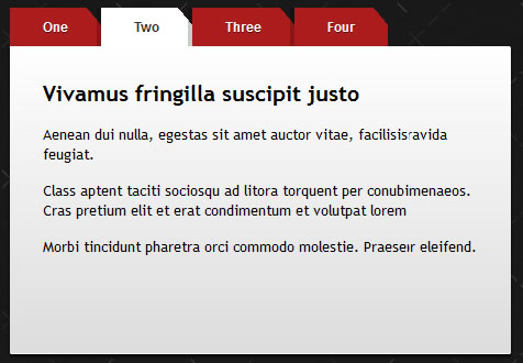
We’ll shoe you how to create some good looking CSS3 tabs with beveled corners. We’ll do that using a clever CSS3 gradients technique.
The idea
A while ago I read this wonderful article by Lea Verou about how to create beveled corners using CSS3 gradients. I found that very clever and we will use that technique in order to create our tabs.
The HTML
The purpose here, as usual, is to write clean and semantic markup: unordered list for the tabbed navigation and simple div‘s for wrapping content.
So, check the HTML below:
<ul id="tabs">
    <li><a href="#" title="tab1">One</a></li>
    <li><a href="#" title="tab2">Two</a></li>
    <li><a href="#" title="tab3">Three</a></li>
    <li><a href="#" title="tab4">Four</a></li>
</ul>

<div id="content">
    <div id="tab1">One - content</div>
    <div id="tab2">Two - content</div>
    <div id="tab3">Three - content</div>
    <div id="tab4">Four - content</div>
</div>
The CSS
Minimal and easy to update styles, also no images were used here:
#tabs
{
  overflow: auto;
  width: 100%;
  list-style: none;
  margin: 0;
  padding: 0;
}

#tabs li
{
    margin: 0;
    padding: 0;
    float: left;
}

#tabs a
{
    -moz-box-shadow: -4px 0 0 rgba(0, 0, 0, .2);
    -webkit-box-shadow: -4px 0 0 rgba(0, 0, 0, .2);
    box-shadow: -4px 0 0 rgba(0, 0, 0, .2);
    background: #ad1c1c;
    background:    -moz-linear-gradient(220deg, transparent 10px, #ad1c1c 10px);
    background:    -webkit-linear-gradient(220deg, transparent 10px, #ad1c1c 10px);
    background:     -ms-linear-gradient(220deg, transparent 10px, #ad1c1c 10px);
    background:      -o-linear-gradient(220deg, transparent 10px, #ad1c1c 10px);
    background:         linear-gradient(220deg, transparent 10px, #ad1c1c 10px);
    text-shadow: 0 1px 0 rgba(0,0,0,.5);
    color: #fff;
    float: left;
    font: bold 12px/35px 'Lucida sans', Arial, Helvetica;
    height: 35px;
    padding: 0 30px;
    text-decoration: none;
}

#tabs a:hover
{
    background: #c93434;
    background:    -moz-linear-gradient(220deg, transparent 10px, #c93434 10px);
    background:    -webkit-linear-gradient(220deg, transparent 10px, #c93434 10px);
    background:     -ms-linear-gradient(220deg, transparent 10px, #c93434 10px);
    background:      -o-linear-gradient(220deg, transparent 10px, #c93434 10px);
    background:         linear-gradient(220deg, transparent 10px, #c93434 10px);
}

#tabs a:focus
{
    outline: 0;
}

#tabs #current a
{
    background: #fff;
    background:    -moz-linear-gradient(220deg, transparent 10px, #fff 10px);
    background:    -webkit-linear-gradient(220deg, transparent 10px, #fff 10px);
    background:     -ms-linear-gradient(220deg, transparent 10px, #fff 10px);
    background:      -o-linear-gradient(220deg, transparent 10px, #fff 10px);
    background:         linear-gradient(220deg, transparent 10px, #fff 10px);
    text-shadow: none;
    color: #333;
}

#content
{
    background-color: #fff;
    background-image: -webkit-gradient(linear, left top, left bottom, from(#fff), to(#ddd));
    background-image: -webkit-linear-gradient(top, #fff, #ddd);
    background-image:    -moz-linear-gradient(top, #fff, #ddd);
    background-image:     -ms-linear-gradient(top, #fff, #ddd);
    background-image:      -o-linear-gradient(top, #fff, #ddd);
    background-image:         linear-gradient(top, #fff, #ddd);
    -moz-border-radius: 0 2px 2px 2px;
    -webkit-border-radius: 0 2px 2px 2px;
    border-radius: 0 2px 2px 2px;
    -moz-box-shadow: 0 2px 2px #000, 0 -1px 0 #fff inset;
    -webkit-box-shadow: 0 2px 2px #000, 0 -1px 0 #fff inset;
    box-shadow: 0 2px 2px #000, 0 -1px 0 #fff inset;
    padding: 30px;
}

/* Remove the rule below if you want the content to be "organic" */
#content div
{
    height: 220px;
}
Read more:http://www.red-team-design.com/css3-tabs-with-beveled-corners
You might also like
Tags
accordion accordion menu animation navigation animation navigation menu carousel checkbox inputs css3 css3 menu css3 navigation date picker dialog drag drop drop down menu drop down navigation menu elastic navigation form form validation gallery glide navigation horizontal navigation menu hover effect image gallery image hover image lightbox image scroller image slideshow multi-level navigation menus rating select dependent select list slide image slider menu stylish form table tabs text effect text scroller tooltips tree menu vertical navigation menu