 Subscribe
 Follow Us
a Content Slider with jQuery
 13 years ago
  12724
12724  2841
2841
 n/a
n/a
Let’s start with the HTML we’ll base our jQuery around. We’ll start with a <div> to hold
the content slider, which we’ll give a class attribute of “contentslider”. Inside that, we need
two more <div> elements with class “cs_wrapper” and
“cs_slider”—these will hold all of the entries and allow for the content to move
left and right.
<div id="contentslider">
 <div class="cs_wrapper">
  <div class="cs_slider">

  <!-- Content goes here -->

  </div><!-- End cs_slider -->
 </div><!-- End cs_wrapper -->
</div><!-- End contentslider -->
To hold our article entries, we create another <div> element with class “cs_article”.
Inside each instance of cs_article, we’ll have a heading, an image, and a description, along with a link to read
the full entry. When all is said and done, each entry looks like this:
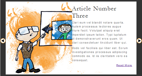
<div class="cs_article">
 <h2> <a href="#">Article Number One</a> </h2>
 <a href="#">
  <img src="images/article01.jpg"
   alt="Artist's interpretation of article headline" />
 </a>
 <p>
  Hendrerit tincidunt vero vel eorum claritatem. Soluta
  legunt quod qui dolore typi. Vel dolore soluta qui odio
  non. Sollemnes minim eorum feugiat nihil nobis. Gothica
  dolor in legentis nihil quinta.
 </p>
 <p>
  Iriure parum autem putamus lectores duis. Quam sit quis
  me me zzril. Facer etiam in lectores hendrerit etiam.
  Exerci lorem liber tincidunt nostrud decima. Mutationem
  est zzril ipsum facer nobis.
 </p>
 <a href="#" class="readmore">Read More</a>
</div><!-- End cs_article -->
Using this format, we’re able to add as many entries to the slider as we feel necessary.
To get our slider to function properly, we have to apply some styles to it. We’re going to use
a non-standard format in order to make customizing the CSS as easy as possible. Because the
JavaScript we’re going to write will control some of the styles, we’re going to split our CSS
into two sections: editable styles and non-editable styles.
First, let’s define our non-editable styles:
.contentslider {
  position:relative;
  display:block;
  width:900px;
  height:400px;
  margin:0 auto;
  overflow:hidden;
}
.cs_wrapper {
  position:relative;
  display:block;
  width:100%;
  height:100%;
  margin:0;
  padding:0;
  overflow:hidden;
}
.cs_slider {
  position:absolute;
  width:10000px;
  height:100%;
  margin:0;
  padding:0;
}
.cs_article {
  float:left;
  position:relative;
  top:0;
  left:0;
  display:block;
  width:900px;
  height:400px;
  margin:0 auto;
  padding:0;
}
Above, we define the default size of the content slider and center it. Then, we
hide any overflow of the “cs_wrapper” and stretch the “cs_slider horizontally
to contain all of the entries. Finally, we set the “cs_article” class to float
left, allowing them to tile horizontally.
With the container elements set up properly, we can now style the inside of the
article container. We need to set up styles for our headline, image, description,
and “Read More” link.
.cs_article h2 {
  display:block;
  width:26%;
  margin:10px 26px 5px 67%;
  text-align:left;
}
.cs_article img {
  position:absolute;
  top:0;
  left:0;
  width:66%;
  border:0;
  -ms-interpolation-mode:bicubic;
}
.cs_article p {
  display:block;
  width:26%;
  margin:0 26px 5px 67%;
  padding:0;
  border:0;
}
.cs_article .readmore {
  display:block;
  width:26%;
  margin:0 26px 0 67%;
  text-align:right;
}
Notice that width is defined with percentages, as is the right margin.
By doing so, we allow for the container to resize without losing the proportions
of our styles.
To round out our non-editable styles, we’ll define our buttons:
.cs_leftBtn, .cs_rightBtn {
  position:absolute;
  top:0;
  height:400px;
  padding:10px 0;
  z-index:10000;
}
.cs_leftBtn {
  left:0;
  outline:0;
}
.cs_rightBtn {
  right:0;
  outline:0;
}
.cs_leftBtn img, .cs_rightBtn img {
  border:0;
  position:relative;
  top:200px;
  margin:0;
}
We set the z-index of the buttons to 10000 to prevent them from sitting
under the article previews, and then we remove the outline from clicked links.
To reduce the amount of markup necessary to achieve our desired effects, note
that we’ve declared our <a> tag as a block-level element.
Our editable styles are all fairly simple, and deal mostly with the colors and
fonts of our display.
.contentslider {
  padding:10px; /* This acts as a border for the content slider */
  background:#333; /* This is the color of said border */
}
.cs_wrapper, .cs_article {
  background:#FFF; /* Background color for the entries */
}
.cs_leftBtn, .cs_rightBtn {
  width:30px; /* Should be as wide as the button graphic being used */
  background:#333; /* This will probably match the contentslider bg color */
}

.cs_article h2 {
  font-size:200%;
  line-height:1.125em;
}
  .cs_article h2 a {
    color:#333;
    text-decoration:none;
  }
.cs_article p {
  font-size:85%;
  line-height:1.5em;
  color:#777;
}
.cs_article .readmore {
  font-size:80%;
}
As indicated by the comments above, we’re using the padding on contentslider
as a border. This made more sense when considering the absolute positioning of
the buttons, because otherwise negative values would have been necessary, and that
complicates things unnecessarily.
Any properties can be added above, but keep in mind that box model tweaks may be
overwritten by the non-editable CSS (located lower in the stylesheet) or by the
jQuery plugin.
With our styles in place, the markup should look a little more presentable. Also,
because the buttons are added by the jQuery plugin, the slider degrades gracefully,
becoming a display box for just the first article.
With the slider styled and marked up properly, we can start adding jQuery effects!
(function($) {
 $.fn.ContentSlider = function(options)
 {
  var defaults = {
    leftBtn : 'images/cs_leftImg.jpg',
    rightBtn : 'images/cs_rightImg.jpg',
    width : '900px',
    height : '400px',
    speed : 400,
    easing : 'easeOutQuad',
    textResize : false,
    IE_h2 : '26px',
    IE_p : '11px'
  }

  // Declare variables here

  // Process the content slider here

})(jQuery)
Our first task is to set up the plugin and declare default values. For this
plugin, we’ll allow the user to customize the images used for the buttons, the
width and height of the content slider, the animation speed, the easing formula,
whether or not the text will be resized by the plugin, and, because Internet
Explorer doesn’t seem to play nice with font-size, IE-specific font
sizes for the article heading and description.
Next we have to extend the default values with those supplied by the user, and
then we declare a handful of variables that will be used by the plugin:
var defaultWidth = defaults.width;
var o = $.extend(defaults, options); // Extend the defaults with user-defined values
var w = parseInt(o.width); // Removes the 'px' from the width option
var n = this.children('.cs_wrapper').children('.cs_slider').children('.cs_article').length;
var x = -1*w*n+w; // Minimum left value
var p = parseInt(o.width)/parseInt(defaultWidth); // Percentage of default size
var thisInstance = this.attr('id'); // The id of the content slider
var inuse = false; // Prevents colliding animations
The variables declared above may not make much sense right now, but we’ll get
to them in just a second.
Our next step is to cycle through all matched elements and make our content slider
interactive. We do this using the .each() method. First, we set the
width and height of the content slider and add the buttons:
return this.each(function() {
  $(this)
    // Set the width and height of the div to the defined size
    .css({
      width:o.width,
      height:o.height
    })
    // Add the buttons to move left and right
    .prepend('<a href="#" class="cs_leftBtn"><img src="'+o.leftBtn+'" /></a>')
    .append('<a href="#" class="cs_rightBtn"><img src="'+o.rightBtn+'" /></a>')
Next, we need to set the article div to be the same size as the content slider.
// Dig down to the article div elements
.find('.cs_article')
  // Set the width and height of the div to the defined size
  .css({
    width:o.width,
    height:o.height
  })
  .end()
Finally, we set the opacity of the left button to zero, then hide the right
button and animate its entrance for a little bit of added style.
// Animate the entrance of the buttons
.find('.cs_leftBtn')
  .css('opacity','0')
  .end()
.find('.cs_rightBtn')
  .hide()
  .animate({ 'width':'show' });
With our buttons in place and the content slider properly sized, we now need
to resize the text (if the textResize flag is set to true).
First, we determine the current size of the text in the content slider and
store it in variables (h2FontSize and pFontSize)—or,
in the case of Internet Explorer, we just set the variables based on the
options passed at the creation of the plugin—and then set the new
size based on the product of our variables and the p variable set
above, which is the size in percent of the content slider after being resized.
      // Resize the font to match the bounding box
if(o.textResize===true) {
  var h2FontSize = $(this).find('h2').css('font-size');
  var pFontSize = $(this).find('p').css('font-size');
  $.each(jQuery.browser, function(i) {
    if($.browser.msie) {
       h2FontSize = o.IE_h2;
       pFontSize = o.IE_p;
    }
  });
  $(this).find('h2').css({ 'font-size' : parseFloat(h2FontSize)*p+'px', 'margin-left' : '66%' });
  $(this).find('p').css({ 'font-size' : parseFloat(pFontSize)*p+'px', 'margin-left' : '66%' });
  $(this).find('.readmore').css({ 'font-size' : parseFloat(pFontSize)*p+'px', 'margin-left' : '66%' });
}
Next, we have to tell the buttons what to do when they’re pressed. To keep
the code as concise as possible, we’re going to move the slider with a
function called moveSlider.
First, we store the button in a variable, and then bind an event to it that
fires on the “click” event. The click will set the inuse variable to
true, which will prevent multiple clicks from causing erratic behavior in the
slider, then fires the moveSlider function.
We repeat this for the right button, and finally run a quick function to
vertically center the buttons. Then we close our .each() call.
     // Store a copy of the button in a variable to pass to moveSlider()
  var leftBtn = $(this).children('.cs_leftBtn');
  leftBtn.bind('click', function() {
    if(inuse===false) {
      inuse = true;
      moveSlider('right', leftBtn);
    }
    return false; // Keep the link from firing
  });

  // Store a copy of the button in a variable to pass to moveSlider()
  var rightBtn = $(this).children('.cs_rightBtn');
  rightBtn.bind('click', function() {
    if(inuse===false) {
      inuse=true;
      moveSlider('left', rightBtn);
    }
    return false; // Keep the link from firing
  });

  vCenterBtns($(this)); // This is a CSS fix function.
});
We now need to define the moveSlider function.
First, we determine the current left value of the “cs_slider” div,
setting it to zero if no value is currently set. Next, we determine how far the
div needs to move by either adding or subtracting the width of the content
slider, depending on which direction we’re moving.
function moveSlider(d, b)
{
  var l = parseInt(b.siblings('.cs_wrapper').children('.cs_slider').css('left'));
  if(isNaN(l)) {
    var l = 0;
  }
  var m = (d=='left') ? l-w : l+w;
Next, we have to make sure the new left value is within the minimum and
maximum constraints, which prevent the content slider from sliding out of
view. If the new left value is within our constraints, we animate the
movement from the current value to the the value.
if(m< =0&amp;amp;amp;amp;amp;amp;&amp;amp;amp;amp;amp;amp;m>=x) {
b
.siblings('.cs_wrapper')
.children('.cs_slider')
.animate({ 'left':m+'px' }, o.speed, o.easing, function() {
inuse=false;
});
To wrap up this function, we want to hide the button if the slider can no
longer move in that direction. In order to do this, we have to first save the
buttons into variables (thisBtn and thatBtn).
if(b.attr('class')=='cs_leftBtn') {
  var thisBtn = $('#'+thisInstance+' .cs_leftBtn');
  var otherBtn = $('#'+thisInstance+' .cs_rightBtn');
} else {
  var thisBtn = $('#'+thisInstance+' .cs_rightBtn');
  var otherBtn = $('#'+thisInstance+' .cs_leftBtn');
}
Next, if the minimum or maximum left value has been reached, we fade out the
button that moves in that direction. Also, we check if the opposite button
from the one clicked is faded out, and fade it back in if so.
          if(m==0||m==x) {
      thisBtn.animate({ 'opacity':'0' }, { duration:o.speed, easing:o.easing });
    }
    if(otherBtn.css('opacity')=='0') {
      otherBtn.animate({ 'opacity':'1' }, { duration:o.speed, easing:o.easing });
    }
  }
}
Our last step is to define the vCenterBtns function.
This function simply divides the plugin-defined height of the content slider and
divides it in half, then sets that as the top value of the button image.
   function vCenterBtns(b)
{
  // Safari and IE don't seem to like the CSS used to vertically center
  // the buttons, so we'll force it with this function
  var mid = parseInt(o.height)/2;
  b
    .find('.cs_leftBtn img').css({ 'top':mid+'px', 'padding':0 }).end()
    .find('.cs_rightBtn img').css({ 'top':mid+'px', 'padding':0 });
}
Finally, to use the plugin, simply call the following:
<script type="text/javascript">
 $('.contentslider').ContentSlider();
</script>
Any of the default options can be altered by simply passing a JSON object as
a parameter the ContentSlider():
<script type="text/javascript">
 $('.contentslider').ContentSlider({
  leftBtn: 'images/newLeftButton.jpg',
  rightBtn: 'images/newRightButton.jpg',
  width : '600px',
  height : '240px',
  speed : 600,
  easing : 'easeInOutBack',
  textResize : true,
  IE_h2 : '30px',
  IE_p : '14px'
 });
</script>
You might also like


Tags
accordion accordion menu animation navigation animation navigation menu carousel checkbox inputs css3 css3 menu css3 navigation date picker dialog drag drop drop down menu drop down navigation menu elastic navigation form form validation gallery glide navigation horizontal navigation menu hover effect image gallery image hover image lightbox image scroller image slideshow multi-level navigation menus rating select dependent select list slide image slider menu stylish form table tabs text effect text scroller tooltips tree menu vertical navigation menu