 Subscribe
 Follow Us
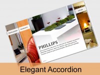
Cross Browser Pure CSS3 Horizontal Accordion
 13 years ago
  23168
23168  3173
3173
 n/a
n/a
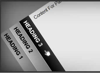
You can add other CSS3 features like gradients, font-face, etc to enhance it further. Our accordion will degrade to an unordered list in IE6 (which will be completely untouched by our CSS). You can use conditional CSS to style unordered list for IE6 or older browsers however you like.
Accordion Markup
We are going to use exactly the same markup that we used to create vertical accordion:
<div class="horizontalaccordion">
<ul>
 <li>
        <h3>Heading 1</h3>
  <div>Content For Panel 1.</div>
 </li>
 <li>
        <h3>Heading 2</h3>
  <div>Content For Panel 2</div>
 </li>
 <li>
        <h3>Heading 3</h3>
  <div>Content For Panel 3.</div>
 </li>
 <li>
        <h3>Heading 4</h3>
  <div>Content For Panel 4</div>
 </li>
</ul>
</div>
Note:
* Each “li” element inside unordered list represents a panel
* Each “h3” element inside a list item represents panel head
* Each “div” element inside a list item represents panel content
Styling Accordion Structure
Unlike vertical accordion, our horizontal accordion depends on CSS3 (transform) to complete its structure. What this means is that it will work in Internet Explorer but not in older versions of other web browsers. Luckily older versions of Firefox, Safari, Chrome and Opera have negligible market share. CSS3 transform is supported in these browsers: Firefox 3.5+, Opera 10.5+, Safari 3+ and Chrome.
Following CSS will create a horizontal accordion with all its panels collapsed:
.horizontalaccordion>ul {
    margin: 0;
    padding: 0;
    list-style:none;
    height: 300px;
}

.horizontalaccordion>ul>li {
    display:block;
 overflow: hidden;
    float:left;
    margin: 0;
    padding: 0;
    list-style:none;
 width:40px;
 height: 300px;

    /* Decorative CSS */
    background:#f0f0f0;
}

.horizontalaccordion>ul>li>h3 {
    display:block;
    float:left;
    margin: 0;
    padding:10px;
    height:19px;
    width:280px;

    /* Decorative CSS */
    border-left:#f0f0f0 1px solid;
    font-family: Arial, Helvetica, sans-serif;
    text-decoration:none;
    text-transform:uppercase;
    color: #000;
    background:#cccccc;

    /* CSS3 Transform Rotate & Translate */
    white-space:nowrap;
    -moz-transform: rotate(90.0deg) translate(-40px,0px);  /* FF3.5+ */
    -moz-transform-origin: 0 100%;
    -o-transform: rotate(90.0deg) translate(-40px,0px);  /* Opera 10.5 */
    -o-transform-origin: 0 100%;
    -webkit-transform: rotate(90.0deg) translate(-40px,0px);  /* Saf3.1+, Chrome */
    -webkit-transform-origin: 0 100%;
    transform: rotate(90.0deg) translate(-40px,0px);  /* Saf3.1+, Chrome */
    transform-origin: 0 100%;
    filter: progid:DXImageTransform.Microsoft.BasicImage(rotation=1.0);  /* IE6,IE7 */
    -ms-filter: "progid:DXImageTransform.Microsoft.BasicImage(rotation=1.0)"; /* IE8 */

}

.horizontalaccordion>ul>li>div {
    display:none;
    float:left;
 overflow: auto;
    position:relative;
    top:-40px;
    left:40px;
    *top:0px;       /* IE7 Hack */
    *left:0px;      /* IE7 Hack */
    margin:0;
    width:320px;
    height:280px;
    padding:10px;
}
Note:
- Child Combinators
I have purposely used child combinators to make sure that CSS applies only to the elements used in creating accordion structure and not inherited by elements that are used in accordion content. - Default State: Panels
Since we are not using “:target” pseudo class, we are not able to specify accordion’s state. That’s why we have to set all panels in collapsed state by default. This is done by setting width of “li” equal to the height (which becomes width after rotation) of “h3” elements (i.e., total width of each panel is equal to the width of its head). - Panel Head
This is the trickiest part of horizontal accordion. Note that height specified here will become width and width will become height after rotating the panel head. So the total height (which will become width after transform) of “h3” element is calculated by adding height, padding-top, padding-bottom and height of the border (if any). Transformation is done using CSS3 transform property and filter for Internet Explorer. In addition to rotating the h3 element, we are also adjusting its position using “translate” so that panel’s content area will adjust its position accordingly. - Panel Content
For panel content “div”, you may want to note that overflow is set to “auto”. This will add scrolling bar(s) if content doesn’t fit inside the content area. Total width (width + padding-left + padding-right) of the content area is determined by using this formula: accordion-width - (number-of-panels x width-of-panel-head). Also note that we have to keep content panel’s position relative to its head (i.e., “h3” element) and adjust the position here as well. Since Internet Explorer 7’s behavior during transformations is different from other browsers, I have used a little hack to accommodate its position.
Styling Accordion Behavior
Now we will add behavior in our accordion using “hover”. Adding following CSS will do the trick:
.horizontalaccordion>ul>li:hover {
    overflow: hidden;
 width: 380px;
}

.horizontalaccordion:hover>ul>li:hover>div {
    display:block;
}

.horizontalaccordion:hover>ul>li:hover>h3 {
    /* Decorative CSS */
    color:#fff;
    background:#000000;
}

.horizontalaccordion>ul>li>h3:hover {
        cursor:pointer;
}
Note:
- Opening Panel With Hover
In order to add behavior to our accordion – all we need to do is increase width of the Panel (“li” element) when mouse is moved over it. Panel width is determined by using this formula: accordion-width – ((number-of-panels – 1) x width-of-panel-head). We also need to “display” content panel’s as “block” when mouse is moved its head. - Highlighting Current Panel Head
We have highlighted current or open panel by changing the background property of the “h3” element when mouse moves over “li”. It is important to do this on “li:hover” instead of “h3:hover”, because you want to highlight panel head even mouse is hovering over its content. - Changing Mouse Pointer
Since we are not using anchors, we have changed mouse pointer using CSS when mouse hovers over “h3” element.
Adding Transition Effect
By adding structure and behavior, we have successfully created pure CSS horizontal accordion. It looks and works perfectly in all modern browsers including IE7+. Now to add transition effect. apply following CSS3 style to our panels (i.e., “li” element):
transition: width 0.3s ease-in-out;
-moz-transition: width 0.3s ease-in-out;
-webkit-transition: width 0.3s ease-in-out;
-o-transition: width 0.3s ease-in-out;
CSS3 transition effect is currently available in Safari, Chrome and Opera. It will soon be available on Firefox with version 3.7. IE7 and IE8 will continue to display CSS accordion without any transition effect.
Complete Code
That’s it – we are done. This is how complete CSS file will look like (note: I have also added gradient effect to our panel head):
.horizontalaccordion>ul {
    margin: 0;
    padding: 0;
    list-style:none;
    height: 300px;
}

.horizontalaccordion>ul>li {
    display:block;
 overflow: hidden;
    float:left;
    margin: 0;
    padding: 0;
    list-style:none;
 width:40px;
 height: 300px;

    /* Decorative CSS */
    background:#f0f0f0;

    /* CSS3 Transitions */
    transition: width 0.3s ease-in-out;
    -moz-transition: width 0.3s ease-in-out;
    -webkit-transition: width 0.3s ease-in-out;
    -o-transition: width 0.3s ease-in-out;
}

.horizontalaccordion>ul>li>h3 {
    display:block;
    float:left;
    margin: 0;
    padding:10px;
    height:19px;
    width:280px;

    /* Decorative CSS */
    border-left:#f0f0f0 1px solid;
    font-family: Arial, Helvetica, sans-serif;
    text-decoration:none;
    text-transform:uppercase;
    color: #000;
    background:#cccccc;

    /* CSS3 Transform Rotate & Translate */
    white-space:nowrap;
    -moz-transform: rotate(90.0deg) translate(-40px,0px);  /* FF3.5+ */
    -moz-transform-origin: 0 100%;
    -o-transform: rotate(90.0deg) translate(-40px,0px);  /* Opera 10.5 */
    -o-transform-origin: 0 100%;
    -webkit-transform: rotate(90.0deg) translate(-40px,0px);  /* Saf3.1+, Chrome */
    -webkit-transform-origin: 0 100%;
    transform: rotate(90.0deg) translate(-40px,0px);  /* Saf3.1+, Chrome */
    transform-origin: 0 100%;
    filter: progid:DXImageTransform.Microsoft.BasicImage(rotation=1.0)
            progid:DXImageTransform.Microsoft.gradient(startColorstr=#ff999999, endColorstr=#ffcccccc);  /* IE6,IE7 */
    -ms-filter: "progid:DXImageTransform.Microsoft.BasicImage(rotation=1.0)"
                "progid:DXImageTransform.Microsoft.gradient(startColorstr=#ff999999, endColorstr=#ffcccccc)"; /* IE8 */

    /* CSS3 Gradient Effect */
    background: -moz-linear-gradient( top, #999999, #cccccc);
    background: -webkit-gradient(linear, left top, left bottom, from(#999999), to(#cccccc));
}

.horizontalaccordion>ul>li>div {
    display:none;
    float:left;
 overflow: auto;
    position:relative;
    top:-40px;
    left:40px;
    *top:0px;       /* IE7 Hack */
    *left:0px;      /* IE7 Hack */
    margin:0;
    width:320px;
    height:280px;
    padding:10px;
}

.horizontalaccordion>ul>li:hover {
    overflow: hidden;
 width: 380px;
}

.horizontalaccordion:hover>ul>li:hover>div {
    display:block;
}

.horizontalaccordion:hover>ul>li:hover>h3 {
    /* Decorative CSS */
    color:#fff;
    background:#000000;

    /* CSS3 Gradient Effect */
    background: -moz-linear-gradient( top, #454545, #000000); /* FF, Flock */
    background: -webkit-gradient(linear, left top, left bottom, from(#454545), to(#000000)); /* Safari, Chrome */
    filter: progid:DXImageTransform.Microsoft.BasicImage(rotation=1.0)
            progid:DXImageTransform.Microsoft.gradient(startColorstr=#ff454545, endColorstr=#ff000000); /* IE 5.5 - IE 7 */
    -ms-filter: "progid:DXImageTransform.Microsoft.BasicImage(rotation=1.0)"
                "progid:DXImageTransform.Microsoft.gradient(startColorstr=#ff454545, endColorstr=#ff000000)";   /* IE 8 */
}

.horizontalaccordion>ul>li>h3:hover {
    cursor:pointer;
}
Note:
- You must specify DOCTYPE in your web page in order for this CSS to work in IE.
- You can have more than one Accordion in a single page. If they have different properties, you can simply copy the above code, give different class name, and change the properties.
- If number of panels are different from our example, you will need to adjust “height” & “width” properties in the CSS accordingly.
- CSS3 gradient effect will work in all browsers except for Opera. You can also add a background image to display gradient effect, which will also work in Opera and older browsers. In this case you can also get rid of IE filters.
- Also note that IE filters must be grouped together in order to work, otherwise only the last filter is applied. This has forced me to use rotation again on mouse over. I personally like to keep structure and behavior separate – I have therefore provided two version of the horizontal accordion in the download file: one with gradient effect for IE and another one without it.
- This accordion uses CSS “hover” and works with a mouse. (Point added after reading concerns in comments below – Sorry for taking this point for-granted)
You might also like
Tags
accordion accordion menu animation navigation animation navigation menu carousel checkbox inputs css3 css3 menu css3 navigation date picker dialog drag drop drop down menu drop down navigation menu elastic navigation form form validation gallery glide navigation horizontal navigation menu hover effect image gallery image hover image lightbox image scroller image slideshow multi-level navigation menus rating select dependent select list slide image slider menu stylish form table tabs text effect text scroller tooltips tree menu vertical navigation menu