 Subscribe
 Follow Us
Tabbed content with jQuery
 13 years ago
 18363
18363 4135
4135
In this example we'll going to show you some web development techniques that can be used in your next projects. This will cover some CSS, HTML and jQuery tricks.
First thing we need is some basic HTML layout to fit what we are going to make.
<!DOCTYPE html PUBLIC "-//W3C//DTD XHTML 1.0 Strict//EN" "http://www.w3.org/TR/xhtml1/DTD/xhtml1-strict.dtd">
<html xmlns="http://www.w3.org/1999/xhtml" xml:lang="en" lang="en">
 <head>
  <title>Tabbed content</title>
  <meta http-equiv='Content-Type' content='text/html; charset=iso-8859-1' />

  <script type='text/javascript' src='http://ajax.googleapis.com/ajax/libs/jquery/1.3/jquery.min.js'></script>

  <link href='css/tabbedContent.css' rel='stylesheet' type='text/css' />
  <script src="js/tabbedContent.js" type="text/javascript"></script>
 </head>

 <body>

 </body>
</html>
I already included jQuery and other files in the head section. We’ll be making these files step by step in the next few minutes.
Next thing we need to do is create the structure of the document. What we need is a container with the tabs and a container which the content will that switch if we change tabs.
As a nice feature to enhance this all we’ll use a tab background that will move to the choice the user makes. While this tab moves, the content will also change to the selected tab.
For this we need a container containing the tabs and the background, a container containing the content and container that prevents the content to be shown prematurely.
Take a look at the following code:
<div class='tabbed_content'> <div class='tabs'> <div class='moving_bg'> </div> <span class='tab_item'> Tab one </span> <span class='tab_item'> Tab two </span> <span class='tab_item'> Tab three </span> <span class='tab_item'> Tab four </span> </div> <div class='slide_content'> <div class='tabslider'> <!-- content goes here --> </div> </div> </div>
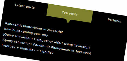
It’s time to do a little styling to the tabs section and the overall container. Note that in the next part I am going to use an image which is included in the source archive. This will enhance the looks of the tabbed container.
This following CSS will make the tabs appear as tabs:
.tabbed_content {
 background-color: #000000;
 width: 620px;
}

.tabs {
 height: 62px;
 position: relative;
}

.tabs .moving_bg {
 background-color:#7F822A;
 background-image:url(../images/arrow_down_green.gif);
 background-position: bottom left;
 background-repeat: no-repeat;
 left: 0;
 padding: 15px;
 padding-bottom: 29px;
 position: absolute;
 width: 125px;
 z-index: 190;
}

.tabs .tab_item {
 display: block;
 float: left;
 padding: 15px;
 width: 125px;
 color: #ffffff;
 text-align: center;
 z-index: 200;
 position: relative;
 cursor: pointer;
}
Note that the tab container has a position of relative to make the moving background position to it. Now we can easily move the moving background using the left property.
In the next part we are going to add the first few lines of Javascript to the tabbedContent.js file to create a mouseover effect on the tab items.
Use this code as a skeleton:
var TabbedContent = {
 init: function() {

 },

 slideContent: function(obj) {

 }
}

$(document).ready(function() {
 TabbedContent.init();
});
This code is will execute the init function once the page is loaded.
Now we need to make is so that the moving background moves to the tab item which is hovered on. Implement the following code:
$(".tab_item").mouseover(function() {

 var background = $(this).parent().find(".moving_bg");

 $(background).stop().animate({
  left: $(this).position()['left']
 }, {
  duration: 300
 });

 TabbedContent.slideContent($(this));

});
This will make all the items with the class tab_item behave as if it was a tab. It also moves the moving background to the right position, matching the left property with that of the tab.
TabbedContent.slideContent($(this)); will make the content switch in a few steps. We’ll get to that.
Next up is creating the content and it’s CSS. The content goes in the place we put <!-- content goes here -->.
<ul>
 <li>
  This matches the first tab
 </li>
</ul>
<ul>
 <li>
  This matches the second tab
 </li>
</ul>
<ul>
 <li>
  This matches the third tab
 </li>
</ul>
<ul>
 <li>
  This matches the fourth tab
 </li>
</ul>
And the matching CSS:
.tabbed_content .slide_content {
 overflow: hidden;
 background-color: #000000;
 padding: 20px 0 20px 20px;
 position: relative;
 width: 600px;
}

.tabslider {
 width: 5000px;
}

.tabslider ul {
 float: left;
 width: 560px;
 margin: 0px;
 padding: 0px;
 margin-right: 40px;
}

.tabslider ul a {
 color: #ffffff;
 text-decoration: none;
}

.tabslider ul a:hover {
 color: #aaaaaa;
}

.tabslider ul li {
 padding-bottom: 7px;
}
Note that the content has two containers. One is for the overall wrapping and the other for making the content move as we hover over the items.
The top container has an overflow of hidden, which makes any content that goes out of it’s limits hidden. The container below that will hold the content that will be hidden.
Now we are going to make the content scroll to the right position as we did with the tabs.
It’s time to fill up the slideContent function:
var margin = $(obj).parent().parent().find(".slide_content").width();
margin = margin * ($(obj).prevAll().size() - 1);
margin = margin * -1;

$(obj).parent().parent().find(".tabslider").stop().animate({
 marginLeft: margin + "px"
}, {
 duration: 300
});
The margin needed for the slider to move is calculated in this function. It has been made so that you can change the widths of several containers in the result, it will scroll to the right position automatically.
Take another looks at the source for references.
You might also like

Tags
accordion accordion menu animation navigation animation navigation menu carousel checkbox inputs css3 css3 menu css3 navigation date picker dialog drag drop drop down menu drop down navigation menu elastic navigation form form validation gallery glide navigation horizontal navigation menu hover effect image gallery image hover image lightbox image scroller image slideshow multi-level navigation menus rating select dependent select list slide image slider menu stylish form table tabs text effect text scroller tooltips tree menu vertical navigation menu