 Subscribe
 Follow Us
Animated Bubble Buttons CSS3
 13 years ago
 15818
15818 3987
3987
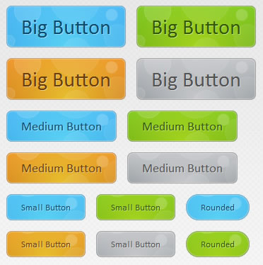
we are creating a useful set of animated buttons with the power of CSS3′s multiple backgrounds and animations. With this button pack, you can easily turn any link on your page into an animated button by just assigning a class name. No JavaScript necessary. Four color themes and three sizes are also available by assigning additional class names.
The HTML
To turn a regular link on your page into a fancy animated CSS3 button, you just need to assign the .button class and one of the supported colors. See some examples below:
<a href="#" class="button blue big">Download</a>
<a href="#" class="button blue medium">Submit</a>
<a href="#" class="button small blue rounded">Submit</a>
There are four color classes available – blue, green, orange and gray. The rest of the classes, which you see assigned to the links above, are optional. You can choose a size from small, medium and big, and one more class – rounded, which creates a more rounded version of the button.
The class names are chosen so they are straightforward and easy to remember, but this raises the possibility of a clash with some of the classes on your page.
Now lets take a closer look at the CSS classes that make this possible.
The CSS
All the CSS code for the animated buttons resides in buttons.css. This makes it easy to just drop it into an existing project and use it.
Notice that throughout the the code below, I’ve defined two versions of the same property in a number of places. This has to do with the way browsers handle CSS definitions. They parse the rules one by one and apply them, ignoring the ones they do not understand. This way we can have a plain version of the rule which is understandable by all, and a CSS3 enabled one which will be ignored by the older ones.
buttons/buttons.css
.button{
    font:15px Calibri, Arial, sans-serif;

    /* A semi-transparent text shadow */
    text-shadow:1px 1px 0 rgba(255,255,255,0.4);

    /* Overriding the default underline styling of the links */
    text-decoration:none !important;
    white-space:nowrap;

    display:inline-block;
    vertical-align:baseline;
    position:relative;
    cursor:pointer;
    padding:10px 20px;

    background-repeat:no-repeat;

    /* The following two rules are fallbacks, in case
       the browser does not support multiple backgrounds. */

    background-position:bottom left;
    background-image:url('button_bg.png');

    /* CSS3 background positioning property with multiple values. The background
       images themselves are defined in the individual color classes */

    background-position:bottom left, top right, 0 0, 0 0;
    background-clip:border-box;

    /* Applying a default border radius of 8px */

    -moz-border-radius:8px;
    -webkit-border-radius:8px;
    border-radius:8px;

    /* A 1px highlight inside of the button */

    -moz-box-shadow:0 0 1px #fff inset;
    -webkit-box-shadow:0 0 1px #fff inset;
    box-shadow:0 0 1px #fff inset;

    /* Animating the background positions with CSS3 */
    /* Currently works only in Safari/Chrome */

    -webkit-transition:background-position 1s;
    -moz-transition:background-position 1s;
    -o-transition:background-position 1s;
    transition:background-position 1s;
}

.button:hover{

    /* The first rule is a fallback, in case the browser
       does not support multiple backgrounds
    */

    background-position:top left;
    background-position:top left, bottom right, 0 0, 0 0;
}
The first thing we need to do is to define the button class. This is the backbone of the buttons as it applies positioning, font and background styles.
First are the font-related styles, after which follows the display property. It is set to inline-block, which allows it to sit on the same line as its surrounding text (like an inline element would), but also behave like a block in regard to the paddings and margins.
As you will see in a moment, each button has four background images applied to it. Although this sounds intimidating, only one file is actually requested from the server. The first two backgrounds are the bottom left and top right part of the bubble image, which you can see in the illustration below, and the other two are pure CSS gradients.
As I mentioned above, the bubble background is displayed as two individual images, offset with the background-position property. Using the CSS3 transition property, we define an animation in which the two versions of the background image slide to the top or bottom respectfully, which creates the bubble effect you see when hovering over the buttons.
Now lets say a few words about the size and rounded classes.
/* The three buttons sizes */

.button.big        { font-size:30px;}
.button.medium    { font-size:18px;}
.button.small    { font-size:13px;}

/* A more rounded button */

.button.rounded{
    -moz-border-radius:4em;
    -webkit-border-radius:4em;
    border-radius:4em;
}
Here are the three size classes – small, medium and big, and the rounded class. The buttons scale according to their text size. This way no explicit width and height has to be specified.
Now lets move on with the interesting part – the colors. Only the definition for the blue button is given below, as the rest are nearly identical.
/* BlueButton */

.blue.button{
    color:#0f4b6d !important;

    border:1px solid #84acc3 !important;

    /* A fallback background color */
    background-color: #48b5f2;

    /* Specifying a version with gradients according to */

    background-image:    url('button_bg.png'), url('button_bg.png'),
                        -moz-radial-gradient(    center bottom, circle,
                                                rgba(89,208,244,1) 0,rgba(89,208,244,0) 100px),
                        -moz-linear-gradient(#4fbbf7, #3faeeb);

    background-image:    url('button_bg.png'), url('button_bg.png'),
                        -webkit-gradient(    radial, 50% 100%, 0, 50% 100%, 100,
                                            from(rgba(89,208,244,1)), to(rgba(89,208,244,0))),
                        -webkit-gradient(linear, 0% 0%, 0% 100%, from(#4fbbf7), to(#3faeeb));
}

.blue.button:hover{
    background-color:#63c7fe;

    background-image:    url('button_bg.png'), url('button_bg.png'),
                        -moz-radial-gradient(    center bottom, circle,
                                           rgba(109,217,250,1) 0,rgba(109,217,250,0) 100px),
                        -moz-linear-gradient(#63c7fe, #58bef7);

    background-image:    url('button_bg.png'), url('button_bg.png'),
                        -webkit-gradient(    radial, 50% 100%, 0, 50% 100%, 100,
                                            from(rgba(109,217,250,1)), to(rgba(109,217,250,0))),
                        -webkit-gradient(linear, 0% 0%, 0% 100%, from(#63c7fe), to(#58bef7));
}
Each color class defines a unique unique set of properties – the color of the buttons’ textual label, a text-shadow and a set of background images. Notice that we use the background property to add multiple images to the button. They are layered one on top of the other, with the ones defined first appearing on the top.
Only Mozilla and Webkit browsers support CSS gradients at the moment, but with quite different syntaxes. The rest of the browsers will display the fallback background color. You may have noticed that we are not including a prefix-free version of the gradient rules. This is due to the fact that gradients are not an official part of the CSS specification as of yet, and there is no agreement on the preferred syntax.
In the fragment above, you can see that we are defining a linear gradient and a radial one on top of it. To make the gradients blend more smoothly, in both the webkit and mozilla syntaxes we are defining the radial one with RGBA, which makes the outer color of the gradient completely transparent.
You might also like

Tags
accordion accordion menu animation navigation animation navigation menu carousel checkbox inputs css3 css3 menu css3 navigation date picker dialog drag drop drop down menu drop down navigation menu elastic navigation form form validation gallery glide navigation horizontal navigation menu hover effect image gallery image hover image lightbox image scroller image slideshow multi-level navigation menus rating select dependent select list slide image slider menu stylish form table tabs text effect text scroller tooltips tree menu vertical navigation menu