 Subscribe
 Follow Us
awesome date-pickers Mootools
 13 years ago
 17268
17268 4822
4822
Calendar is a Javascript class that adds accessible and unobtrusive date-pickers to your form elements. This class is a compilation of many date-pickers I have implemented over the years and has been completely re-written for Mootools. I have tried to include all the features that have been most useful while streamlining the class itself to keep it as small as possible. Use the links below to see what features are available in Calendar and how it might enhance the accessibility, usability and validation of form elements on your website.
Important
Using Calendar requires at the very least knowledge of XHTML and CSS and some experience using Javascript in web pages. If you meet those requirements first make sure you have downloaded Mootools with the components listed above. Then follow the instructions below to begin using Calendar!
Installation
Link the calendar.js javascript file from within the head of your HTML document. Be sure to link calendar.js after mootools.js in the order they appear. Note remember to adjust the src to reflect the location of the javascripts on your website.
<head>
  ...
  <script type="text/javascript" src="mootools.js"></script>
  <script type="text/javascript" src="calendar.js"></script>
</head>
Usage
Execute the class from within the head of your HTML document. Calendar has one required parameter: an object containing the element_id: 'format' pairs of the inputs or selects the class will be applied to. An object in Javascript is a collection of key: value pairs separated by commas and contained within curly-brackets {}. In this case, assuming the element you wanted to apply the class to was the following:
<input id="date" name="date" type="text" />
An example of a valid execution of Calendar would be:
<head>
  ...
  <script type="text/javascript">
    window.addEvent('domready', function() { myCal = new Calendar({ date: 'd/m/Y' }); });
  </script>
</head>
In this case the function() { ... } is the execution call: we are attaching it to the domready event of the window, which means it will be run as soon as the webpage has been loaded, without waiting for images. Of the function statement myCal = new Calendar({ ... }); itself: we are setting a new Calendar instance to a variable named myCal. Of the object { date: 'd/m/Y' } we are passing in as the required parameter: date is the id of the element and 'd/m/Y' is the format the date will appear as. Calendar accepts the following characters for date formatting: d, D, j, l, N, w, S, F, m, M, n, Y, y borrowing syntax from PHP's date function. Some other examples are as follows:
new Calendar({ year: { day: 'd', month: 'm', year: 'Y' }});
Where day, month and year are the ids of 3 inputs or selects and 'd', 'm' and 'Y' are their corresponding formats. The preceding year indicates the element the calendar button will be appended to–see Styling Your Calendar below for more information.
new Calendar({ day: { day: 'd', monthyear: 'm-Y' }});
Similar to above, in this case there is one element for the day and one element for the combined month and year values. The button is appended to the day element.
new Calendar({ date1: 'd/m/Y', date2: 'd/m/Y' });
Here the class is applied to two different date elements, resulting in multi-calendar functionality as demonstrated in the features above.
new Calendar({ day1: { day1: 'd', monthyear1: 'm-Y' }, day2: { day2: 'd', monthyear2: 'm-Y' }});
Similar to example two, but with multi-calendar functionality as well.
Properties
Following the first object, the class also accepts an optional second object that may contain any of the following properties to help customize Calendar to your website:
- blocked - An array of blocked (disabled) dates in the following format: 'day month year'. The syntax is similar to cron: the values are separated by spaces and may contain * (asterisk) - (dash) and , (comma) delimiters. For example blocked: ['1 1 2007'] would disable January 1, 2007; blocked: ['* 1 2007'] would disable all days (wildcard) in January, 2007; blocked: ['1-10 1 2007'] would disable January 1 through 10, 2007; while blocked: ['1,10 1 2007'] would disable January 1 and 10, 2007. In combination: blocked: ['1-10,20,22,24 1-3 *'] would disable 1 through 10, plus the 22nd and 24th of January through March for every (wildcard) year. There is an optional additional value which is day of the week (0 - 6 with 0 being Sunday). For example blocked: ['0 * 2007 0,6'] would disable all weekends (saturdays and sundays) in 2007.
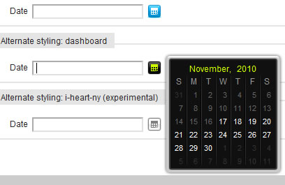
- classes - An array of 12 CSS classes that are applied to the calendar construct: calendar, prev, next, month, year, today, invalid, valid, inactive, active, hover, hilite. It is not necessary (as of RC3) to pass all 11 classes in the array: if you only wanted to change the 1st class you would set classes: ['alternate']; if you only wanted to change the 1st and 4th classes you would need to set classes: ['alternate', '', '', 'mes']. The first class, by default 'calendar', is applied to the div that contains the calendar element, the calendar button and the input or select it is appended to. The 'hilite' class (as of RC4) is applied to all days between 2 or more selected dates in multi-calendar functionality - see the demo for an example.
- days - An array of the 7 names of the days of the week, starting with sunday.
- direction - A positive or negative integer that determines the calendar's direction: n (a positive number) the calendar is future-only beginning at n days after today; -n (a negative number) the calendar is past-only ending at n days before today; 0 (zero) the calendar has no future or past restrictions (default). Note if you would like the calendar to be directional starting from today–as opposed to (1) tomorrow or (-1) yesterday–use a positive or negative fraction, such as direction: .5 (future-only, starting today).
- draggable - A boolean value, true or false, to indicate if the calendar element will be draggable–useful in case the calendar obstructs (or is obstructed by) some other element on the page. Note, requires Mootools to be compiled with the Drag component.
- months - An array of the 12 names of the month, starting with january.
- navigation - An integer–0, 1 or 2–indicating which navigation method the class will use: traditional navigation (1) where left and right arrows allow the user to navigate by month (default); improved navigation (2) where the user can navigate by month or year; and static navigation (0) which is actually no navigation at all.
- offset - An integer that indicates the first day of the week, with 0 being Sunday (default).
- onHideStart, onHideComplete, onShowStart, onShowComplete - Event handlers that can be used to trigger your own scripts.
- pad - An integer, the minimum number of days between calendars with multi-calendar functionality. For example: 1 (default) would enforce multiple calendars to space at least 1 day between picked dates; 7 would enforce a space of at least 1 week; while 0 (no padding) would allow multiple calendars to occupy the same date.
- tweak - An object with { x: 0, y: 0} values that will "tweak" the calendar's placement on the page by x number of pixels horizontally and y number of pixels vertically.
Therefore, it's possible that your Calendar initialization actually looks something like this:
myCal = new Calendar({ date1: 'F j, Y', date2: 'F j, Y' }, { blocked: ['20-25,31 12 *'], direction: 1, navigation: 2, pad: 2 });
Styling Your Calendar
As described above in the classes property, Calendar uses the following CSS classes to stylize elements or functionality: calendar, prev, next, month, year, invalid, valid, inactive, active, hover. The first class, in this case 'calendar', is applied to the div that contains the calendar element, the calendar button and the form element it is appended to. Since it usually looks better to reduce the size of the form element to accommodate the button, an example of styles might be:
input {
  width: 100px;
}
input.calendar {
  width: 74px;
}
button.calendar {
  background: url(calendar-icon.gif);
  border: 0;
  cursor: pointer;
  float: left;
  height: 20px;
  margin-right: 6px;
  width: 20px;
}
button.calendar:hover,
button.calendar.active {
  background-position: left bottom;
}
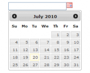
Here you can see the default width of a form input is 100px. In this case, the element that the calendar button will be appended to has a width of 74px - that's the default width (100) minus the width (20) and margin (6) of the calendar button. The XHTML of the calendar element itself depends slightly on the navigation mode set. The default, navigation: 1, generates the following:
<div class="calendar">
<div>
<table>
<caption>
<a class="prev"><</a>
<span class="month">[Month]</span>
<span class="year">[Year]</span>
<a class="next">></a>
</caption>
<thead>
<tr>
<th>S</th>
<th>M</th>
<th>T</th>
<th>W</th>
<th>T</th>
<th>F</th>
<th>S</th>
</tr>
</thead>
<tbody>
<tr>
<td>30</td>
<td>31</td>
<td class="invalid">1</td>
<td class="invalid">2</td>
<td class="valid">3</td>
<td class="inactive">4</td>
<td class="active">5</td>
</tr>
<tr> ... </tr>
<tr> ... </tr>
<tr> ... </tr>
<tr> ... </tr>
<tr> ... </tr>
</tbody>
</table>
</div>
</div>
Note that the calendar is padded with the ending days of the previous month and starting days of the next month, however these table cells are unclassed. Days that are within the current month but disabled or blocked are classed as 'invalid'. Days that are within the current month and clickable are classed as 'valid'. The day that has been set is classed 'active'. In multi-calendar mode, days that have been set by other calendars appear classed as 'inactive'. All clickable days–which may include days classed as inactive or active–receive the 'hover' class on mouseover.
Depending on the navigation mode set, the CAPTION element may be created differently. For navigation: 2, the caption element is generated as following:
<caption>
<span class="month">
<a class="prev"><</a>
<span>[Month]</span>
<a class="next">></a>
</span>
<span class="year">
<a class="prev"><</a>
<span>[Year]</span>
<a class="next">></a>
</span>
</caption>
For static or no navigation (0) the caption element is:
<caption>
  <span class="month">[Month]</span>
  <span class="year">[Year]</span>
</caption>
Tips & Tricks
- In case you noticed the XHTML contains an extra div between the table and the calendar wrapper: briefly, any element that does not have a typical block or inline CSS display property, results in a lot of rendering disparities between the browsers. In this case, the caption element has it's own display: table-caption which seems to share qualities with both block and inline. Anyway I found that by adding the extra div I was able to resolve all CSS problems without needing separate stylesheets or CSS hacks–hope it helps someone else the same way.
You might also like
Tags
accordion accordion menu animation navigation animation navigation menu carousel checkbox inputs css3 css3 menu css3 navigation date picker dialog drag drop drop down menu drop down navigation menu elastic navigation form form validation gallery glide navigation horizontal navigation menu hover effect image gallery image hover image lightbox image scroller image slideshow multi-level navigation menus rating select dependent select list slide image slider menu stylish form table tabs text effect text scroller tooltips tree menu vertical navigation menu