 Subscribe
 Follow Us
Rare Accessible charts using jQuery and HTML5
 13 years ago
 21962
21962 4560
4560
Accessible data visualization in HTML has always been tricky to achieve: people commonly use image elements for static charts, which provide only the most basic textual information to non-visual users; or proprietary plugins for interactive charts, which require downloads and updates by the user and don't always fully address accessibility issues.
The HTML5 canvas element provides an important breakthrough compared with those traditional methods: its native JavaScript drawing API allows us to dynamically draw bitmap images on the page, meaning we can use Canvas to generate charts and graphs based on data that's already available in the HTML.
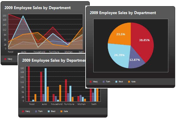
The Visualize plugin parses key content elements in a well-structured HTML table, and leverages that native HTML5 canvas drawing ability to transform them into a chart or graph visualization. For example, table row data values serve as chart bars, lines or pie wedges; table headers become value and legend labels; and the title and caption values provide title labels within the image. Visualize also automatically checks for the highest and lowest values in the chart and uses them to calculate x-axis values for line and bar charts. Finally, the plugin includes two different CSS styles — one light and one dark — that can be used as is, or can serve as a starting point to customize chart and graph presentation to match any application style.
ARIA support now included
Though this approach to creating charts and graphs is inherently accessible — the table data remains in the page markup for screen readers and browsers that don't support JavaScript — we realized that the canvas element needed ARIA attributes to better identify it as a visualization. In the latest update to Visualize, we edited the plugin to automatically assign two ARIA attributes to the chart container to more clearly identify its purpose to screen readers:
- role="image" – tells screen readers that the chart is purely visual, and can therefore be skipped
- aria-label="Chart representing data from: [table caption value]" – specifically identifies the chart's content as belonging to the associated table
Step 1: Preparing files
Here we go! The first thing to do is obviously to create a directory on your Mac (or PC, nobody’s perfect ![]() ). You should name it chart for example. Once done, download the required Javascript and CSS files and save it on your hard drive.
). You should name it chart for example. Once done, download the required Javascript and CSS files and save it on your hard drive.
Now, create a new html document, named charts.html. Copy the html structure below, and paste it into your newly created charts.html file.
<!DOCTYPE html>
<html>
<head>
    <meta http-equiv="content-type" content="text/html;charset=UTF-8" />
    <title>Charts!</title>

</head>

<body>

</body>
</html>
Did you notice that I used the <!DOCTYPE html> doctype? It is the right doctype to use, as the javscript code we’ll add later will turn a html table into a HTML 5 canvas.
Step 2: Adding data
Now that we downloaded the javascript files and created an html document, it’s time to add data. Copy the code below and paste it within the <body> and </body> tags of your charts.html file.
<table>
    <caption>Visits from August 16 to August 21</caption>
    <thead>
        <tr>
            <td></td>
            <th scope="col">Monday</th>
            <th scope="col">Tuesday</th>
            <th scope="col">Wednesday</th>
            <th scope="col">Thursday</th>
            <th scope="col">Friday</th>
            <th scope="col">Saturday</th>
            <th scope="col">Sunday</th>
        </tr>
    </thead>
    <tbody>

        <tr>
            <th scope="row">CatsWhoCode.com</th>
            <td>12541</td>
            <td>11204</td>
            <td>11354</td>
            <td>10058</td>
            <td>9871</td>
            <td>8254</td>
            <td>5477</td>
        </tr>
        <tr>
            <th scope="row">WpRecipes.com</th>
            <td>9855</td>
            <td>8870</td>
            <td>8731</td>
            <td>7488</td>
            <td>8159</td>
            <td>6547</td>
            <td>4512</td>
        </tr>
        <tr>
            <th scope="row">CatsWhoBlog.com</th>
            <td>3241</td>
            <td>2544</td>
            <td>2597</td>
            <td>3108</td>
            <td>2114</td>
            <td>2045</td>
            <td>950</td>
        </tr>
    </tbody>
</table>
Of course, feel free to add your own data to make the example more interesting for you.
Step 3: Let the magic happen
Alright, now we have a bunch of downloaded files and an html document. It’s time to merge them all together and finally generate the chart.
Unzip the downloaded file and open the extracted directory. Copy the following files into your chart directory.
- charting/css/basic.css
- charting/css/visualize.css
- charting/css/visualize-light.css
- charting/js/visualize.js
Once done, we obviously have to link the css and javascript files to our document. Paste the following after the <title> tag of the document:
<link href="basic.css" type="text/css" rel="stylesheet" />
<link href="visualize.css" type="text/css" rel="stylesheet" />
<link href="visualize-light.css" type="text/css" rel="stylesheet" />
<script type="text/javascript" src="http://ajax.googleapis.com/ajax/libs/jquery/1.4.2/jquery.min.js"></script>
<script type="text/javascript" src="visualize.js"></script>
It’s time to give life to our chart. Paste the final piece of code after the script calls:
<script type="text/javascript">
    $(function(){
        $('table').visualize();
    });
</script>
Once you saved the file, your HTML table should be displayed along with a good looking chart. If you don’t want the table to be visible, simply hide it using the display:none css property.
Additional explanations
Generating bar charts is definitely great, but what if your preference goes to a pie chart? No problem, visualize.js allows 4 different type of charts: Bar, area, pie and line.
Changing the default type is pretty easy: Just add the type parameter as shown below:
$('table').visualize({type: 'pie'});
Cool, isn’t it? Visualize.js accepts even more parameters to make sure your chart will look exactly how you want. Here are the parameters which can be used:
- type: string. Accepts ‘bar’, ‘area’, ‘pie’, ‘line’. Default: ‘bar’.
- width: number. Width of chart. Defaults to table width
- height: number. Height of chart. Defaults to table height
- appendTitle: boolean. Add title to chart. Default: true.
- title: string. Title for chart. Defaults to text of table’s Caption element.
- appendKey: boolean. Adds the color key to the chart. Default: true.
- colors: array. Array items are hex values, used in order of appearance. Default: ['#be1e2d','#666699','#92d5ea','#ee8310','#8d10ee','#5a3b16','#26a4ed','#f45a90','#e9e744']
- textColors: array. Array items are hex values. Each item corresponds with colors array. null/undefined items will fall back to CSS text color. Default: [].
- parseDirection: string. Direction to parse the table data. Accepts ‘x’ and ‘y’. Default: ‘x’.
- pieMargin: number. Space around outer circle of Pie chart. Default: 20.
- pieLabelPos: string. Position of text labels in Pie chart. Accepts ‘inside’ and ‘outside’. Default: ‘inside’.
- lineWeight: number. Stroke weight for lines in line and area charts. Default: 4.
- barGroupMargin: number. Space around each group of bars in a bar chart. Default: 10.
- barMargin: number. Creates space around bars in bar chart (added to both sides of each bar). Default: 1
That’s all for today. Have fun with the charts
You might also like
Tags
accordion accordion menu animation navigation animation navigation menu carousel checkbox inputs css3 css3 menu css3 navigation date picker dialog drag drop drop down menu drop down navigation menu elastic navigation form form validation gallery glide navigation horizontal navigation menu hover effect image gallery image hover image lightbox image scroller image slideshow multi-level navigation menus rating select dependent select list slide image slider menu stylish form table tabs text effect text scroller tooltips tree menu vertical navigation menu