 Subscribe
 Follow Us
lovely Candy CSS3 buttons
 13 years ago
 16387
16387 4467
4467
Create CSS buttons that are sexy looking, really flexible, but with the most minimalistic markup as possible.
And voila.. here they are, the BonBon Buttons. Named after the French word for "Candy". So, let's take a tour trough the candy store.
No, wait! Before you click that download button and try to use them on your site,
Markup
I get a real kick out of trying to keep the markup minimal, so I'm really happy with the outcome. A basic button looks like this:
<a href="" class="button">Label</a>
You can change the look by adding more classes:
<a href="" class="button orange glossy">Label</a>
Icons
If you would like to add an icon, you can use the HTML5 custom data attribute like this: data-icon="S". This allows you to use any of the Unicode symbols or the newly released icon fonts like Pictos or Writesocial. With the following CSS .button:before { content: attr(data-icon); } it will add the icon in front of the label. I think it's a great solution to keep your markup semantic and to hide the additional icon letter from screen readers. Plus it allows you to quickly change icons without having to touch your CSS.
<a href="" class="button orange glossy" data-icon="S">Label</a>
Accessibility
Addingrole="button" makes it more accessible. Use tabindex to keep them highlighted and if you use the <button> tag you also can use attributes like "disabled".
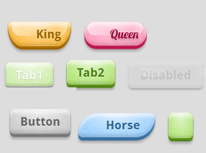
<a href="" role="button" tabindex="1" class="button pink">Tab1</a>
<a href="" role="button" tabindex="2" class="button pink">Tab2</a>
<button disabled class="button pink glossy">Disabled</button>
Looks
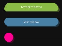
I tried to avoid any images but couldn't resist adding a PNG for the noise. The rest is a combination of text-shadows, box-shadows, gradients and borders. This makes it easy to resize the buttons and keep them sharp. It also makes it easy to change the shape. Yes, try it out.. a morphing button:
A border-radius doesn't always need to be rounded. You can bend it in a more oval shape using a second set of points separated with a "/". The above buttons use a transition to animate the border-radius for the default, :hover and :active state:
border-radius: 5em / 2em;
border-radius: .4em .4em 2em 2em / .4em .4em 3em 3em;
border-radius: .3em;
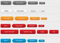
For the colors HSL values are used. It makes it much easer to apply different shades of a color if you can use %. For example the text color is a darker version of the background, so I just lower the lightness by 20%:
color: hsl(39, 100%, 30%);
background-color: hsl(39, 100%, 50%);
I tried to simulate different materials. A "mate", "glossy" and a "glass" version. The difference of the later two is that the glass version adds a dark blurry text-shadow which makes it look like you can see trough the button to its bottom. Works great in combination with the "back" shape.
The glossy shape is created using an :after element with a gradient background on top. It get's cutout with a border-radius that is slightly smaller in width and half in height from the main button. Unfortunately I couldn't figure out how to animate the :after element. So it's disabled on the morphing shape. Also, if the button gets too long, it doesn't look as good anymore. The gloss and highlight gradient doesn't grow.
There are two more datails that I would like to point out: The border uses a brighter and a darker box-shadow to imitate depth and the drop shadow changes when pressing the button.
Flexibility
Here all the optional class names if you wanna play around with -webkits Inspector or Firebug:
- Color: orange, pink, blue, green, transparent
- Font: serif
- Material: glossy, glass
- Size: xs, xl
- Shape: round, oval, brackets, skew, back, knife, shield, drop, morph
- Icon only: icon
- Disabled: disabled
There is one thing I'm kinda sad about. At the beginning when I started with the buttons, my plan was to use something like data-color="#ff0000" in the markup and it would create a red button. But I quickly realized that if you just add highlights and shadows on top of a color, it starts to look dull and less vivid. So all the colors need to be predefined in the CSS. I never tried it out, but maybe LESS/SASS would be a good solution because you can brighten/darken colors with code. But even then it's kinda hard, because not all colors need the same amount. Well, we shall see..
Flaws
And it gets worse.. If you're planing to use the BonBon buttons for production.. Well, I don't recommend it.. yet! Yes, I'm sorry, life is hard.
This is just a demo and not meant to be used on your next project that targets the average internet user. I just wanted to show a couple techniques how to use some of the new CSS3/HTML5 features. So only the current version of Safari, Chrome and Firefox are supported.
Another point. Each design element should fit with the overall design of a site. So I think it's not a good idea to just use "out of the box" buttons. It's like using one of those stock office girls on your contact page.. ;-)
But feel free to download the code, play around and maybe even use the one thing or the other, sooner or later. Thanks for reading.
You might also like

Tags
accordion accordion menu animation navigation animation navigation menu carousel checkbox inputs css3 css3 menu css3 navigation date picker dialog drag drop drop down menu drop down navigation menu elastic navigation form form validation gallery glide navigation horizontal navigation menu hover effect image gallery image hover image lightbox image scroller image slideshow multi-level navigation menus rating select dependent select list slide image slider menu stylish form table tabs text effect text scroller tooltips tree menu vertical navigation menu