Useful Magazine Style Dropdown Menu with jQuery

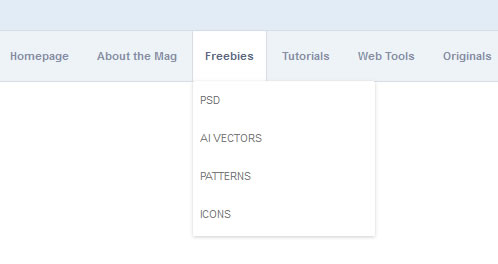
This is a magazine-style drop down nav menu. This will be created with some fancy CSS3 techniques to work in standards-compliant browsers. Even if you are shaky with jQuery you should be able to keep up with this little bit of code, and possibly learn something new.
Structuring our Page HTML
We should start off by constructing the basic page layout. I’ve done this in HTML with an unordered list for menu links. Both the CSS styles and jQuery library are excluded externally which saves a bit of space. Added below is the heading to our HTML code.
<!DOCTYPE html>
<html lang="en">
<head>
<meta http-equiv="Content-Type" content="text/html; charset=utf-8" />
<title>DesignShack Sexy Magazine-Style Dropdown Menu</title>
<script type="text/javascript" src="http://ajax.googleapis.com/ajax/libs/jquery/1.6.2/jquery.min.js"></script>
<link rel="stylesheet" type="text/css" href="style.css" media="all" />
</head>
The jQuery library v1.6.2 is hosted on Google’s servers for web developers to use. This can often cut off some of the load to your own servers. Differences are especially noticeable if you are processing tens or hundreds of thousands of visitors daily. I’ve also set my doctype to HTML5, not that it should affect our script.
Moving down a bit in the code let’s take a look at the inner body content. Below is a copy/paste of everything inside the body tag. I have removed the final jQuery code since we’ll be looking at that in a later section.
<div id="head">
	<div class="wrap">
		<h1><img src="images/logo.jpg" alt="Blog Magazine Logo" /></h1>
	</div>
</div>

<div class="wrap">
	<ul id="nav">
		<li><a href="#">Homepage</a></li>
		<li><a href="#">About the Mag</a>
			<ul>
				<li><a href="#">Company</a></li>
				<li><a href="#">Authors</a></li>
				<li><a href="#">Write for Us?</a></li>
				<li><a href="#">Advertising</a></li>
				<li><a href="#">Get in Touch</a></li>
			</ul>
		</li>
		<li><a href="#">Freebies</a>
			<ul>
				<li><a href="#">PSD</a></li>
				<li><a href="#">AI Vectors</a></li>
				<li><a href="#">Patterns</a></li>
				<li><a href="#">Icons</a></li>
			</ul>
		</li>
		<li><a href="#">Tutorials</a>
			<ul>
				<li><a href="#">HTML5</a></li>
				<li><a href="#">CSS3</a></li>
				<li><a href="#">jQuery</a></li>
				<li><a href="#">PHP MySQL</a></li>
				<li><a href="#">Ruby on Rails</a></li>
			</ul>
		</li>
		<li><a href="#">Web Tools</a>
			<ul>
				<li><a href="#">Performance</a></li>
				<li><a href="#">Browser Testing</a></li>
				<li><a href="#">CMS Plugins</a></li>
				<li><a href="#">Cheat Sheets</a></li>
			</ul>
		</li>
		<li><a href="#">Originals</a>
			<ul>
				<li><a href="#">Website Design</a></li>
				<li><a href="#">Mobile</a></li>
				<li><a href="#">User Interface</a></li>
				<li><a href="#">Freelancing</a></li>
				<li><a href="#">Inspiration</a></li>
			</ul>
		</li>
	</ul>
</div>
So this should finish up our main HTML structure. All the nested lists are using ul elements which are positioned inside a parent list item. Not too difficult if you have a basic grasp in web design and coding. So let’s move right ahead into the CSS styles.
Designing with CSS
I’ll break down each segment of the small style.css file attached with the demo code. We start with a group block resetting margins/padding for the whole document. A simple man’s page reset, really.
* { margin: 0; padding: 0; }
body {font-family: Arial, Tahoma, sans-serif; font-size: 11px; color: #232323; }

/* @group structure */
#head { background: #e1ecf6; height: 100px; padding-top: 15px; border-bottom: 1px solid #d5dce8; }
.wrap { width: 800px; margin: 0 auto; }
The head content will hold a small logo graphic I made in Photoshop. I’ve used .wrap as a class so we can re-use the same styles with our nav menu. This wrapper creates an 800px content div and centers it on the page.
The next group is a bit larger, providing styles for the root nav menu and its list items. Note the #nav selector is on our original unordered list element, so we can use this to select all sub-ul elements later on.
/* @group core nav menu */
#nav { margin: 0; padding: 0; list-style: none; border-left: 1px solid #d5dce8; border-right: 1px solid #d5dce8; border-bottom: 1px solid #d5dce8; border-bottom-left-radius: 4px; -moz-border-radius-bottomleft: 4px; -webkit-border-bottom-left-radius: 4px; border-bottom-right-radius: 4px; -moz-border-radius-bottomright: 4px; -webkit-border-bottom-right-radius: 4px; height: 50px; padding-left: 15px; padding-right: 15px; background: #edf3f7; }

#nav li { float: left; display: block; background: none; position: relative; z-index: 999; margin: 0 1px; }

#nav li a { display: block; padding: 0; font-weight: 700; line-height: 50px; text-decoration: none;  color: #818ba3; zoom: 1; border-left: 1px solid transparent; border-right: 1px solid transparent; padding: 0px 12px; }
#nav li a:hover, #nav li a.hov { background-color: #fff; border-left: 1px solid #d5dce8; border-right: 1px solid #d5dce8; color: #576482; }
On the root UL I have added 3 solid borders: left, right, and bottom. The top border spans the entire website and this is added in the header area. I’ve additionally rounded the bottom left and right corners. This technique done in CSS3 using -moz, -webkit, and the standard border-radius properties.
The list items are given a z-index of 999 to appear above all other elements. So in this way we would hover off the original li onto our subnav and lose the popup. Instead the li element expands to take up the full height of our new sliding menu and stay on top as we mouse over links. Also position: relative; is added to properly use absolute positioning on the inner list.
The anchor links aren’t too interesting in themselves. They highlight with a white background on hover with two additional borders to the left and right side. On the final hover selector I added another class .hov to be used by jQuery. This will make it so when you move the mouse cursor over sub-menu links the original nav link stays hovered! Pretty neat.
Sub-Navigation Menu Styles
This last CSS code will style our sub menu links. We use absolute positioning to move around our sub-ul element directly to the top of its container. Also a great drop shadow effect using some new CSS3 properties.
/* @group subnav */
#nav ul { position: absolute; left: 1px; display: none; margin: 0; padding: 0; list-style: none; -moz-box-shadow: 0 1px 3px rgba(0,0,0,0.2); -o-box-shadow: 0 1px 3px rgba(0,0,0,0.2); box-shadow: 0 1px 3px rgba(0,0,0,0.2); -webkit-box-shadow: 0 1px 3px rgba(0,0,0,0.2); padding-bottom: 3px; }
#nav ul li { width: 180px; float: left; border-top: 1px solid #fff; text-align: left; }
#nav ul li:hover { border-left: 0px solid transparent; border-right: 0px solid transparent; }
The individual properties I’ve used and their supporting browsers can get a bit confusing. Below is a small translation guide.
- -moz-box-shadow – Firefox/Mozilla Engine
- -o-box-shadow – Opera
- -webkit-box-shadow – Standard WebKit browsers, Google Chrome or Safari
- box-shadow – Most others including Microsoft Internet Explorer
Each sub-nav list item is set 180px in width. This defines the max size our menu will pop out to be. If you port over the code you should change this to accommodate sizes in your own template.
#nav ul a { display: block; height: 20px; line-height: 20px; padding: 8px 5px; color: #666; border-bottom: 1px solid transparent; text-transform:  uppercase; color: #797979; font-weight: normal; }
#nav ul a:hover { text-decoration: none; border-right-color: transparent; border-left-color: transparent; background: transparent; color: #4e4e4e; }

* html #nav ul { margin: 0 0 0 -2px; }
Each sub-menu anchor is set to a height and line-height of 20px. This will keep the menu text centered vertically in each menu block. On hover effect I’ve hidden the borders which are inherited from the parent nav links. All fairly straightforward with CSS styles, and now the final bit of JavaScript to piece it all together.
jQuery Show/Hide Sub Menu
Directly after the final .wrap div our content area ends. So right here I’ve added a new script tag and placed all the jQuery code inside. This makes editing a lot easier, and our code is fairly small anyways.
$(document).ready(function() {
	$('#nav li').hover(function() {
		$('ul', this).slideDown(200);
		$(this).children('a:first').addClass("hov");
	}, function() {
		$('ul', this).slideUp(100);
		$(this).children('a:first').removeClass("hov");
	});
});
Start the script by checking if the page document has finished loading. We want to trigger our first function after the user hovers over a list item in the root #nav ul. The first block of function code is made up of two lines.
It targets our inner ul element and adds a slide-down effect to complete in 200 milliseconds. Secondly we need to add the .hov class onto the currently selected anchor link. This keeps the hovered effect in the main link even when moving over sub-navigation links. The second function is our callback parameter for the .hover() method which happens on mouse off.
This is also comprised of 2 simple lines of code. These actually just reverse what we’ve done in the first area. The inner ul is forced to slide up in a quicker animation (100 milliseconds long) and we remove the hover class as well.
The article source:http://designshack.co.uk/articles/javascript/code-a-web-magazine-style-dropdown-navigation-menu/
You might also like
Tags
accordion accordion menu animation navigation animation navigation menu carousel checkbox inputs css3 css3 menu css3 navigation date picker dialog drag drop drop down menu drop down navigation menu elastic navigation form form validation gallery glide navigation horizontal navigation menu hover effect image gallery image hover image lightbox image scroller image slideshow multi-level navigation menus rating select dependent select list slide image slider menu stylish form table tabs text effect text scroller tooltips tree menu vertical navigation menu

 Subscribe
 Follow Us
 12 years ago
 27078
27078 8609
8609


