 Subscribe
 Follow Us
CSS3 Gradient Background
 13 years ago
  9997
9997  1791
1791
 n/a
n/a
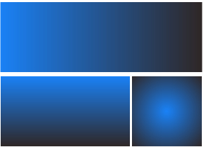
WebKit browsers paved the way with CSS based gradients. Now Firefox 3.6 is out and is supporting them as well, which makes using them for progressive enhancement all the more appealing. More good news, CSS3 gradients fall into the camp where you can specify fallbacks (i.e. images) so that browsers that don’t support them just use the image instead.
But wait… if you need to use an image anyway, why bother with declaring the gradient with CSS? That is kind of how I felt for a long time, but there is one important aspect that makes it worth it: browsers that support them don’t load the image fallback. One less HTTP Request = all the faster your site will load.
How it’s done
Cutting to the chase, here is how it’s done:
div {
            background-color: #1a82f7; /* fallback color */
            background-image: url(images/linear_bg_2.png); /* fallback image */
            background-image: -moz-linear-gradient(100% 100% 90deg, #2F2727, #1a82f7);
            background-image: -webkit-gradient(linear, 0% 0%, 0% 100%, from(#1a82f7), to(#2F2727));
}
Different syntax for different rendering engines
Mozilla (Firefox, Flock, etc)
Mozilla’s syntax is like this:
-moz-linear-gradient( [<point> || <angle>,]? <stop>, <stop> [, <stop>]* )
The simplest way to declare a gradient is to just list a comma separated list of colors. That will start at the top and gradient to the bottom with equidistant color stops for each color. In the demo code above, we use a point and an angle (90deg) to it go bottom-to-top instead. For radial gradients: -moz-radial-gradient
WebKit (Safari, Chrome, etc)
WebKit’s syntax is like this:
-webkit-gradient(<type>, <point> [, <radius>]?, <point> [, <radius>]? [, <stop>]*)
Trident (IE)
Trident’s syntax is like this:
filter: progid:DXImageTransform.Microsoft.gradient(GradientType=0, startColorstr=#1471da, endColorstr=#1C85FB);

-ms-filter: "progid:DXImageTransform.Microsoft.gradient (GradientType=0, startColorstr=#1471da, endColorstr=#1C85FB)";
Doing it by the numbers
The speed gained by losing an HTTP request, to me, is the biggest advantage. The more I learn about web performance it seems to me keeping those down is the #1 way to improve page load time. However there is another advantage to using CSS3 gradients, and that is that these gradients are created programatically through numbers. Need to adjust some colors? Just adjust some numbers. No need to bring a big image editing program into the picture. This makes maintaining the site easier, as well as opens up doors for adjusting values on-the-fly. I imagine JavaScript libraries will begin to get the ability to animate these values soon enough, which will be pretty darn cool.
Ooooh Stretchy
When using an image for a gradient, it is declared as a CSS background-image and then repeated (you can often get away with a 1px slice, which is very efficient, size wise). The result though is that a static portion of the background is gradientized, and any overflow to that is flat color. Sometimes that works perfectly. Sometimes though it would be cool if the gradient stretched the entire height or width of the box.
You might also like


Tags
accordion accordion menu animation navigation animation navigation menu carousel checkbox inputs css3 css3 menu css3 navigation date picker dialog drag drop drop down menu drop down navigation menu elastic navigation form form validation gallery glide navigation horizontal navigation menu hover effect image gallery image hover image lightbox image scroller image slideshow multi-level navigation menus rating select dependent select list slide image slider menu stylish form table tabs text effect text scroller tooltips tree menu vertical navigation menu