 Subscribe
 Follow Us
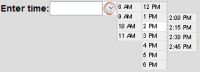
Slider from a Select Element With jQuery UI
 13 years ago
 13901
13901 2209
2209
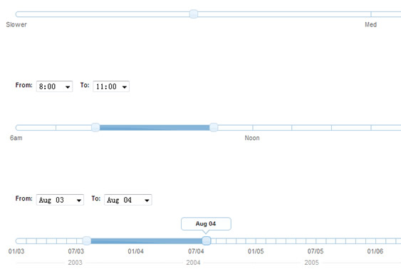
We've updated our popular jQuery UI selectToUISlider plugin with ARIA support, making the jQuery UI slider widget more accessible to users on assistive devices. The plugin uses progressive enhancement to replace an already-functional HTML select element with a jQuery UI slider control, and adds a number of features for both visual users and those on assistive technologies.
Now Updated for ARIA Support!
So what is ARIA Anyway?
WAI-ARIA, the Web Accessibility Initiative's Accessible Rich Internet Applications Suite, is a set of specifications for applying meaningful roles to web widgets, allowing them to be accessible to assistive technologies. You can find out more about ARIA here: WAI-ARIA Overview.
How we applied ARIA to the jQuery UI Slider
Following the guidelines for the slider role specified at WAI-ARIA Slider Role, this plugin now adds and manipulates the following attributes on each slider handle:
- role(slider) The ARIA role for a slider widget.
- aria-valuemin: The minimum value of the slider.
- aria-valuemax: The maximum value of the slider.
- aria-valuenow: The current value of the slider (automatically updates during slide).
- aria-valuetext: The current human-friendly value of the slider (same as tooltip, and automatically updates during slide).
- aria-labelledby: The ID of the label corresponding to the slider. We use the select element's corresponding label. The ID is generated if it's not in markup already.
- tabindex: tabindex="0" is added to the slider handle, bringing it into the natural tab order of a form.
- role of "application" to the slider's parent div: In our testing, this triggered our screenreader into the proper mode to meaningfully interact with the slider widget.
What we discovered along the way
A workaround for "aria-labelledby"
The ARIA spec provides the aria-labelledby attribute as a means of associating an ARIA widget with a label element on the page. By setting the value of the aria-labelledby attribute to the ID of a label, a screenreader should read that label's text aloud and associate the ARIA widget with its purpose.
While testing on Jaws and NVDA, we noticed that the aria-labelledby attribute was not being read aloud to the user as we expected. It seemed that while using "role=application" allowed the screenreader to recognize the markup as a slider widget, it also disabled the functionality of the aria-labelledby attribute. Unfortunately, we couldn't find a workaround, so we added a hidden span element inside each slider handle which acts in its place as a label for screenreader users. The text within the span reads "Slider control for" followed by the text contained in the form label on your page. In the case of the demo above, for instance, upon focusing on a slider handle, the screen reader will say "Slider control for Start Date", followed by instructions for using the control with keyboard commands.
Avoiding duplicate controls for screenreader users
Now that this slider component is fairly accessible on its own, we found that, while it might be useful for a sighted user to see both the selects and the slider on the page and see them interacting with one another, it may lead to a confusing experience to screenreader users to have duplicate controls on the page that do the same thing. To work around this problem, we think it's best to hide the original select element from all users (screenreader users too) by styling it with display: none; once the slider has been generated. You can either hide the select by adding a class to it and creating a style in your CSS for it, or by simply adding a call to the .hide(); method to the end of your selectToUISlider(); call, as shown below:
$('select').selectToUISlider().hide();
The hidden select menu will still be able to store the value of the slider, so you can submit your form as if the slider was never there.
Don't want to hide the select element? If you can not hide the select element from the interface, perhaps you could provide some text for all users instructing that they can use either the select menu or the slider to accomplish the task at hand.
Using this plugin
To use this widget, you'll need to include jQuery version 1.3+, and the jQuery UI 1.7+ Slider plugin (which requires jQuery UI Core as well). You can get all of the necessary code through the zip provided below.
The following code example demonstrates the basic way to use this plugin:
HTML
<select name="speed" id="speed">
  <option value="Slower">Slower</option>
  <option value="Slow">Slow</option>
  <option value="Med" selected="selected">Med</option>
  <option value="Fast">Fast</option>
  <option value="Faster">Faster</option>
</select>
JavaScript
$('select').selectToUISlider();
Developer Options
The following options are available in this plugin:
- labels: Number, number of labels to show. Labels are shown in even distribution from the center of the slider. Default is 3.
- tooltip: Boolean, show tooltips or not. Default is true.
- tooltipSrc: Specific String, tooltip text source from select menu. Available values are "value" or "text". Default is "text".
- labelSrc: Specific String, scale label text source from select menu. Available values are "value" or "text". Default is "value".
- sliderOptions: Object, accepts native jQuery UI slider options. Note:This plugin generates some of the native slider options. For the plugin to work as shown, do not override these options: step, min, max, range, slide, and values.
You might also like
Tags
accordion accordion menu animation navigation animation navigation menu carousel checkbox inputs css3 css3 menu css3 navigation date picker dialog drag drop drop down menu drop down navigation menu elastic navigation form form validation gallery glide navigation horizontal navigation menu hover effect image gallery image hover image lightbox image scroller image slideshow multi-level navigation menus rating select dependent select list slide image slider menu stylish form table tabs text effect text scroller tooltips tree menu vertical navigation menu