 Subscribe
 Follow Us
CSS3 3D Lightbox Image Gallery Animation
 12 years ago
 21100
21100 4901
4901
For the most part, the CSS3 tutorials and examples out there are a little dull. Of course there are some really great examples out there such as Benjamin de Cock’s CSS Playground but most others consist of a drop-shadow here and a few rounded corners there and nothing more. It’s time to start doing something more inspirational and useful at the same time.
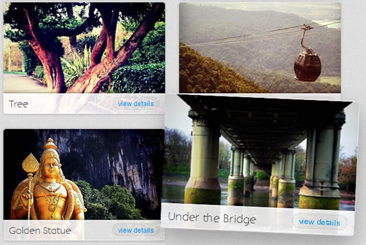
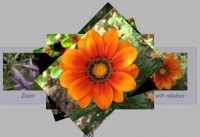
Having been inspired to get ‘Hardboiled‘, I’ve started playing around with a few cool techniques and exploring how to make the content accessible in less capable browsers while giving the best possible experiences to the ones that support the latest advancements in CSS. I’ve taken Benjamin’s CSS lightbox gallery and built upon by adding a few hover effects for the gallery grid itself and a 3D rotation for the lightbox content, all with the use of CSS.
The :target Pseudo-Class
First, let’s look at how the lightbox actually appears without JavaScript and only CSS with the use of the :target pseudo-class. If you’re writing CSS, you’re already using pseudo-classes as you’ll be familiar with :hover, :visited and :active.
You can link directly to a place on a page by adding a page anchor (#) with the ID of an element to the end of the URL:
http://url.com/#info1
You probably already knew that but what you may not know that you can affect the style of the element that is linked to via the :target pseudo-class. The following code would only be seen if a user clicks on a link with the target ID in:
#info1:target { background-color: red; }
In the case of the demo, we’re using any list item with an ID that has been ‘targeted’ to display the lightbox li[id]:target. Pretty standard CSS is then used to display the lightbox on the page, even with a dark transparent overlay through the use of opacity.
The Animation
If we leave it at that, it’s pretty much the same as a standard lightbox or modal window so we’ll set it apart with a fun animation. Here is how we’ve created the animation with the help of keyframes (WebKit only for now):
@-webkit-keyframes lightbox {
	0% { -webkit-transform: scale(5) rotateY(-270deg); }
	100% { -webkit-transform: scale(1) rotateY(0deg); }
}
On it’s own, the code above won’t do anything so we need to reference it against the element(s) we want to animate.
li[id]:target div { -webkit-animation: lightbox 0.75s cubic-bezier(0,0,0,1); }
As you can see, the animation is called lightbox and that’s the first part of the animation property, followed by the duration and the timing function.
It’s very simple. We’re telling the div (the white box with the blue heading in the demo) to transform 5 times bigger with scale(5) and from a rotated position of -270 degress with rotateY(-270deg). Then when the animation ends after 0.75s we want it to reset to it’s actual size and rotation. The browser will create the animation in between (which is affected but the cubic-bezier timing function above).
Less Capable Browsers
The good thing about this is that browsers that don’t support CSS3 will fallback to an accessible version without the fancy animations thanks to the use of the page anchor and Modernizr.
We do this by testing to see if CSS transforms aren’t supported and then adding CSS using the .no-csstransforms class. Why are we testing for a lack of CSS transforms and not CSS animation? It’s mainly to do with :target pseudo-class support which we can’t test for with Modernizr. It isn’t supported by older browsers, specifically IE8 and below but it is supported in all browsers with support for CSS transforms (as far as I know).
I’ve taken that one step further by creating an equal to or less than IE8 condition comment and <noscript> to make sure it is displayed the same in IE without JavaScript.
<!--[if lte IE 8]>
<noscript>
<style>
    #information li { overflow: visible; position: relative; margin: 0 auto; margin-bottom: 25px; background: #fff; width: 600px; padding: 30px; height: auto; list-style: none; }
    #information li div a.close { position: relative; background: transparent; padding: 0; color: #0090e2; font-size: 12px; font-weight: normal; left: 0; top: 0; }
</style>
</noscript>
<![endif]-->
We also want to replace the ‘x’ (the close button in the lightbox) with ‘Back to top’ text for lesser browsers to aid usability. We do that with a bit of jQuery and a test for no CSS transforms with Modernizr.
if (!Modernizr.csstransforms) {
	$(document).ready(function(){
		$(".close").text("Back to top");
	});
}
Issues
There are a couple of issues I need to point out:
- Double scrollbar when the lightbox content exceeds the height of the screen resolution
- Animation is possibly slow on older machines (needs more testing)
- Loads all content, whereas JavaScript solutions online load content when requested
- If a browser has JavaScript turned off and doesn’t support CSS transforms, no content will be displayed. This is a problem with using Modernizr as a JS solution for browser feature testing.
The article source:http://inspectelement.com/articles/create-a-css3-image-gallery-with-a-3d-lightbox-animation/
You might also like
Tags
accordion accordion menu animation navigation animation navigation menu carousel checkbox inputs css3 css3 menu css3 navigation date picker dialog drag drop drop down menu drop down navigation menu elastic navigation form form validation gallery glide navigation horizontal navigation menu hover effect image gallery image hover image lightbox image scroller image slideshow multi-level navigation menus rating select dependent select list slide image slider menu stylish form table tabs text effect text scroller tooltips tree menu vertical navigation menu