 Subscribe
 Follow Us
Glow Tabs with Box Shadow CSS3
 13 years ago
 24013
24013 5716
5716
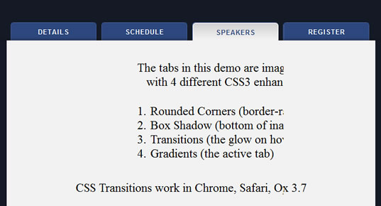
The “Glowing” Hover Effect
Most of the CSS and HTML is pretty straightforward, so I won’t bore you with those details, I’ll just focus on the two primary effects that make the tabs so visually appealing. First of all, I figured since it was a website related to the jQuery library, then they must be using jQuery for the “glow” effect. I’ve seen the effect before, and it’s usually done with JavaScript. In this case, they’re using CSS Transitions, and it’s dead simple to produce:
ul#navigation li a:link, ul#navigation li a:visited {
 /* some other CSS here... */
 -webkit-transition: background-color 0.2s linear;
 -moz-transition: background-color 0.2s linear;
 -o-transition: background-color 0.2s linear;
}

ul#navigation li a:hover {
 background-color: #5a87dd;
}
If you’re unfamiliar with how the above code works, here’s a CSS transitions 101 lesson: The -propietary-transition declaration is shown above in shorthand for 3 different rendering engines, and according to the Webkit website, here is what the three values represent:
transition-property — What property should animate, e.g., opacity.
transition-duration — How long the transition should last.
transition-timing-function — The timing function for the transition (e.g., linear vs. ease-in vs. a custom cubic bezier function).
The second section in the CSS gives the hover event for the navigation tab, and this combines to create the animated “glow” effect. If a browser doesn’t support the transition, then it just does a straight hover without the glow.
The Inner Shadow
This is the tough part, and it does unfortunately muck up our markup a little bit. But it’s a nice effect, and you could always use JavaScript to create the extra element to keep your markup clean. In the HTML, we add an extra empty list item at the end of the list, giving it a class of “shadow” and style it with the following:
ul#navigation li.shadow {
 width: 100%;
 height: 2px;
 position: absolute;
 bottom: -3px;
 left: 0;
 border: none;
 background: none;
 z-index: 2;
 -webkit-box-shadow: #111 0 -2px 6px;
 -moz-box-shadow: #111 0 -2px 6px;
 box-shadow: #111 0 -2px 6px;
}
The key parts of the above CSS are:
- The absolute positioning to place the element at the bottom of the tabs
- The full width, so the shadow spans the entire tab section
- The CSS3 box shadow
- The
z-indexvalue of “2″, which ensures the shadow is below the “selected” tab; the selected tab has az-indexof “3″; the inactive tabs are set toz-index“1″
You might also like

Tags
accordion accordion menu animation navigation animation navigation menu carousel checkbox inputs css3 css3 menu css3 navigation date picker dialog drag drop drop down menu drop down navigation menu elastic navigation form form validation gallery glide navigation horizontal navigation menu hover effect image gallery image hover image lightbox image scroller image slideshow multi-level navigation menus rating select dependent select list slide image slider menu stylish form table tabs text effect text scroller tooltips tree menu vertical navigation menu