 Subscribe
 Follow Us
Very Simple jQuery Tabs
 12 years ago
 61376
61376 15383
15383
The tab system very simple, very light and especially with a more elaborate visual transition that pass strict tab to tab. The result is a small plugin home simple to manage tabs with jQuery.
Here are the specifications:
Simple to implement
Easy Styling with CSS
Can re-display a tab depending on a parameter passed by $ _GET method
The HTML part
Html structure consists of a global container (id "tabsholder"), which oversees two main elements: The tabs, for which we use a list of "ul", container and content boxes with a tag "div".
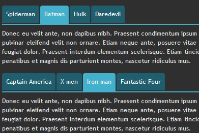
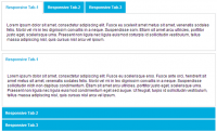
<!-- Tabs -->
<div id="tabsholder">
<ul class="tabs">
<li id="tab1">Spiderman</li>
<li id="tab2">Batman</li>
<li id="tab3">Hulk</li>
<li id="tab4">Daredevil</li>
</ul>
<div class="contents marginbot">
<div id="content1" class="tabscontent">
Contenu...
</div>
<div id="content2" class="tabscontent">
Contenu...
</div>
<div id="content3" class="tabscontent">
Contenu...
</div>
<div id="content4" class="tabscontent">
Contenu...
</div>
</div>
</div>
<!-- /Tabs -->
CSS
 For now the layout is a bit scattered, apply the following styles:
ul.tabs {
width:100%;
overflow:hidden;
}

ul.tabs li {
list-style-type:none;
display:block;
float:left;
color:#fff;
padding:8px;
margin-right:2px;
border-bottom:2px solid #2f2f2f;
background-color:#1f5e6f;
-moz-border-radius: 4px 4px 0 0;
-webkit-border-radius: 4px 4px 0 0;
cursor:pointer;
}

ul.tabs li:hover {
background-color:#43b0ce;
}

ul.tabs li.current {
border-bottom:2px solid #43b0ce;
background-color:#43b0ce;
padding:8px;
}

.tabscontent {
border-top:2px solid #43b0ce;
padding:8px 0 0 0;
display:none;
width:100%;
text-align:justify;
}
Detail a bit styles:
The tab container is assigned a size of 100% and overflow: hidden to avoid duplication of floating as we shall see below that the evidence "li" will all be floating (float: left).
ul.tabs {
width:100%;
overflow:hidden;
}
The tabs themselves, tag "li" are floating (float: left), block type, style no particular list (list-style-type: none) and are applied on a rounded top corners for a more nice (except IE of course).
Note that the right margin (margin-right: 2px) and the bottom border (border-bottom: 2px) have the same value to balance the space left / right / bottom tabs.
The color of the bottom border (border-bottom: 2px solid # 2f2f2f) is also important because it is the same as the background color of "body" to give the impression that the tabs are not selected are down compared to the one who is.
We also apply a cursor: pointer so that the cursor changes appearance during the rollover ...
ul.tabs li {
list-style-type:none;
display:block;
float:left;
color:#fff;
padding:8px;
margin-right:2px;
border-bottom:2px solid #2f2f2f;
background-color:#1f5e6f;
-moz-border-radius: 4px 4px 0 0;
-webkit-border-radius: 4px 4px 0 0;
cursor:pointer;
}
Precisely, during a rollover, the color of the tabs is the color of the selected tab ...
ul.tabs li:hover {
background-color:#43b0ce;
}
The selected tab is assigned a different color background to be the same for the color of its border demarcation ensuring low compared to other tabs. Note that the class ". Current" will be applied only via jQuery.
ul.tabs li.current {
border-bottom:2px solid #43b0ce;
background-color:#43b0ce;
padding:8px;
}
The two important things about the container contents are along the same color as the selected tab and display: none, ie none of them are visible, jQuery provides the reappearance of the necessary elements.
.tabscontent {
border-top:2px solid #43b0ce;
padding:8px 0 0 0;
display:none;
width:100%;
text-align:justify;
}
The fun part, the jQuery plugin
(function($) {
	$.fn.tytabs = function(options) {
		var defaults = {
			prefixtabs:"tab",
			prefixcontent:"content",
			classcontent:"tabscontent",
			tabinit:"1",
			catchget:"tab",
			fadespeed:"normal"
		},
		opts = $.extend({}, defaults, options);
		// iterate and reformat each matched element
		return this.each(function() {
			var obj = $(this);
			opts.classcontent = "." + opts.classcontent;
			opts.prefixcontent = "#" + opts.prefixcontent;
			function showTab(id){
				// Contre les stress-click
				$(opts.classcontent, obj).stop(true, true);
				var contentvisible = $(opts.classcontent + ":visible", obj);
				if(contentvisible.length > 0) {
					contentvisible.fadeOut(opts.fadespeed, function(){
						fadeincontent(id)
					});
				} else {
					fadeincontent(id)
				}
				$("#" + opts.prefixtabs + opts.tabinit).removeAttr("class");
				$("#" + opts.prefixtabs + id).attr("class", "current");
				// Update tab courant
				opts.tabinit = id;
			};
			// Fadein du contenu ciblé
			function fadeincontent(id){
				$(opts.prefixcontent + id, obj).fadeIn(opts.fadespeed);
			};
			// Click sur les onglets
			$("ul.tabs li", obj).click(function(){
				showTab($(this).attr("id").replace(opts.prefixtabs, ""));
				return false;
			});
			// Demande réaffich onglet via GET['tab']
			var tab = getvars(opts.catchget);
			// Demande de réaffichage d'un onglet ? Si oui vérif existence
			// Sinon tabinit est utilisé : Si introuvable = "1" par défaut
			showTab(((tab && $(opts.prefixcontent + tab).length == 1) ? tab : ($(opts.prefixcontent + opts.tabinit).length == 1) ? opts.tabinit : "1"));
		}); // end each
	};
	// Source : http://www.onlineaspect.com
	function getvars(q,s) {
        s = (s) ? s : window.location.search;
        var re = new RegExp('&'+q+'=([^&]*)','i');
        return (s=s.replace(/^\?/,'&').match(re)) ? s=s[1] : s='';
    };
})(jQuery);
Read more:http://blog.carefordesign.com/?p=72
You might also like
Tags
accordion accordion menu animation navigation animation navigation menu carousel checkbox inputs css3 css3 menu css3 navigation date picker dialog drag drop drop down menu drop down navigation menu elastic navigation form form validation gallery glide navigation horizontal navigation menu hover effect image gallery image hover image lightbox image scroller image slideshow multi-level navigation menus rating select dependent select list slide image slider menu stylish form table tabs text effect text scroller tooltips tree menu vertical navigation menu