 Subscribe
 Follow Us
beautiful css3 and jQuery clock effect
 12 years ago
 15327
15327 4505
4505
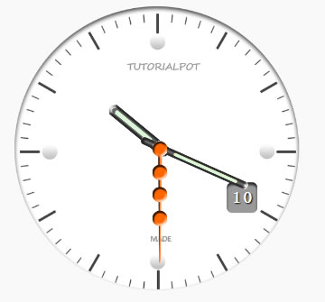
We will simply create a clock image in photoshop and provide different images for each hand. A jQuery script will update the rotate position every 1000 millisecond, therefore creating a rotating effect on each of the three hands.
The technique
Have a self executing function that runs every 1000 millisecond.
Each hand has a background image, the background rotate property is updated every second.
The markup
index.html
Sadly there is nothing to see here
jQuery script
script.js
$(document).ready(function() {

	//markup for the clock
			var clock = [
				'
<ul id="clock">',
				'
<li id="date"></li>

',
				'
<li id="seconds"></li>

',
				'
<li id="hours"></li>

',
				'
<li id="minutes"></li>

',
				'</ul>

'].join('');

		//fadein the clock and append it to the body
		  $(clock).fadeIn().appendTo('body');

			//an autoexecuting function that updates the clovk view every second
			//you can also use setInterval (function Clock (){})();
			(function Clock(){

		//get the date and time
              var date = new Date().getDate(),//get the current date
			   hours = new Date().getHours(),//get the current hour
               minutes = new Date().getMinutes();	//get the current minute
			   seconds = new Date().getSeconds(),//get the current second

              $("#date").html(date); //show the current date on the clock

			 var hrotate = hours * 30 + (minutes / 2);
			 //i.e 12 hours * 30 = 360 degrees

              $("#hours").css({
				  'transform'	:  'rotate('+ hrotate +'deg)',
				'-moz-transform'	:'rotate('+ hrotate +'deg)',
				'-webkit-transform'	:'rotate('+ hrotate +'deg)'
				  });

			  var mrotate = minutes * 6; //degrees to rotate the minute hand

              $("#minutes").css({
				'transform'	:  'rotate('+ mrotate +'deg)',
				'-moz-transform'	:'rotate('+ mrotate +'deg)',
				'-webkit-transform'	:'rotate('+ mrotate +'deg)'
				  });

              var srotate = seconds * 6;//for the rotation to reach 360 degrees
			  //i.e 60 seconds * 6 = 360 degrees.

              $("#seconds").css({
				 'transform'	:  'rotate('+ srotate +'deg)',
				'-moz-transform'	:'rotate('+ srotate +'deg)',
				'-webkit-transform'	:'rotate('+ srotate +'deg)'
				  });

             //a call to the clock function after every 1000 miliseconds
			  setTimeout(Clock,1000);
			 })();
        });
The markup is delivered by our script and appended to the body of our html with a fadeIn effect.
The rotate property of each hand is updated every second.
The clock also displays the current date.
The trivial part here may be the hrotate property:
Breakdown
var hrotate = hours * 30 + (minutes / 2);
Since rotation should be 360 degrees and there are 12 hours in an analog clock.
From the above breakdown take hours = 10 and minute = 0 giving a final of 300 degrees that the hour hand will have rotated.
Styling
demo.css
#clock
{
	position: relative;
	width: 600px;
	height: 600px;
	list-style: none;
	margin: 20px auto;
	background: url('../images/clock.png') no-repeat center;

}
#seconds,
#minutes,
#hours
{
	position: absolute;
	width: 30px;
	height: 580px;
	left: 270px;
}
#date
{
	text-shadow:1px 2px 1px #000;
	position: absolute;
	top: 365px;
	color:#fff;
	right: 140px;
	font:30px/36px Acens;
	font-weight:bold;
	letter-spacing:3px;
}
#hours
{
	background: url('../images/hands.png') no-repeat left;
	z-index: 1000;
}
#minutes
{
	background: url('../images/hands.png') no-repeat center;
	width:25px;
	z-index: 2000;
}

#seconds
{
	background: url('../images/hands.png') no-repeat right;
	z-index: 3000;
}
A basic styling for the clock which is a background image and the hands which appear centered since the other half is invisible
Hope you find this clock useful
The article source:http://tutorialpot.com/2011/09/creating-a-css3-and-jquery-clock/
You might also like
Tags
accordion accordion menu animation navigation animation navigation menu carousel checkbox inputs css3 css3 menu css3 navigation date picker dialog drag drop drop down menu drop down navigation menu elastic navigation form form validation gallery glide navigation horizontal navigation menu hover effect image gallery image hover image lightbox image scroller image slideshow multi-level navigation menus rating select dependent select list slide image slider menu stylish form table tabs text effect text scroller tooltips tree menu vertical navigation menu