 Subscribe
 Follow Us
Pure CSS3 multiple Animated Buttons
 12 years ago
 17448
17448 4694
4694
Still hyped by the possibilities of CSS3, I want to share some CSS3 button experiments with you. The idea is to create some animated link elements with different styles, hover effects and active states.
The icons used in some of the examples are by webiconset.com and the symbol font is by Just Be Nice
We’ll go through every example and see how the HTML structure looks and what the styles for the normal, the hover and the active states are.
Please note that the animations/transitions will only work in browsers that support those CSS3 properties.
In order not to bloat the tutorial, I will not be using any CSS vendor prefixes. The downloadable files contain them, of course.
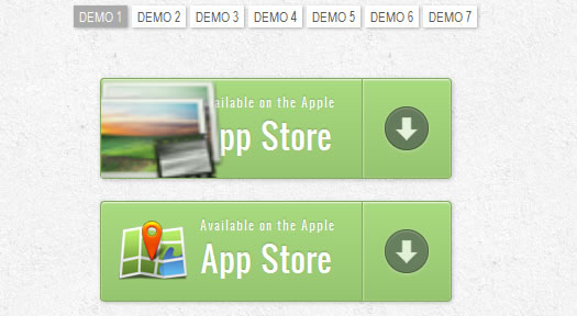
In this example we will create a big button with several details in it. It will have an icon, a main text, an arrow on the right side and a price that will only appear when we hover.
Markup
The structure is pretty straightforward: the icon will be an image and the other elements will be spans:
<a href="#" class="a-btn">
	<span class="a-btn-slide-text">$29</span>
	<img src="images/icons/1.png" alt="Photos" />
	<span class="a-btn-text"><small>Available on the Apple</small> App Store</span>
	<span class="a-btn-icon-right"><span></span></span>
</a>
CSS
In the style we will make sure that the right transitions are set on the element that we want to animate on hover. The price will be invisible by setting its opacity to 0. Applying mulitple box shadows will allow us to create realistic effects:
.a-btn{
    background: linear-gradient(top, #a9db80 0%,#96c56f 100%);
    padding-left: 90px;
    padding-right: 105px;
    height: 90px;
    display: inline-block;
    position: relative;
    border: 1px solid #80ab5d;
    box-shadow:
		0px 1px 1px rgba(255,255,255,0.8) inset,
		1px 1px 3px rgba(0,0,0,0.2);
    border-radius: 4px;
    float: left;
    clear: both;
    margin: 10px 0px;
    overflow: hidden;
    transition: box-shadow 0.3s ease-in-out;
}
.a-btn img{
    position: absolute;
    left: 15px;
    top: 13px;
    border: none;
    transition: all 0.3s ease-in-out;
}
.a-btn .a-btn-slide-text{
    position: absolute;
    font-size: 36px;
    top: 18px;
    left: 18px;
    color: #6d954e;
    opacity: 0;
    text-shadow: 0px 1px 1px rgba(255,255,255,0.4);
    transition: opacity 0.2s ease-in-out;
}
.a-btn-text{
    padding-top: 13px;
    display: block;
    font-size: 30px;
    text-shadow: 0px -1px 1px #80ab5d;
}
.a-btn-text small{
    display: block;
    font-size: 11px;
    letter-spacing: 1px;
}
.a-btn-icon-right{
    position: absolute;
    right: 0px;
    top: 0px;
    height: 100%;
    width: 80px;
    border-left: 1px solid #80ab5d;
    box-shadow: 1px 0px 1px rgba(255,255,255,0.4) inset;
}
.a-btn-icon-right span{
    width: 38px;
    height: 38px;
    opacity: 0.7;
    border-radius: 20px;
    position: absolute;
    left: 50%;
    top: 50%;
    margin: -20px 0px 0px -20px;
    border: 1px solid rgba(0,0,0,0.5);
    background: #4e5c50 url(../images/arrow_down.png) no-repeat center center;
    box-shadow:
        0px 1px 1px rgba(255,255,255,0.3) inset,
        0px 1px 2px rgba(255,255,255,0.5);
    transition: all 0.3s ease-in-out;
}
Read more:http://tympanus.net/codrops/2011/11/07/animated-buttons-with-css3/
You might also like
Tags
accordion accordion menu animation navigation animation navigation menu carousel checkbox inputs css3 css3 menu css3 navigation date picker dialog drag drop drop down menu drop down navigation menu elastic navigation form form validation gallery glide navigation horizontal navigation menu hover effect image gallery image hover image lightbox image scroller image slideshow multi-level navigation menus rating select dependent select list slide image slider menu stylish form table tabs text effect text scroller tooltips tree menu vertical navigation menu