 Subscribe
 Follow Us
Nice CSS3 buttons
 13 years ago
 13156
13156 2753
2753
It’s worth noting that if your using Internet explorer you’re not going to see all these effects as IE still doesn’t support CSS3. Compatible CSS3 browsers are, Safari, Chrome and FireFox 3+.
The Objective
We want to create a set of styles that are both cross browser compliant and degrade gracefully for non CSS3 compliant browsers. A button that is scaleable meaning that we can make it a variety of sizes and colours with ease.
The button style
This is the default class that is applied to each button on our page. We can customise a button is by adding a chain of CSS classes, this way we can set the colour and size. You’ll see below that we have an overlay.png background image. This gives us the gradient effect if your still conscious about IE6 you’ll need to use a PNG transparency hack to make 24 bit PNG’s render correctly.
Another feature with CSS3 is RGBA, This is the same as RGB but with an alpha layer allowing you to set the opacity of a colour. This allows us to easily change the background of our buttons containing div without us having to adjust the buttons style
[code language="css"]
.button, .button:visited {
background: #222 url(overlay.png) repeat-x;
display: inline-block;
padding: 5px 10px 6px;
color: #fff;
text-decoration: none;
-moz-border-radius: 6px;
-webkit-border-radius: 6px;
-moz-box-shadow: 0 1px 3px rgba(0,0,0,0.6);
-webkit-box-shadow: 0 1px 3px rgba(0,0,0,0.6);
text-shadow: 0 -1px 1px rgba(0,0,0,0.25);
border-bottom: 1px solid rgba(0,0,0,0.25);
position: relative;
cursor: pointer
}
[/code]
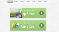
In the image below you can see that the background colour is different but the shadow around the edge of the button remains the same. If we had used a HEX colour value the left button on white would no doubt be something like #dedede and the button on black would be #333333. So you can see that using RGBA allows us much more flexibility when rendering shadows.
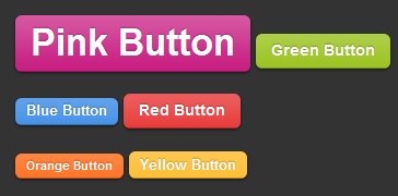
Button Size
Now we have the main structure of our button set on the .button class we can now go ahead and setup some instances of size. below we’ve set the classes .small .medium .large and .super. In all cases except for the .medium button we’ve just adjusted the font size and padding with the same button structure.
[code language="css"]
.small.button, .small.button:visited { font-size: 11px}
.button, .button:visited,
.medium.button, .medium.button:visited { font-size: 13px;
font-weight: bold;
line-height: 1;
text-shadow: 0 -1px 1px rgba(0,0,0,0.25);
}

.large.button, .large.button:visited { font-size: 14px;
padding: 8px 14px 9px; }

.super.button, .super.button:visited { font-size: 34px;
padding: 8px 14px 9px; }

[/code]
Button Colour
The final step is to specify a CSS class for whatever colour we want our button(s) to be. In this case we have a set of predefined colours but you can adjust or add to these as you like.
.pink.button, .magenta.button:visited { background-color: #e22092; }
.pink.button:hover { background-color: #c81e82; }
.green.button, .green.button:visited { background-color: #91bd09; }
.green.button:hover { background-color: #749a02; }
.red.button, .red.button:visited { background-color: #e62727; }
.red.button:hover { background-color: #cf2525; }
.orange.button, .orange.button:visited { background-color: #ff5c00; }
.orange.button:hover { background-color: #d45500; }
.blue.button, .blue.button:visited { background-color: #2981e4; }
.blue.button:hover { background-color: #2575cf; }
.yellow.button, .yellow.button:visited { background-color: #ffb515; }
.yellow.button:hover { background-color: #fc9200; }
Wrapping Up
I like to put all of this style in a separate style sheet and adjust it to fit my needs. It’s completely flexible so you can easily add or remove styles to suit your needs.
You might also like
Tags
accordion accordion menu animation navigation animation navigation menu carousel checkbox inputs css3 css3 menu css3 navigation date picker dialog drag drop drop down menu drop down navigation menu elastic navigation form form validation gallery glide navigation horizontal navigation menu hover effect image gallery image hover image lightbox image scroller image slideshow multi-level navigation menus rating select dependent select list slide image slider menu stylish form table tabs text effect text scroller tooltips tree menu vertical navigation menu