 Subscribe
 Follow Us
Very Beautiful CSS3 transition Animated Buttons
 12 years ago
 13268
13268 3643
3643
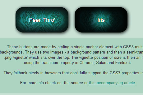
This demo used a patterned background and placed vignette-style .pngs over the top which are animated using transition.
The Set Up
Each example in the demo is a single <a> element, so the HTML is about as basic as it gets:
<a class="button" href="#">A Button!</a>
Next up, we add in some standard styling that will work in all browsers.
.button {
display: block;
width: 5em;
padding: 30px 40px;
text-align: center;
font-family: Arial, sans-serif;
font-size: 18px;
color: #fff;
text-decoration: none;
background: url(images/background.png) no-repeat center -100px;
}

.button:hover {
background: url(images/background.png) no-repeat center 0px;
}
The declaration positions the darker image in place first, then moves the brighter version into view on hover.
To finish the set up, we sprinkle on a bit of CSS3 goodness for those browsers that have joined the party.
.button {
display: block;
width: 5em;
padding: 30px 40px;
text-align: center;
font-family: Arial, sans-serif;
font-size: 18px;
color: #fff;
text-decoration: none;
text-shadow: 1px 1px 0px #000;
-moz-border-radius: 25px;
-webkit-border-radius: 25px;
-o-border-radius: 25px;
border-radius: 25px;
-moz-box-shadow: 2px 2px 10px #000;
-webkit-box-shadow: 2px 2px 10px #000;
-o-box-shadow: 2px 2px 10px #000;
box-shadow: 2px 2px 10px #000;
background: url(images/background.png) no-repeat center -100px;
}
Example One – A Simple Fade
The first example uses a technique similar to that used by Jonathan Snook, the difference being that we are using CSS3 instead of JQuery and layered, semi-transparent backgrounds instead of just one.
This is placed over the background using the CSS3 multiple background syntax. By moving the original background declaration to the top (rather than replacing it) means that browsers that don’t support multiple backgrounds will parse the first and simply ignore the second. For those that do, the second declaration overrides the first.
.button {

/* Fallback for browsers that don't support multiple bgs*/

background: url(images/background.png) no-repeat center -100px;

/* Style for the rest */

display: block;
width: 5em;
padding: 30px 40px;
text-align: center;
font-family: Arial, sans-serif;
font-size: 18px;
color: #fff;
text-decoration: none;
text-shadow: 1px 1px 0px #000;
-moz-border-radius: 25px;
-webkit-border-radius: 25px;
-o-border-radius: 25px;
border-radius: 25px;
-moz-box-shadow: 2px 2px 10px #000;
-webkit-box-shadow: 2px 2px 10px #000;
-o-box-shadow: 2px 2px 10px #000;
box-shadow: 2px 2px 10px #000;
background: url(images/linear-gradient.png) no-repeat 0px -400px, url(images/background.png) no-repeat center 0px;
}

.button:hover {

/* Fallback for browsers that don't support multiple bgs*/

background: url(images/background.png) no-repeat center 0px;

/* Hover style for the rest */

background: url(images/linear-gradient.png) no-repeat 0px 0px, url(images/background.png) no-repeat center 0px;

}
So, what’s happening here is that the dark part of the gradient is placed over background pattern, then the gradient is moved on hover to a more tranparent position, revealing more of the pattern underneath.
Now we have this set up, we can animate the change of gradient position using CSS3 transitions by adding this code on to the end of each rule:
-moz-transition: all 1s ease;
-webkit-transition: all 1s ease;
-o-transition: all 1s ease;
transition: all 1s ease;
read more:http://www.mightymeta.co.uk/1075/css3-animated-vignette-buttons/
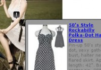
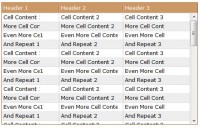
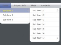
You might also like
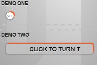
Tags
accordion accordion menu animation navigation animation navigation menu carousel checkbox inputs css3 css3 menu css3 navigation date picker dialog drag drop drop down menu drop down navigation menu elastic navigation form form validation gallery glide navigation horizontal navigation menu hover effect image gallery image hover image lightbox image scroller image slideshow multi-level navigation menus rating select dependent select list slide image slider menu stylish form table tabs text effect text scroller tooltips tree menu vertical navigation menu