 Subscribe
 Follow Us
Intelligent Accordion Effect(jQuery )
 14 years ago
  10953
10953  2364
2364
 n/a
n/a
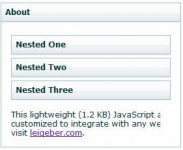
We’ve all seen the “accordion” type effect used on many Web 2.0 sites; however, many accordion scripts are heavy, make poor use of the libraries they are based on, and don’t handle things like ensuring that the accordion maintains a consistent height. In this tutorial, we will use the Prototype and Scriptaculous libraries to create a lightweight, intelligent accordion.
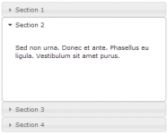
Step 1 - Begin with Basic Markup
To begin, we will create some simple HTML markup for our accordion:
<div id="test-accordion" class="accordion">
     <div class="accordion-toggle">Toggle 1</div>
     <div class="accordion-content">Content 1</div>
     <div class="accordion-toggle">Toggle 2</div>
     <div class="accordion-content">Content 2</div>
     <div class="accordion-toggle">Toggle 3</div>
     <div class="accordion-content">Content 3</div>
     <div class="accordion-toggle">Toggle 4</div>
     <div class="accordion-content">Content 4</div>
</div>
Step 2 - Add Some Style
Next, we need to add some style around our accordion to make it look like an accordion. To begin with, we’ll do a first pass of basic styling and then add more when it’s all working. There are also some additional
styles that need to be included to ensure that the accordion will display correctly as it is animating.
div#test-accordion{
    margin: 10px;
    border: 1px solid #aaa;}

div.accordion {
    position: relative; /* required for bounding--works around a "peculiarity" in Prototype */
}

div.accordion-toggle{
    position: relative; /* required for effect */
    z-index: 10;  /* required for effect */
    background: #eee;   /* required for effect--can be anything except "transparent" */
    cursor: pointer;
}

div.accordion-toggle-active{
    background: #fff;
}

div.accordion-content{
    overflow: hidden; /* required for effect */
    background: #aaa;
}
Step 3 - Create the Javascript Accordion Class
Prototype provides a wonderful framework for building classes in Javascript and we’ll use that functionality to build
our accordion class. This class will contain all the properties and methods of an accordion: the currently displayed
pane, the contents of the accordion, methods to expand and contract panes, and event handler methods to define what happens
when users take an action such as clicking. For now, we’ll set up the basic structure of the class as well as all the
properties and methods we’ll need:
var Accordion = Class.create({
    initialize: function(){
        this.accordion = null;           /* Stores a pointer to the the accordion element */
        this.contents = null;            /* Array of pointers to the headings and content panes of the accordion */
        this.options = null;             /* Allows user to define the names of the css classes */
        this.maxHeight = 0;              /* Stores the height of the tallest content pane */
        this.current = null;             /* Stores a pointer to the currently expanded content pane */
        this.toExpand = null;            /* Stores a pointer to the content pane to expand when a user clicks */
        this.isAnimating = false;        /* Keeps track of whether or not animation is currently running */

    },

    checkMaxHeight: function(){},         /* Determines the height of the tallest content pane */
    initialHide: function(){},            /* Hides the panes which are not displayed by default */
    attachInitialMaxHeight: function(){}, /* Ensures that the height of the first content pane matches the tallest */
    expand: function(el){},               /* Tells the animation function which elements to animate */
    animate: function(){},                /* Performs the actual animation of the accordion effect */
    handleClick: function(e){}            /* Determine where a user has clicked and act based on that click */

});
Step 4 - Initialize: Get Things Started
Prototype classes have a special method called initalize() which is a constructor; this means it acts when the user
creates a new instance object of that class. For any accordion, we need to know 2 things before we begin:
- The id of the accordion element.
- The default starting position of the accordion (if anything other than the first position)
So, we will need to allow our constructor to accept those two parameters. Additionally, our constructor must:
- Retrieve and store the accordion and its contents as pointers to those elements
- Set the user defined options
- Set the current expanded element
- Determine the maximum height we will use as the height for all of our content panes and apply it
- Hide the content panes which are not shown by default
- Add an event listener to the accordion to watch user clicks.
Here is the code for our initialize() method:
initialize: function(id, defaultExpandedCount) {
    if(!$(id)) throw("Attempted to initalize accordion with id: "+ id + " which was not found.");
    this.accordion = $(id);
    this.options = {
        toggleClass: "accordion-toggle",
        toggleActive: "accordion-toggle-active",
        contentClass: "accordion-content"
    }
    this.contents = this.accordion.select('div.'+this.options.contentClass);
    this.isAnimating = false;
    this.maxHeight = 0;
    this.current = defaultExpandedCount ? this.contents[defaultExpandedCount-1] : this.contents[0];
    this.toExpand = null;

    this.checkMaxHeight();
    this.initialHide();
    this.attachInitialMaxHeight();

    var clickHandler =  this.clickHandler.bindAsEventListener(this);
    this.accordion.observe('click', clickHandler);
}
Step 5 - Checking the Tallest Element
One of the requirements for our accordion is that it must scale so that even when the tallest content pane is expanded,
the overall accordion height will remain constant. To accomplish this goal, we will iterate through the content panes
determining which one is the tallest and set the maxHeight property accordingly:
checkMaxHeight: function() {
    for(var i=0; i<this.contents.length; i++) {
        if(this.contents[i].getHeight() > this.maxHeight) {
            this.maxHeight = this.contents[i].getHeight();
        }
    }
}
Step 6 - Hiding the Rest
Our accordion should only display the content pane specified as the current pane; all others should be hidden
by default. Additionally, we need to set these content pane’s height attribute to 0; this prevents the content pane from
briefly appearing fully expanded before properly animating.
initialHide: function(){
    for(var i=0; i<this.contents.length; i++){
        if(this.contents[i] != this.current) {
            this.contents[i].hide();
            this.contents[i].setStyle({height: 0});
        }
    }
}
Step 7 - Show the Default Content Pane
Now that we’ve hidden all but the default content pane, we need to make sure the default content pane displays correctly;
it’s heading should have the “active” style applied to it and it’s height should match the maxHeight property:
attachInitialMaxHeight: function() {
    this.current.previous('div.'+this.options.toggleClass).addClassName(this.options.toggleActive);
    if(this.current.getHeight() != this.maxHeight) this.current.setStyle({height: this.maxHeight+"px"});
}
Step 8 - Create the Event Handler
If you come from a traditional event handling background where we attach the event handler to each area we want clickable,
it may seem confusing that we are only attaching the handler to one element. We are using event
delegation. For those of you unfamiliar with the subject, I have written a brief
overview of event delegation which
will introduce you to the concept and why it is so important. That said, we need an intelligent event handler:
clickHandler: function(e) {
    var el = e.element();
    if(el.hasClassName(this.options.toggleClass) && !this.isAnimating) {
        this.expand(el);
    }
}
Step 9 - Start the Process
Now we can start the process of doing the accordion effect. We know the expand() method must take a parameter for the
element which was clicked. Using that parameter, the expand method determines which content pane to expand, and if it
is not already expanded, calls the animate() method to “do its magic!”
expand: function(el) {
    this.toExpand = el.next('div.'+this.options.contentClass);
    if(this.current != this.toExpand){
     this.toExpand.show();
        this.animate();
    }
},
Step 10 - Doing the “Dirty Work”
At this point, all of the pieces are in place; we know which content pane is currently displayed, we know which heading
the user has clicked, and we know which content pane the user has requested to be shown. Now, we must create the accordion
animation. For this, we will create an animate() method that will use the Scriptaculous Effect.Parallel class to render
the two animations together; and the Effect.Scale class to change the size of each content pane. The animate method will
perform these steps:
- Create an array that will be used to store our Effect.Scale objects
- Collect the parameters to pass to the Effect.Scale constructor for the content pane that will be shown and create
the object - Add that object to our array
- Collect the parameters to pass to the Effect.Scale constructor for the content pane that will be hidden and create
the object - Add that object to our array
- Create the Effect.Parallel object that will run our Effect.Scale objects is sync.
- Tell our Accordion object that we are animating
- Run the animations
- Clean up any styles left behind
- Tell our Accordion object that we are finished animating
animate: function() {
    var effects = new Array();
    var options = {
        sync: true,
        scaleFrom: 0,
        scaleContent: false,
        transition: Effect.Transitions.sinoidal,
        scaleMode: {
            originalHeight: this.maxHeight,
            originalWidth: this.accordion.getWidth()
        },
        scaleX: false,
        scaleY: true
    };

    effects.push(new Effect.Scale(this.toExpand, 100, options));

    options = {
        sync: true,
        scaleContent: false,
        transition: Effect.Transitions.sinoidal,
        scaleX: false,
        scaleY: true
    };

    effects.push(new Effect.Scale(this.current, 0, options));

    new Effect.Parallel(effects, {
        duration: 0.5,
        fps: 35,
        queue: {
            position: 'end',
            scope: 'accordion'
        },
        beforeStart: function() {
            this.isAnimating = true;
            this.current.previous('div.'+this.options.toggleClass).removeClassName(this.options.toggleActive);
            this.toExpand.previous('div.'+this.options.toggleClass).addClassName(this.options.toggleActive);
        }.bind(this),
        afterFinish: function() {
            this.current.hide();
            this.toExpand.setStyle({ height: this.maxHeight+"px" });
            this.current = this.toExpand;
            this.isAnimating = false;
        }.bind(this)
    });
}
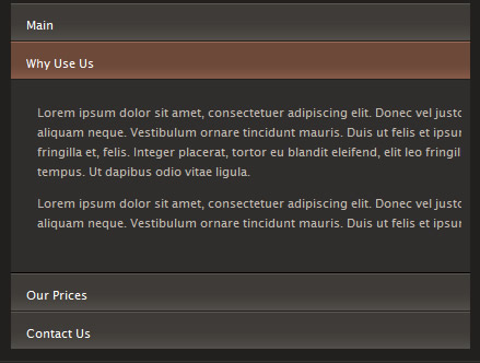
Step 11 - Adding Some More Style
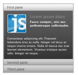
At this point we have a decent looking accordion, which you can see in action here. But with a little CSS we can make it all look much more spectactular. So first we create a quick Photoshop mockup so we have a rough idea of how it should all look.
body {
 padding: 130px 50px 50px 50px;
 background: #252422 url(../img/logo.gif) no-repeat;
 background-position: 60px 40px;
 font-family: "Lucida Grande", "Lucida Sans Unicode", Arial, Sans-serif;
 font-size: 11px;
 line-height: 18px;
}

div#test-accordion{
 border: 1px solid #343230;
 background-color: #21201f;
 padding: 10px;
}

div.accordion {
 position: relative; /* required for bounding */http://net.tutsplus.com/wp-admin/users.php
 width: 800px;
}

div.accordion-toggle{
 position: relative; /* required for effect */
 z-index: 10;  /* required for effect */
 background: #3f3c38 url(../img/off.jpg) repeat-x;
 background-position: bottom;
 color: #fff;
 cursor: pointer;
 margin-bottom: 1px;
 padding: 9px 14px 6px 14px;
 border-top: 1px solid #5d5852;
}

div.accordion-toggle:hover, div.accordion-toggle-active{
 background-image: url(../img/on.jpg);
 background-color: #6d493a;
 border-top: 1px solid #a06b55;
}

div.accordion-content{
 overflow: hidden; /* required for effect */
 background: #302e2c;
 color: #c4bab1;
 border-bottom: 1px solid #000;
}

div.accordion-content p{
margin: 9px 24px 6px 24px;
}
Well done!
You might also like
Tags
accordion accordion menu animation navigation animation navigation menu carousel checkbox inputs css3 css3 menu css3 navigation date picker dialog drag drop drop down menu drop down navigation menu elastic navigation form form validation gallery glide navigation horizontal navigation menu hover effect image gallery image hover image lightbox image scroller image slideshow multi-level navigation menus rating select dependent select list slide image slider menu stylish form table tabs text effect text scroller tooltips tree menu vertical navigation menu