 Subscribe
 Follow Us
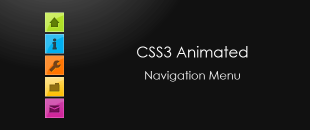
Minimalistic Navigation Menu with CSS3
 14 years ago
 30199
30199 6316
6316
Today we are making something practical – a simple CSS3 animated navigation menu
The XHTML
The menu is organized as an unordered list. This is the most suitable structure for a menu, as it provides an easy way to style the menu links and is semantically correct.
demo.html
<ul id="navigationMenu">
    <li>
     <a class="home" href="#">
            <span>Home</span>
        </a>
    </li>

    <li>
     <a class="about" href="#">
            <span>About</span>
        </a>
    </li>

    <li>
      <a class="services" href="#">
            <span>Services</span>
         </a>
    </li>

    <li>
     <a class="portfolio" href="#">
            <span>Portfolio</span>
        </a>
    </li>

    <li>
     <a class="contact" href="#">
            <span>Contact us</span>
        </a>
    </li>
</ul>
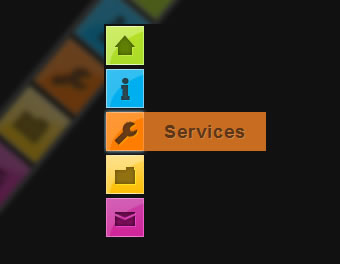
Inside each li we have a hyperlink with a span inside it. By default these spans are hidden, and are only shown when you hover over the link. Each link has a unique class name, which is used to give it a unique background and style the inner span, as you will see in a moment.
The CSS
Once we have the basic structure in place, we can now move to creating the fancy CSS3 effects and styling. This works even on browsers, which do not support CSS3 transition animations (all browsers except Chrome, Safari and Opera, at the moment of this writing) albeit with less glitter. The menu is even perfectly usable in browsers as old as IE6.
styles.css – Part 1
*{
 /* A universal CSS reset */
 margin:0;
 padding:0;
}

body{
 font-size:14px;
 color:#666;
 background:#111 no-repeat;

 /* CSS3 Radial Gradients */
 background-image:-moz-radial-gradient(center -100px 45deg, circle farthest-corner, #444 150px, #111 300px);
 background-image:-webkit-gradient(radial, 50% 0, 150, 50% 0, 300, from(#444), to(#111));

 font-family:Arial, Helvetica, sans-serif;
}

#navigationMenu li{
 list-style:none;
 height:39px;
 padding:2px;
 width:40px;
}
For the styling of the body background, I first supplied a background color, which acts as a fallback, and then added two CSS3 radial gradients (for Firefox and Chrome/Safari respectfully) as background images. If the visitor’s browser does not support gradients, it will just ignore the rules and go with the plain background color.
You can see in the styles, that most of the rules are preceded by the id of the unordered list – #navigationMenu. This is to prevent collisions with the rest of your page styles, if you incorporate the menu into your site.
styles.css – Part 2
#navigationMenu span{
 /* Container properties */
 width:0;
 left:38px;
 padding:0;
 position:absolute;
 overflow:hidden;

 /* Text properties */
 font-family:'Myriad Pro',Arial, Helvetica, sans-serif;
 font-size:18px;
 font-weight:bold;
 letter-spacing:0.6px;
 white-space:nowrap;
 line-height:39px;

 /* CSS3 Transition: */
 -webkit-transition: 0.25s;

 /* Future proofing (these do not work yet): */
 -moz-transition: 0.25s;
 transition: 0.25s;
}

#navigationMenu a{
 /* The background sprite: */
 background:url('img/navigation.jpg') no-repeat;

 height:39px;
 width:38px;
 display:block;
 position:relative;
}

/* General hover styles */

#navigationMenu a:hover span{ width:auto; padding:0 20px;overflow:visible; }
#navigationMenu a:hover{
 text-decoration:none;

 /* CSS outer glow with the box-shadow property */
 -moz-box-shadow:0 0 5px #9ddff5;
 -webkit-box-shadow:0 0 5px #9ddff5;
 box-shadow:0 0 5px #9ddff5;
}
The CSS3 transition property is a really powerful one. It enables you to animate changes that occur on a element when a pseudo properties take effect. For example here, when the user moves their mouse over a navigation link, the :hover pseudo-property takes effect, showing the span which is otherwise hidden.
Without the definition of a transition property, this change is instantaneous. But with a transition we can animate it. Here we are telling the browser, that the duration of the animation is 250 milliseconds. You can optionally specify a list of specific properties to be animated instead of all of them.
Transitions are currently only supported in webkit based browsers (Safari and Chrome), but the next version of Firefox is also expected to support them, so we future-proof the script by specifying a -moz-transition.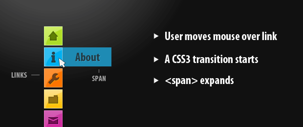
styles.css – Part 3
/* Green Button */

#navigationMenu .home { background-position:0 0;}
#navigationMenu .home:hover { background-position:0 -39px;}
#navigationMenu .home span{
 background-color:#7da315;
 color:#3d4f0c;
 text-shadow:1px 1px 0 #99bf31;
}

/* Blue Button */

#navigationMenu .about { background-position:-38px 0;}
#navigationMenu .about:hover { background-position:-38px -39px;}
#navigationMenu .about span{
 background-color:#1e8bb4;
 color:#223a44;
 text-shadow:1px 1px 0 #44a8d0;
}

/* Orange Button */

#navigationMenu .services { background-position:-76px 0;}
#navigationMenu .services:hover { background-position:-76px -39px;}
#navigationMenu .services span{
 background-color:#c86c1f;
 color:#5a3517;
 text-shadow:1px 1px 0 #d28344;
}

/* Yellow Button */

#navigationMenu .portfolio { background-position:-114px 0;}
#navigationMenu .portfolio:hover{ background-position:-114px -39px;}
#navigationMenu .portfolio span{
 background-color:#d0a525;
 color:#604e18;
 text-shadow:1px 1px 0 #d8b54b;
}

/* Purple Button */

#navigationMenu .contact { background-position:-152px 0;}
#navigationMenu .contact:hover { background-position:-152px -39px;}
#navigationMenu .contact span{
 background-color:#af1e83;
 color:#460f35;
 text-shadow:1px 1px 0 #d244a6;
}
In the last part of the styling, we specify 5 different designs for the navigation links. All the background images for the links are contained inside a single sprite file. They have a normal and a hover state one under another. When a hover occurs, the background is offset to show the appropriate version of the background image.
A PSD file is included in the downloadable archive, so you can customize the images as much as you like.
With this our minimalistic CSS3 navigation menu is complete!
You might also like


Tags
accordion accordion menu animation navigation animation navigation menu carousel checkbox inputs css3 css3 menu css3 navigation date picker dialog drag drop drop down menu drop down navigation menu elastic navigation form form validation gallery glide navigation horizontal navigation menu hover effect image gallery image hover image lightbox image scroller image slideshow multi-level navigation menus rating select dependent select list slide image slider menu stylish form table tabs text effect text scroller tooltips tree menu vertical navigation menu