A website that has an original look stands out from the rest. CSS buttons therefore are important. Perhaps they are even trivial to implement using basic CSS and jQuery events. However, creating any high-quality work requires a thorough examination of the ingredients.
This tutorial is a direct excerpt from my tutorial e-book. This is from Revision 3 that I am currently working on as of July 26th, 2012. The book contains all 3 parts of this tutorial. I decided to split it into 3 parts and share it with everyone for free on jQuery4U as a way to let people know about my work.
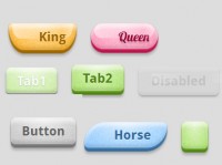
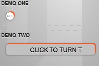
In this tutorial we will create custom CSS buttons that may look like this:
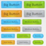
Or how about navigation bar buttons like these?
The buttons shown here are 3 times the original size.
These sets can be accomplished using simple CSS styles. But the most important ingredient of a good looking button is attention to detail. We can’t carelessly slap gradients and colors onto a button. There is something subtle about how the human eye picks up on the smallest details.
But first, a little history.
In the past, when it came to creating buttons our choices were limited to HTML’s <input> and <button> tags. Their extent ranged from using the default button rendered by the browser itself to using custom images as the background of the button element. In addition the programmer could simply wrap an <IMG> tag with an <A> tag and remove the border of the image by setting it’s border attribute to zero as in border = 0.
These techniques still work. But they have many flaws. For example on older Windows (that may still be in use today,) the default button would appear as a plain button in gray color. On the newer Windows operating systems the native button looks better, but it may not always fit the theme of the custom website or UI you are developing.
With text using basics font like Arial or Verdana which is almost the only thing you can change about the default HTML buttons, we are stuck with the limitations of the native button design.
But we are not in the 1990’s anymore. These shortcomings have since evolved. Modern buttons are created using CSS styles, jQuery and Ajax. The HTML and CSS elements of a button represent its visual style, of course. jQuery is used to dynamically change the appearance of the button depending on whether the mouse cursor is over or out of the button’s HTML element.
And finally Ajax is used to execute some function on the server once the button is clicked (like a PHP file that returns a value). Of course, the action that occurs when the button is clicked on could have been just a client-side JavaScript function. In fact, that is probably what most buttons are used for. However, linking button actions to Ajax events that run some type of a script is not uncommon. Buttons come in different types and flavors. What should happen when a button is clicked is usually determined within a function known as a callback function.
$(“div#my_button”).click( function() { /* Do something */ } );
Here the callback function is highlighted in light yellow. As you can see, it is passed to jQuery’s click method as the only argument.
Choosing the Base Element: DIV or A
Let’s create a rule. All elements that are buttons will inherit the CSS class “button.” In other words, in order for the web page to consider an HTML element a button we will apply the class named “button” to that element using the class attribute as in:
<a class = “button”> or <div class = “button”>
Does it have to be this way? Of course not. But you are the developer, you create these rules. For the purpose of this tutorial I chose to do it this way, but it’s certainly not a universal rule cast out of iron or stone for creating CSS buttons.
The button we are about to create is going to have a base element. We can use any blocking (commonly for buttons positioned with position: absolute) or inline elements (for buttons positioned with position: relative) such as <DIV> or <A> to represent our button.
Sometimes it makes sense to make the button out of the <A> tag (which creates a hyperlink) and simply re-style it into a button and mute HREF functionality. You may think that <A> is a convenient choice because by default the <A> tag is already clickable. However, this is not a good reason for choosing the <A> tag to create buttons at all. In fact the default clickability of the <A> tag should be muted entirely if we want it to serve as a CSS button.
Later on you will see that we will override all button events using jQuery’s .bind() method instead of using the href or onclick attributes. Doing it this way makes it easy to switch to DIV later on if in fact you do run into some type of a CSS style conflict that has to do with element tag name collisions.
Let’s compare the two HTML tags that can be used to spur the roots of HTML button creation:
<a href = “#” class = “button”>Okay</a>
<div class = “button”>Okay</div>
Normally, we should reserve the <A> tag specifically for hyperlinks to avoid clashing CSS styles between hyperlinks and buttons that may be added later on in our project.
We can, however create a special button and refer to it by its class name. Such a button can be created using the A.button {...} style as in <A href = “#“ class = “button“>Okay</A>) as long as we promise ourselves that all buttons will be created this way (to keep our CSS files organized and easier to work with).
Working on a serious web project your responsibility is to do everything in your power to ensure that the buttons created using the <A> tag will work the same and look the same in all browsers. While I try to maintain at least some cross-browser compatibility in my tutorials you can say that this tutorial is mainly limited to the Chrome, Firefox, Safari and the latest version of Internet Explorer browser.
Writing a different tutorial for each browser could interfere with the fundamental concepts presented here and I think one could write an entire book talking about the differences between browsers alone.
Keep Things Simple At The Root
We have just introduced several basic principles of building CSS buttons. Let's continue exploring this subject with emphasis on using the A tag as the button base element. This entire tutorial was inspired by the latest tutorials from my e-book you can get on my website.
Last night we left off our discussion with choosing either A or DIV tag for our buttons. But the A tag requires more attention before we can use it as a CSS button.
The DIV tags don’t have to deal with the HREF attribute. Aside from that the two tags will produce identical results. However, for this to be true within our script there are a few things you should know about the <A> tag.
Dealing with A and HREF
The <A> tag has the infamous HREF attribute which is used to specify the destination of the hyperlink. But we don’t want a button created using the <A> tag to go to a web page. In other words, we want our universal button to be able to respond to a click event. But we don’t want to do that using the onclick attribute either. After all, this is a jQuery tutorial and jQuery offers the convenience of using events which are accessible within a single point in our JavaScript code. Being able to access important code from a single point in our script will save time working on our application in the long term.
jQuery allows us to bind events to our buttons and this code will always be stored in the same place during initialization of our web page (let’s say within the $(document).ready event.) This will prevent us from having to jump from one onclick element to another throughout the entire HTML part of our web application. And when the time comes to deal with modifying button functionality in the future we can always refer to that single place in our code. And save ourselves a headache.
Let’s now talk more about the HREF attribute. As we just discussed we will be using jQuery events instead of onclick and HREF attributes. This means that we need to figure out a way to completely disable HREF.
You probably already know that when instead of providing a URL we can use the number symbol # followed by a custom anchor name (like #Paris) as HREF value. This will make the vertical scrollbar “jump” to the anchor location named “Paris” on your website. In other words
Clicking on this link: <A href = “#Paris”>Go to paris</A> the page will jump to a location marked by this code:
<A name = “Paris”>Travel to Paris</A>
We can simply use just the # symbol as in <a href = “#”>Return to top of the page</a> and this way, seeing how the anchor name is not provided at all, the web page will jump back to the very beginning.
This is the default hyperlink functionality. But we want this to be completely disabled for our button. We don’t want the button to go to any URLs or anchors. And we definitely don’t want our button to jump back to the very top of the page when it’s clicked. But we do want something to happen when a button is clicked using a jQuery event. We’ll discuss that momentarily. For now let’s disable the HREF functionality completely by doing one of the following:
1. Use javascript: return false; as the HREF value, as in href = “javascript: return false;“
2. Specify return: false as the value of the onclick attribute, as in onclick = “return false;“
3. Remove HREF attribute completely. Example <a class = “button“>Okay</a>
All 3 techniques will disable the default HREF function of the A tag.
You may have not expected technique 3 to work. But in my tests, it worked without a problem in Chrome, Firefox and Internet Explorer. In other words, by not specifying the HREF attribute at all we are telling HTML that this is just an anchor, not a hyperlink.
The behavior of the A tag depends on the presence of the HREF attribute within the tag. With it, it behaves like a hyperlink. Without it, it behaves like an anchor. Essentially by skipping HREF we are turning the anchor into a button, not the hyperlink.
The cursor pointer icon is also dependent on the existence of HREF attribute within a tag. When you hover over the HREF-less tag with your mouse it will no longer turn into a proper pointer cursor. It will turn into a text-selection cursor. But that’s not a problem. We can re-add the correct mouse pointer cursor back again by forcing the CSS style on our buttons as in:
A.button { cursor: pointer; } /* Getting the mouse pointer back into a HREF-less A */
That works. But wait. Let’s take care of one more thing. The <A> tag used for buttons might still be rendered as a hyperlink. This means it will display an underline text decoration under the button’s name which is the text printed inside the button. This of course wouldn’t happen with a DIV. But in order to prevent that from happening in an A tag, let’s also remove the text decorations by enforcing the following CSS style on all buttons whose class is “button”:
A.button { text-decoration: none; }
Once we handle the HREF tag by applying the aforementioned CSS styles to our A-tag based buttons we are pretty much left with the equivalent of a DIV tag. At this point this stripped down A tag will behave in the same way as a DIV-based button would.
From this moment on, given that we understand the changes we just made to the A tag, we can continue the discussion of creating custom buttons in such way that would apply to both the A and the DIV tags equally in the same exact way.
Choosing the DIV tag as the base element for our buttons saves us from having to deal with “preparing” the A tag for turning it into a button. Which tag you will use in your web application for creating CSS buttons is up to you. Just make sure that you stick to one tag to avoid complications later on.
Whichever tag you will use to create your buttons, one thing is clear. We will simply use the jQuery’s .click(...) method or “bind” the click action using the .bind(...) method to the anonymous callback function that will execute the code when the button is clicked.
I think we are equipped withe enough knowledge to start experimenting with the code.
Let’s walk through the process step by step and create a few buttons. First, we need to determine the HTML and CSS. We already discussed that the button will be defined using either the A or DIV elements. Either way, notice the class=”button” is present.
<A class = “button”>Okay</A>
<A class = “button”>Cancel</A>
<A class = “button”>Delete</A>
Alternatively, you can use the DIV tag. Notice the abscence of onclick attribute in either case.
<DIV class = “button”>Okay</ DIV>
<DIV class = “button”>Cancel</ DIV>
<DIV class = “button”>Delete</ DIV>
Button CSS Styles
Now let’s write the CSS. To add interactivity to our button we want to have at least 3 different CSS styles for mouseover, mouseout and mousedown events.
Default Style
First we will need to determine the main CSS style which will describe the color, border style and the gradient of the button. This is the default style that will be applied to all buttons:
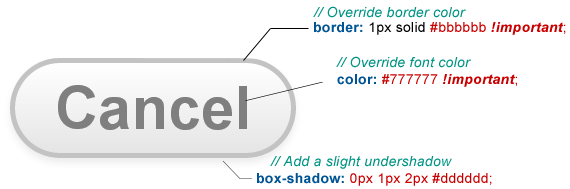
The button displayed here is several times larger for clarity. It's actually quite small and the border is only 1px. But this way we can see which CSS code refers to which part of the button.
We have just talked about the A tag and determined the default style of our CSS buttons. We can now complete our discussion with the final part of this tutorial which talks about the implementation of jQuery mouse events. You will also be given the complete source code for the buttons at the very bottom of this article.
Our goal is to match the button with the theme of the rest of the website. That’s entirely up to you and your sense of design. Let’s take a look at how border-radius can change the appearance or “feel” of the entire button.
Aside from the three examples above using border-radius that is far greater than half of the button’s height will result in an angle that makes a perfect circle, making both sides of the button perfectly round. That’s why in the Default Style we started with I set border-radius to the value of 32px. Half of our button’s height is far less than that because it’s just an A element. But if we provide a value that is larger than half of the height of the HTML element the roundness of the button will reach its maximum and stop there, looking like half of a perfect circle.
Button style is a personal choice. You can change the border-radius value to anything you want. Simply experiment with different values until you achieve something that looks good.
On Hover
When we hover the mouse pointer over the button, we want the button to change its appearance. One of the best ways to achieve this subtle effect is by slightly changing the color of the border, the font color and adding an outset shadow using the box-shadow property:
The .buttonOn class does not need to define all of the values of the Default Class because it will simply inherit all of them from A.button. What we need to do is to overwrite some of the values. I indicated new box-shadow property and the overwritten properties in red color.
The new color #bbbbbb is probably not very far from #cccccc of the original button. But you have to believe me that these subtle adjustments make the experience of using the button feel much more elegant.
The idea is to apply subtle changes. It is therefore a good habit to avoid changing style properties from one extreme to another just because we have hovered the mouse cursor over the button. The same goes for the font color. We apply a subtle, almost invisible change on hover.
Pressed Down
And finally we need a third style that is applied to a button when the mouse button is pressed down. I have experimented with an inverse gradient. However, the button in this state looked much more elegant if I simply made the background a solid gray color.
After conducting a few CSS experiments I have determined that the optimal styles for all three states should look close to something compared to what you are seeing below. So far we have arrived at these three styles:
Of course, we don’t have to stop here. You can continue applying further changes to match the buttons with the theme of your website. But this is a very good base to start with.
So far, we have briefly discussed the CSS code for creating three different button states. I even mentioned the linear-gradient property in the very first example. But even though the CSS property linear-gradient is a WC3 standard, it will not work in Chrome.
I wanted to find a way to easily create gradients without having to define solutions that worked in all browsers by hand. Moreover, I needed a solution that would produce the same results in all browsers. After a quick Google search, I found what I was looking for.
The CSS code gradient for the background of the buttons was created using this extremely powerful online CSS gradient tool. It makes sure the gradient looks the same in all browsers. In addition, you can simply copy and paste the generated code into your CSS file.
Instead of cluttering the page with the source code listing for the entire CSS, let me give you a link to the actual button.css file which describes the styles we have discussed in this section.
Download buttons.css
Now that we have A.button, .Hover and .Pressed defined we can use jQuery to program the logic of our buttons. We have discussed jQuery events earlier in the book. But in addition to events we will use jQuery’s methods .addClass and .removeClass to dynamically add and remove the CSS classes we have just created when a mouse event (such as mouseover) occurs.
Attaching Mouse Events to the Buttons
Let’s take a look at a very simple jQuery event system that will switch the CSS classes of our buttons depending on whether the mouse is in over, out, pressed, and released state.
$(document).ready( function() {
// What should happen to all .button elements when the mouse is over the element?
$(“.button“).mouseover( function() {
// Add .Hover
$(this).addClass(“Hover”);
});
// What should happen to all .button elements when the mouse is outside of the element?
$(“.button”).mouseout( function() {
// Remove .Hover and also remove .Pressed if it was present from a previous action.
$(this).removeClass(“Hover”).removeClass(“Pressed”);
}
// What should happen to all .button elements when the mouse button is pressed down?
$(“.button”).mousedown( function() {
// Add class .Pressed
$(this).addClass(“Pressed”);
}
// And finally, what happens when the mouse is released?
$(“.button”).mouseup(function()
{
// Remove class .Pressed
$(this).removeClass(“Pressed”);
});
}); // End of $(document).ready
We just linked the mouseover, mouseout, mousedown and mouseup events with the previously created CSS button styles and took care of all special cases. For example, notice that the mouseout event also removes class .Pressed from the button. This is necessary because when the mouse cursor leaves the button element from a pressed state it is important to return the button to its default style again. If we didn’t do that, the button would continue to look like it is still pressed even though the mouse curors is no longer on it.
Running this code inside $(document).ready(...) is important because we only need to attach these events once. We use .addClass and .removeClass accordingly inside of each callback.
From this moment on, you can physically change the CSS style of each button and the functionality will remain the same. If you need the buttons to look different than the ones in this example you should easily be able to modify them without losing the event functionality.
 Subscribe
 Follow Us
 11 years ago
 20374
20374 2298
2298


