 Subscribe
 Follow Us
Pure CSS3 Windows 7 start menu
 13 years ago
  20258
20258  4288
4288
 n/a
n/a
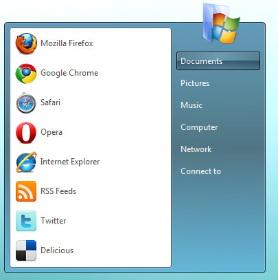
You can do with so little using CSS3. Many user interface elements that require images in order to have appropriate visual appearance now can be styled only with CSS3.
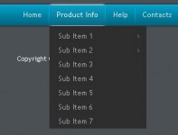
Container
The container named startmenu holds two unordered lists that act as menus. It has linear gradient with three color stops: light blue at the top, dark blue in the middle, and another shade of light blue at the bottom. Transparency is achieved using rgba() which has four parameters. The first three represent red, green and blue color values and the last one is opacity. Two borders are created with border and box-shadow properties.
#startmenu { border:solid 1px #102a3e; overflow:visible; display:inline-block; margin:60px 0 0 20px;
             -moz-border-radius:5px;-webkit-border-radius:5px; position:relative;
             box-shadow: inset 0 0 1px #fff; -moz-box-shadow: inset 0 0 1px #fff; -webkit-box-shadow: inset 0 0 1px #fff;
             background-color:#619bb9;
             background: -moz-linear-gradient(top, rgba(50, 123, 165, 0.75), rgba(46, 75, 90, 0.75) 50%, rgba(92, 176, 220, 0.75));
             background: -webkit-gradient(linear, center top, center bottom, from(#327aa4),color-stop(45%, #2e4b5a), to(#5cb0dc)); }
Programs menu
This unordered list has white background and two borders created with border and box-shadow properties. Its links, which contain icons and program names, uses gradients and box shadows in hover state.
#programs, #links {float:left; display:block; padding:0; list-style:none;}
#programs { background:#fff; border:solid 1px #365167; margin:7px 0 7px 7px;
            box-shadow: 0 0 1px #fff; -moz-box-shadow: 0 0 1px #fff; -webkit-box-shadow: 0 0 1px #fff;
            -moz-border-radius:3px;-webkit-border-radius:3px;}
#programs a { border:solid 1px transparent; display:block; padding:3px; margin:3px;
              color:#4b4b4b; text-decoration:none; min-width:220px;}
#programs a:hover {border:solid 1px #7da2ce;
             -moz-border-radius:3px; -webkit-border-radius:3px;
             box-shadow: inset 0 0 1px #fff; -moz-box-shadow: inset 0 0 1px #fff; -webkit-box-shadow: inset 0 0 1px #fff;
             background-color:#cfe3fd;
             background: -moz-linear-gradient(top, #dcebfd, #c2dcfd);
             background: -webkit-gradient(linear, center top, center bottom, from(#dcebfd), to(#c2dcfd));}
#programs a img {border:0; vertical-align:middle; margin:0 5px 0 0;}
Links menu
As in the previous case, links menu is quite simple. But the interesting part comes in hover state. Each link has horizontal gradient with three stops: dark blue on the left and right side, and a bit lighter blue in the middle. Now, unlike programs menu links, here, every links has inner <span> element which contains text. This span element has one more gradient - vertical linear gradient. It is transparent in the upper half and the lower part goes from very dark blue to almost transparent light blue. The combination of two transparent gradients gives exactly the same look as buttons in Windows 7 link menu.
#links {margin:7px; margin-top:-30px;}
#links li.icon {text-align:center;}
#links a {border:solid 1px transparent; display:block; margin:5px 0; position:relative;
              color:#fff; text-decoration:none; min-width:120px;}
#links a:hover {border:solid 1px #000;
             -moz-border-radius:3px; -webkit-border-radius:3px;
             box-shadow: 0 0 1px #fff; -moz-box-shadow: inset 0 0 1px #fff; -webkit-box-shadow: inset 0 0 1px #fff;
             background-color:#658da0;
             background: -moz-linear-gradient(center left, rgba(81,115,132,0.55), rgba(121,163,184,0.55) 50%, rgba(81,115,132,0.55));
             background: -webkit-gradient(linear, 0% 100%, 100% 100%, from(#517384), color-stop(50%, #79a3b8), to(#517384));
             }
#links a span { padding:5px; display:block; }
#links a:hover span  { background: -moz-linear-gradient(center top, transparent, transparent 49%, rgba(2,37,58,0.5) 50%, rgba(63,111,135,0.5));
            background: -webkit-gradient(linear, center top, center bottom, from(transparent), color-stop(49%, transparent),
            color-stop(50%, rgba(2,37,58,0.5)), to(rgba(63,111,135,0.5))); }
You might also like

Tags
accordion accordion menu animation navigation animation navigation menu carousel checkbox inputs css3 css3 menu css3 navigation date picker dialog drag drop drop down menu drop down navigation menu elastic navigation form form validation gallery glide navigation horizontal navigation menu hover effect image gallery image hover image lightbox image scroller image slideshow multi-level navigation menus rating select dependent select list slide image slider menu stylish form table tabs text effect text scroller tooltips tree menu vertical navigation menu