 Subscribe
 Follow Us
Stunning Sliding Door Effect with jQuery
 14 years ago
  14559
14559  3274
3274
 n/a
n/a
Basically, this is what it does:
- Grab all the div with qitem class, find the image and replace it with four DIVs (four corners)
- Each of the corner will have the same background image (grabbed from qitem class's child image element) but with different background position: top left, top right, bottom left and bottom right. It will still look like a whole image, however, the image is actually replaced by DIVd and divided into four portions.
- Mouse over and mouse out event will move the corners diagonally out and in according to the mouse event.
- Caption will be displayed after the corners have moved out.
- If user clicked on it, it will execute the link assign to the item.
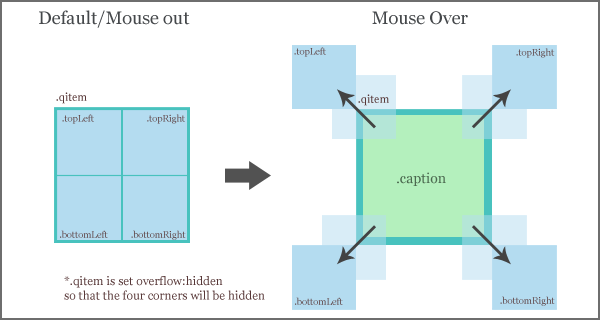
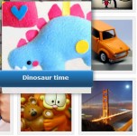
The following image illustrate how it works:
1. HTML
It's a good practise to keep HTML as simple as possible. HTML always can be simplified using CSS and Javascript. As a result from the simplification, This is the html for a single item. We can duplicate it into more than one.
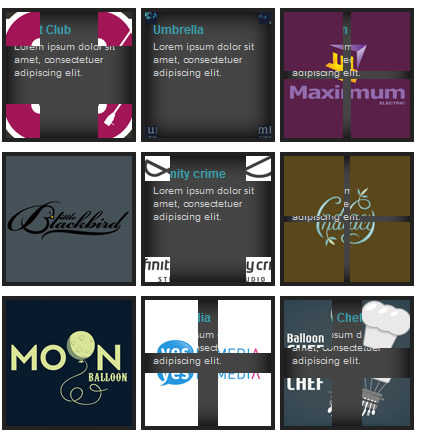
In the demo, we can see there are total of 9 items. Please be aware that, in this tutorial, we are using float:left and clear:both in CSS to create the multi column and rows. Make sure the floating is cleared to ensure it doesnt mess up your existing website layout.
<div class="qitem">
 <a href="http://www.google.com"><img src="1.gif" alt="Test 1" title="" width="126" height="126"/></a>
 <span class="caption"><h4>Night Club</h4><p>Lorem ipsum dolor sit amet, consectetuer adipiscing elit.</p></span>
</div>
2. CSS
In CSS section, it's quite simple. We have a class called qitem. qitem must be overflow:hidden to hide those four corners, float:left to create the milti rows and columns and cursor:hand/ cursor:pointer to let uses know they can click on it.
For caption, position:absolute is a must to se the z-index. Caption should be layered under the four corners
We need to set the generic setting for all the corners. We can do this in javascript, but it would be more efficient and simpler to do it with CSS. You see, the good thing in web development is, one problem can have different type of solutions.
body {
 font-family:arial;
}

.qitem {
 /* width and height must be even number */
 width:126px;
 height:126px;

 /* some styling for the item */
 border:4px solid #222;
 margin:5px 5px 5px 0;
 background: url('bg.gif') no-repeat;

 /* make sure the four divs are hidden after changing the position */
 overflow:hidden;

 /* absolute position enabled for children elements*/
 position:relative;

 /* display item in single row */
 float:left;

 /* hand symbol for ie and other browser */
 cursor:hand; cursor:pointer;
}

 .qitem img {
  border:0;
 }

 /* styling for caption, position absolute is a must to set the z-index */
 .qitem .caption {
  position:absolute;
  z-index:0;
  color:#ccc;
  display:block;
 }

  .qitem .caption h4 {
   font-size:12px;
   padding:10px 5px 0 8px;
   margin:0;
   color:#369ead;
  }

  .qitem .caption p {
   font-size:10px;
   padding:3px 5px 0 8px;
   margin:0;
  }


/* Generic setting for corners */
.topLeft, .topRight, .bottomLeft, .bottomRight {
 /* allow javascript to move the corners */
 position:absolute;
 background-repeat: no-repeat;
 z-index:200;
}

/* set the background position for different corners */
.topLeft {
 background-position: top left;
}

.topRight {
 background-position: top right;
}

.bottomLeft {
 background-position: bottom left;
}

.bottomRight {
 background-position: bottom right;
}

.clear {
 clear:both;
}
3. Javascript
Javascript is abit messy this time. But I have isolated all the configurable setting on the top to make it easier to change. Basically, this is what it does:
- When the document is ready, it counts all the value for all corners
- Using each() to loop through the the item, in the loop:
- Grab all the details: url, image path
- Remove the img element
- Append the four corners
- Set the background image (image path grabbed from img element) to all the corners
- Set the position to all the corners
- * Due to IE7, you need to make sure the image/qitem size is even number, so that the divided value is whole number. IE7 doesn't render fraction value properly.
- On mouse over event: Set correct values to all the corners and animate them so that the corners are moving away from the qitem.
- On mouse out event: reset all the corners and animate them so that the corners are moving back to where there were.
- On click: execute the link (grabbed from anchor element).
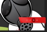
The following image illustrate the calculation:
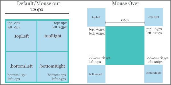
In the javascript below, we have a section for the calculation. If you look at the image above carefully, assume the item width is 126px, and values that we need to generate is 0px, 63px, -63px and 126px
Hence, (the item size we used in this tutorial is 126px)
- var neg = Math.round($('.qitem').width() / 2) * (-1);
(126 / 2) * (-1), neg = -63px - var pos = neg * (-1);
neg = -63px, pos = (-63) * -(1), pos = 63px - var out = pos * 2;
pos = 63px, pos = 63 * 2, pos = 126px
Now, we know all the mathematic calculations, how it works. It's time to combine everything into one piece!
$(document).ready(function() {

 //Custom settings
 var style_in = 'easeOutBounce';
 var style_out = 'jswing';
 var speed_in = 1000;
 var speed_out = 300;

 //Calculation for corners
 var neg = Math.round($('.qitem').width() / 2) * (-1);
 var pos = neg * (-1);
 var out = pos * 2;

 $('.qitem').each(function () {

  //grab the anchor and image path
  url = $(this).find('a').attr('href');
  img = $(this).find('img').attr('src');

  //remove the image
  $('img', this).remove();

  //append four corners/divs into it
  $(this).append('<div class="topLeft"></div><div class="topRight"></div><div class="bottomLeft"></div><div class="bottomRight"></div>');

  //set the background image to all the corners
  $(this).children('div').css('background-image','url('+ img + ')');

  //set the position of corners
  $(this).find('div.topLeft').css({top:0, left:0, width:pos , height:pos});
  $(this).find('div.topRight').css({top:0, left:pos, width:pos , height:pos});
  $(this).find('div.bottomLeft').css({bottom:0, left:0, width:pos , height:pos});
  $(this).find('div.bottomRight').css({bottom:0, left:pos, width:pos , height:pos});

 }).hover(function () {

  //animate the position
  $(this).find('div.topLeft').stop(false, true).animate({top:neg, left:neg}, {duration:speed_out, easing:style_out});
  $(this).find('div.topRight').stop(false, true).animate({top:neg, left:out}, {duration:speed_out, easing:style_out});
  $(this).find('div.bottomLeft').stop(false, true).animate({bottom:neg, left:neg}, {duration:speed_out, easing:style_out});
  $(this).find('div.bottomRight').stop(false, true).animate({bottom:neg, left:out}, {duration:speed_out, easing:style_out});

 },

 function () {

  //put corners back to the original position
  $(this).find('div.topLeft').stop(false, true).animate({top:0, left:0}, {duration:speed_in, easing:style_in});
  $(this).find('div.topRight').stop(false, true).animate({top:0, left:pos}, {duration:speed_in, easing:style_in});
  $(this).find('div.bottomLeft').stop(false, true).animate({bottom:0, left:0}, {duration:speed_in, easing:style_in});
  $(this).find('div.bottomRight').stop(false, true).animate({bottom:0, left:pos}, {duration:speed_in, easing:style_in});

 }).click (function () {

  //go to the url
  [removed] = $(this).find('a').attr('href');
 });

});
You might also like


Tags
accordion accordion menu animation navigation animation navigation menu carousel checkbox inputs css3 css3 menu css3 navigation date picker dialog drag drop drop down menu drop down navigation menu elastic navigation form form validation gallery glide navigation horizontal navigation menu hover effect image gallery image hover image lightbox image scroller image slideshow multi-level navigation menus rating select dependent select list slide image slider menu stylish form table tabs text effect text scroller tooltips tree menu vertical navigation menu