 Subscribe
 Follow Us
Apple-like Retina Effect With jQuery
 14 years ago
 16476
16476 2536
2536
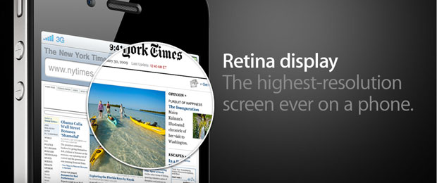
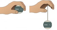
This is also the case with the latest version of their iPhone. But what I found interesting is the term they coined – “Retina display” and the promo image accompanying it.
What made me wonder is if it was possible to turn this static image into a fully functional “Retina effect” with only jQuery and CSS. This is exactly what we are doing today. So grab the demo files from the button above and read on.
UPDATE: Seems Apple folks have also liked the idea, and they’ve implemented it on apple.com.
Step 1 – XHMTL
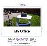
The markup for the effect is quite straightforward. You can see that we only have a number of divs and an image.
demo.html
<div id="main">

 <div id="iphone">
  <div id="webpage">
   <img src="img/webpage.png" width="499" height="283" alt="Web Page" />
   <div id="retina"></div>
  </div>
 </div>

</div>
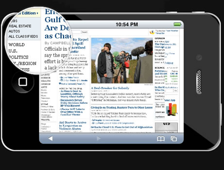
The #iphone div displays the iphone frame. Inside it is the #webpage div with the screenshot of the webpage. The screenshot is actually displayed at half its original size, as we are using the same image for both the small version (displayed in the iPhone) and big version, which is shown in the rounded tooltip.
Lastly we have the retina div, which is rounded with CSS3 and displays the big version of the webpage screeshot as its background as it is moved around with the mouse.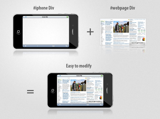
Step 2 – CSS
Moving to the CSS part of the tutorial. We are going to style the iphone, webpage and retina divs, so we make the awesome effect possible.
styles.css
#iphone{
 /* The iphone frame div */
 width:750px;
 height:400px;
 background:url('img/iphone_4G.png') no-repeat center center;
}

#webpage{
 /* Contains the webpage screenshot */
 width:499px;
 height:283px;
 position:absolute;
 top:50%;
 left:50%;
 margin:-141px 0 0 -249px;
}

#retina{
 /* The Retina effect */
 background:url('img/webpage.png') no-repeat center center white;
 border:2px solid white;

 /* Positioned absolutely, so we can move it around */
 position:absolute;
 height:180px;
 width:180px;

 /* Hidden by default */
 display:none;

 /* A blank cursor, notice the default fallback */
 cursor:url('img/blank.cur'),default;

 /* CSS3 Box Shadow */
 -moz-box-shadow:0 0 5px #777, 0 0 10px #aaa inset;
 -webkit-box-shadow:0 0 5px #777;
 box-shadow:0 0 5px #777, 0 0 10px #aaa inset;

 /* CSS3 rounded corners */
 -moz-border-radius:90px;
 -webkit-border-radius:90px;
 border-radius:90px;
}

#retina.chrome{
 /* A special chrome version of the cursor */
 cursor:url('img/blank_google_chrome.cur'),default;
}

#main{
 /* The main div */
 margin:40px auto;
 position:relative;
 width:750px;
}
By specifying an absolute positioning on the webpage div, we can apply the vertical and horizontal centering technique, effectively putting the webpage screenshot in the middle of the iphone frame.
The retina div is also assigned an absolute positioning, so it is possible to move it in the jQuery part of the tutorial by just specifying a top and left offsets. This div also has the webpage screenshot as its background (in its original size). Offsetting the background with the movement of the div creates the illusion that it magnifies the small screenshot below it.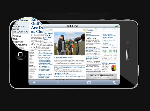
The retina div also has applied a border radius with a value of exactly half its width, which turns it into a perfect circle (at least in browsers which support the border-radius CSS3 property – Chrome, Safari, Opera & Firefox).
And finally we hide the mouse pointer by providing a blank cursor file (Google Chrome fails to render completely blank cursors, so we provide a special 1px white cursor for it – at least it is better than nothing). The Opera browser completely ignores custom cursors and there are no workarounds, so users using this browser might not enjoy the full experience.
Step 3 – jQuery
If you can remember, a few months ago we did a tutorial here at Tutorialzine, in which we used jQuery to create a photoshoot effect. This time we are using a similar technique to make the “retina effect”, as seen on Apple’s web site.
And since we have all the styling in place, it is a matter of some JavaScript coding with the help of the jQuery library.
script.js
$(document).ready(function(){

 /* This code is executed on the document ready event */

 var left = 0,
  top  = 0,
  sizes = { retina: { width:190, height:190 },
    webpage:{ width:500, height:283 } },
  webpage = $('#webpage'),
  offset = { left: webpage.offset().left, top: webpage.offset().top },
  retina = $('#retina');

 if(navigator.userAgent.indexOf('Chrome')!=-1)
 {
  /* Applying a special chrome curosor,
   as it fails to render completely blank curosrs. */

  retina.addClass('chrome');
 }

 webpage.mousemove(function(e){

  left = (e.pageX-offset.left);
  top = (e.pageY-offset.top);

  if(retina.is(':not(:animated):hidden')){
   /* Fixes a bug where the retina div is not shown */
   webpage.trigger('mouseenter');
  }

  if(left<0 || top<0 || left > sizes.webpage.width ||
   top > sizes.webpage.height)
  {
   /* If we are out of the bondaries of the
    webpage screenshot, hide the retina div */

   if(!retina.is(':animated')){
    webpage.trigger('mouseleave');
   }
   return false;
  }

  /* Moving the retina div with the mouse
   (and scrolling the background) */

  retina.css({
   left    : left - sizes.retina.width/2,
   top     : top - sizes.retina.height/2,
   backgroundPosition : '-'+(1.6*left)+'px -'+(1.35*top)+'px'
  });

 }).mouseleave(function(){
  retina.stop(true,true).fadeOut('fast');
 }).mouseenter(function(){
  retina.stop(true,true).fadeIn('fast');
 });
});
In the mousemove function, the current coordinates of the mouse are passed as e.pageX and e.pageY, but they are absolute with relation to the document. Subtracting the position offset of the website div, we end up with relative coordinates for the mouse, which are later used to position the retina div.
This, combined with the blank cursor we set up in the CSS part of the tutorial, creates the retina effect in pure JavaScript and CSS.
You might also like


Tags
accordion accordion menu animation navigation animation navigation menu carousel checkbox inputs css3 css3 menu css3 navigation date picker dialog drag drop drop down menu drop down navigation menu elastic navigation form form validation gallery glide navigation horizontal navigation menu hover effect image gallery image hover image lightbox image scroller image slideshow multi-level navigation menus rating select dependent select list slide image slider menu stylish form table tabs text effect text scroller tooltips tree menu vertical navigation menu