 Subscribe
 Follow Us
Amazing Webkit Image Hover Effects with CSS3
 13 years ago
 10301
10301 1960
1960
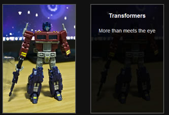
Image Shrink Effect
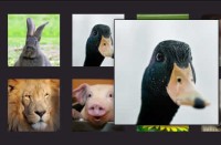
The image will shrink if you put your mouse pointer on top of it. It is achieved by using the -webkit-transform:scale(value) property.
The HTML
 <div id="demo-1" class="demobox">
 <img src="optimusprime.jpg"/>
</div>
The CSS
#demo-1 img {
 -webkit-transform: scale(1);
 -webkit-transition-timing-function: ease-out;
 -webkit-transition-duration: 500ms;
}
#demo-1 img:hover{
 -webkit-transform: scale(.5);
 -webkit-transition-timing-function: ease-out;
 -webkit-transition-duration: 500ms;
}
Notice how the HTML looks very simple. It’s just a simple <img/> tag but with webkit, you can achieve a very cool effect.
Fade Out Image Effect
On mouse hover, the image will fade out to 50% opacity smoothly.
The HTML
<div id="demo-2">
<img src="optimusprime.jpg"/>
</div>
The CSS
#demo-2 img {
opacity: 1;
-webkit-transition: opacity;
-webkit-transition-timing-function: ease-out;
-webkit-transition-duration: 500ms;
}
#demo-2 img:hover{
opacity: .5;
-webkit-transition: opacity;
-webkit-transition-timing-function: ease-out;
-webkit-transition-duration: 500ms;
}
Fade in Description Box Effect
When you hover your mouse over the image, a box will fade in smoothly with its title and description.
The HTML
<div id="demo-3">
 <img src="optimusprime.jpg"/>
 <div>
  <h3>Transformers</h3>
  <p>More than meets the eye</p>
 </div>
</div>
The CSS
#demo-3{position:relative;}
#demo-3 img{
opacity:1
-webkit-transition: opacity;
-webkit-transition-timing-function: ease-out;
-webkit-transition-duration: 500ms;
}
#demo-3 .details{
position:absolute;
top:0;
left:0;
opacity: 0;
-webkit-transition: opacity;
-webkit-transition-timing-function: ease-out;
-webkit-transition-duration: 500ms;
}

#demo-3 .details:hover{
opacity: .9;
-webkit-transition: opacity;
-webkit-transition-timing-function: ease-out;
-webkit-transition-duration: 500ms;
}
Image Slide Out Effect
The image is above the description box and when the mouse is hovered over the image, it will slide out revealing the description box.
The HTML
<div id="demo-4">
 <img src="optimusprime.jpg"/>
 <div>
  <h3>Transformers</h3>
  <p>More than meets the eye</p>
 </div>
</div>
The CSS
#demo-4{position:relative;}
#demo-4 img{
position:absolute;
top:0;
left:0;
-webkit-transition: margin-left;
-webkit-transition-timing-function: ease-in;
-webkit-transition-duration: 250ms;
}
#demo-4:hover img{
margin-left:200px;
}
#demo-4 .details{
position:absolute;
top:0;
left:0;
z-index:-1;
}
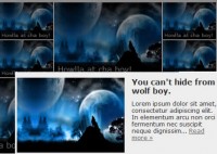
Slide In Box Effect
The description box will slide in on top of the image on mouse hover.
The HTML
<div id="demo-5">
 <img src="optimusprime.jpg"/>
 <div>
  <h3>Transformers</h3>
  <p>More than meets the eye</p>
 </div>
</div>
The CSS
#demo-5{position:relative;}
#demo-5 .details{
opacity: .9;
position:absolute;
top:0;
left:0;
margin-left:-200px;
-webkit-transition: margin-left;
-webkit-transition-timing-function: ease-in;
-webkit-transition-duration: 250ms;
}
#demo-5:hover .details{
margin-left:0;
}
Zoom in Box Effect
The description box will zoom out from the middle of the image when the image is triggered by mouse hover.
The HTML
<div id="demo-5">
 <img src="optimusprime.jpg"/>
 <div>
  <h3>Transformers</h3>
  <p>More than meets the eye</p>
 </div>
</div>
The CSS
#demo-6{
 position:relative;
 }
 #demo-6 img{
 position:absolute;
 top:0;
 left:0;
 z-index:0;
 }
 #demo-6 .details{
 opacity: .9;
 position:absolute;
 top:100;
 left:150;
 z-index:999;
 -webkit-transform: scale(0);
 -webkit-transition-timing-function: ease-out;
 -webkit-transition-duration: 250ms;
 }
 #demo-6:hover .details{
 -webkit-transform: scale(1);
 -webkit-transition-timing-function: ease-out;
 -webkit-transition-duration: 250ms;
 }
These examples are just a few things the Webkit engine can do. The question now is, can we use these on real world projects? Why, of course. We might just need a little work for browsers that doesn’t support these awesome transition effects.
You might also like
Tags
accordion accordion menu animation navigation animation navigation menu carousel checkbox inputs css3 css3 menu css3 navigation date picker dialog drag drop drop down menu drop down navigation menu elastic navigation form form validation gallery glide navigation horizontal navigation menu hover effect image gallery image hover image lightbox image scroller image slideshow multi-level navigation menus rating select dependent select list slide image slider menu stylish form table tabs text effect text scroller tooltips tree menu vertical navigation menu