 Subscribe
 Follow Us
a Dynamic Stack of Index Cards(CSS3)
 14 years ago
  15757
15757  4572
4572
 n/a
n/a
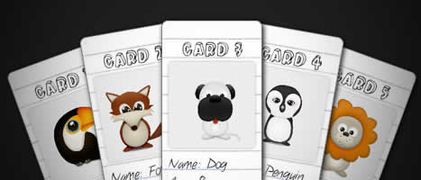
We will create a dynamic stack of index cards solely with HTML and CSS3 and use such CSS3 features as transform and transition (for the dynamic effects) and @font-face, box-shadow and border-radius (for the styling).
Let’s start with the simple HTML-markup, which consists of simple, unordered list, filled with random content.
<body>
    <div id="wrapper">
        <ul id="index_cards">
            <li id="card-1">
                <h3>Card 1</h3>
                <img src="images/t9tuqui_trans.png" height="130" width="130" alt="Toucan" />
                <p>Name: Toucan<br />
                Age: 5<br />
                Size: 50 cm<br />
                Weight: 600 g<br />
                Food: Fruit<br />
                Toucan lives in southern and central America and loves to fly around</p>
            </li>
            <li id="card-2">
                <h3>Card 2</h3>
                <img src="images/t9foxy_trans.png" height="130" width="130" alt="Fox" />
                <p>Name: Fox<br />
                Age: 3<br />
                Size: 70 cm<br />
                Weight: 5.5 kg<br />
                Food: Meat<br />
                Fox lives in the northern hemisphere and loves to play seek and hide</p>
            </li>
            <li id="card-3">
                <h3>Card 3</h3>
                <img src="images/t9dog2_trans.png" height="130" width="130" alt="Dog" />
                <p>Name: Dog<br />
                Age: 8<br />
                Size: 120 cm<br />
                Weight: 10 kg<br />
                Food: Bones<br />
                Dog lives in a dog hut and loves to chew shoes, bark and go for walks</p>
            </li>
            <li id="card-4">
                <h3>Card 4</h3>
                <img src="images/t9penguino_trans.png" height="130" width="130" alt="Penguin" />
                <p>Name: Penguin<br />
                Age: 20<br />
                Size: 110 cm<br />
                Weight: 35 kg<br />
                Food: Fish<br />
                Penguin lives where it's cold and icy and loves to swim and dive</p>
            </li>
            <li id="card-5">
                <h3>Card 5</h3>
                <img src="images/t9lion_trans.png" height="130" width="130" alt="Lion" />
                <p>Name: Lion<br />
                Age: 12<br />
                Size: 190 cm<br />
                Weight: 180 kg<br />
                Food: Meat<br />
                Lions lives in Africa and loves to sleep most of the day and hunt sometimes</p>
            </li>
        </ul>
    </div>
</body>
Now the CSS. I’m using the Yahoo User Interface(YUI) 2 CSS Reset to achieve similar results in all browsers, then we’ll need to define the fonts we want to use with @font-face (for more information on @font-face have a look at our recent post 30 Beautiful and Free Fonts You Can Use with @font-face) and add some general CSS rules.
The fonts Note This and Kulminoituva, both of which are available in @font-face kits (with all necessary font-formats and preformatted CSS-file) on Font Squirrel, are the ones used in my example design.
/* @font-face definitions */

@font-face {
  font-family: 'KulminoituvaRegular';
  src: url('../fonts/kulminoituva.eot');
  src: local('Kulminoituva Regular'), local('Kulminoituva'), url('../fonts/kulminoituva.woff') format('woff'), url('../fonts/kulminoituva.ttf') format('truetype'), url('../fonts/kulminoituva.svg#Kulminoituva') format('svg');
}

@font-face {
  font-family: 'NotethisRegular';
  src: url('../fonts/Note_this.eot');
  src: local('Note this Regular'), local('Notethis'), url('../fonts/Note_this.woff') format('woff'), url('../fonts/Note_this.ttf') format('truetype'), url('../fonts/Note_this.svg#Notethis') format('svg');
}

/* General styling */

body {
  background:#202020;
  font-family: NotethisRegular, Verdana, Arial, sans-serif;
  font-size:125%;
  color:#202020;
}

h1, h2, h3, h4, h5, h6 {
  font-family: KulminoituvaRegular, "Arial Black", Gadget, sans-serif;
  font-size:1.5em;
}

#wrapper {
  width:760px;
  margin:0 auto;
  text-align:center;
  padding-top:50px;
}
Then we’ll need to style the index cards.
First we add some general CSS2.1 rules like the height, width, padding and border (You can choose whatever values you see fit). The background image is optional, but also makes the index cards look so much better Make sure to set position:relative, display:block and float:left.
Additionally we’ll use some CSS3 stylings to kick our cards a notch up.
With the help of border-radius we achieve rounded corners, the px-value you assign will result in smaller or bigger rounded edges.
The box-shadow property allows us to add a drop shadow to the index cards; the first value determines the horizontal (x) offset, the second value the vertical (y) offset and the third value the size of the blur. The last value defines the color of the shadow. With the help of this property you are able to imitate nearly every drop shadow you can create in Photoshop.
The transition property allows us to define how and how long changes into different states (:hover, :active, etc.) will occur. The first value indicates the property your targeting (like this you can as an example have different animation effects for the growth and rotation of an element) , the second the time the transition will take and third defines the rendering of the animation (how the animation will transform over time).
/* Index Card Styling */

ul#index_cards {
  margin-top:50px;
  text-align:center;
}

ul#index_cards li {
  background:url(../images/card_bg.jpg) repeat;
  height:450px;
  width:130px;
  display:block;
  float:left;
  border:1px solid #666;
  padding:25px 10px;
  position:relative;
  -moz-border-radius: 10px;
  -webkit-border-radius: 10px;
  -moz-box-shadow: 2px 2px 10px #000;
  -webkit-box-shadow: 2px 2px 10px #000;
  -moz-transition: all 0.5s ease-in-out;
  -webkit-transition: all 0.5s ease-in-out;
}
Now we have to add some individual styling to each card.
Arrange the cards with the help of top, right, bottom and left and then, with the help of transform:rotate add a rotation to the cards. Make sure that the values of the two outmost cards (1 and 5) and two inner cards (2 and 4) are opposing (e.g -20deg for Card 1 and 20 deg for Card 5).
You also need to assign different values to the z-index of the cards – use the values form the code below.
#card-1 {
  -webkit-transform: rotate(-20deg);
  -moz-transform: rotate(-20deg);
  z-index:1;
  left:150px;
  top:40px;
}

#card-2 {
  -webkit-transform: rotate(-10deg);
  -moz-transform: rotate(-10deg);
  z-index:2;
  left:70px;
  top:10px;
}

#card-3 {
  background-color:#69732B;
  z-index:3;
}

#card-4 {
  -webkit-transform: rotate(10deg);
  -moz-transform: rotate(10deg);
  z-index:2;
  right:70px;
  top:10px;
}

#card-5 {
  -webkit-transform: rotate(20deg);
  -moz-transform: rotate(20deg);
  z-index:1;
  right:150px;
  top:40px;
}
Now we only have to add the different hover states to the cards.
First we’ll assign a general hover state to all cards in which we assign a high z-index to the currently hovered card. Like this the appropriate card is always in front.
Then you have to add individual transform values to each card. This time we need to use the transform property’s scale function besides the rotate function.
In the code below each card is scaled up 110% (x1.1) and rotate 2 degrees (you have to consider the card’s original rotation though, e.g. from 10 degree to 12).
/* Hover States */

ul#index_cards li:hover {
  z-index:4;
}

#card-1:hover {
  -moz-transform: scale(1.1) rotate(-18deg);
     -webkit-transform: scale(1.1) rotate(-18deg);
}

#card-2:hover {
  -moz-transform: scale(1.1) rotate(-8deg);
   -webkit-transform: scale(1.1) rotate(-8deg);
}

#card-3:hover {
  -moz-transform: scale(1.1) rotate(2deg);
   -webkit-transform: scale(1.1) rotate(2deg);
}

#card-4:hover {
  -moz-transform: scale(1.1) rotate(12deg);
   -webkit-transform: scale(1.1) rotate(12deg);
}

#card-5:hover {
  -moz-transform: scale(1.1) rotate(22deg);
   -webkit-transform: scale(1.1) rotate(22deg);
}
Finally you just have to add some styling to the content of the cards.
Despite the CSS-Reset we used there might be differences in the margin and padding of the custom @font-face fonts, there seem still to be some issues regarding cross-browser compatibility.
In my specific example I added rounded corners, a drop shadow and background to the featured images and some minor adjustments to the text.
/* Content Styling */

ul#index_cards li img {
  margin-top:7px;
  background:#eee;
  -moz-border-radius: 5px;
  -webkit-border-radius: 5px;
  -moz-box-shadow: 0px 0px 5px #aaa;
  -webkit-box-shadow: 0px 0px 5px #aaa;
}

ul#index_cards li p {
  margin-top:4px;
  text-align:left;
  line-height:28px;
}
You might also like
Tags
accordion accordion menu animation navigation animation navigation menu carousel checkbox inputs css3 css3 menu css3 navigation date picker dialog drag drop drop down menu drop down navigation menu elastic navigation form form validation gallery glide navigation horizontal navigation menu hover effect image gallery image hover image lightbox image scroller image slideshow multi-level navigation menus rating select dependent select list slide image slider menu stylish form table tabs text effect text scroller tooltips tree menu vertical navigation menu