 Subscribe
 Follow Us
awesome jQuery and CSS3 Contextual Slideout Tips
 14 years ago
 32714
32714 4206
4206

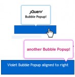
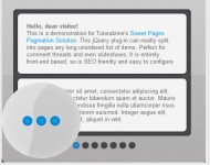
The main idea is to create an easily configurable set of contextual slideouts. Each can be opened in one of four directions – bottom-right (default), bottom-left, top-left and top-right, and each can be in one of three colors – green (default), blue, and red.
To create a slideout element, you need to include a regular paragraph p tag to the page. This means that all the content is visible to search engines in a semantic way. The paragraphs are replaced with the markup for the slideouts by jQuery on page load, with the title, class and style attributes of the paragraph passed to the newly created element.
Step 1 – XHTML
Now lets take a look at the structure of the paragraph tags you should add to the page, and how they are configured.
demo.html
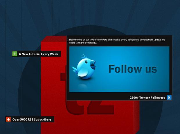
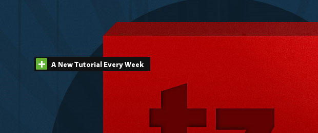
<div class="main">

 <p title="A New Tutorial Every Week" style="top:200px;left:120px;">
  This slideout is going to open to the bottom-right (the default).
 </p>

 <p title="2200+ Twitter Followers" class="openTop openLeft blue" style="top:400px;left:650px;">
  This slideout is going to open to the top-left.
 </p>

 <p title="Over 5000 RSS Subscribers" class="openTop red" style="top:500px;left:90px;">
  This slideout is going to open to the top-right.
 </p>

</div>
As you can see, each of the tags contains a style, a class (optional) and a title attribute. As discussed above, these are copied to the slideouts when jQuery replaces the markup.
The style attribute contains the coordinates relative to the parent div element, which means that the slideouts are positioned in exactly the same place as the paragraphs.
The class attribute is optional and specifies a number of options for the slideouts. You can choose the direction to which the slideouts open, and their color.
slideout markup
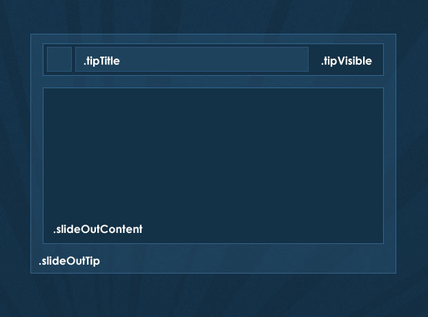
<div class="slideOutTip openLeft blue" style="left:100px;top:200px">

 <div class="tipVisible">
  <div class="tipIcon"><div class="plusIcon"></div></div>
  <p class="tipTitle">The title of the slideout</p>
 </div>

 <div class="slideOutContent">
  <p>Slideout Content</p>
 </div>
</div>
Step 2 – CSS
Now lets take a closer look at the styling. Only the styles directly used by the slideouts are presented here. You can see the rest of the styles in styles.css in the download archive.
styles.css – Part 1
.slideOutTip{
 /* The main wrapping div of the slideout tips */
 position:absolute;
 padding:3px;
 top:0;
 left:0;
 background-color:#111;
 font-size:13px;
 color:white;
 overflow:hidden;
 height:22px;
}

.slideOutTip:hover{
 /* Applying a CSS3 outer glow on hover */
 -moz-box-shadow:0 0 1px #999;
 -webkit-box-shadow:0 0 1px #999;
 box-shadow:0 0 1px #999;
}

/* The holder for the title and the icon: */
.tipVisible{ cursor:pointer; height:22px; }

.tipTitle{
 float:left;
 font-family:'Myriad Pro',Arial, Helvetica, sans-serif;
 font-size:15px;
 font-weight:bold;
 white-space:nowrap;
 line-height:22px;
 padding-right:5px;
}

.tipIcon{
 width:20px;
 height:20px;
 float:left;
 background-color:#61b035;
 border:1px solid #70c244;
 margin-right:8px;

 /* CSS3 Rounded corners */

 -moz-border-radius:1px;
 -webkit-border-radius:1px;
 border-radius:1px;
}
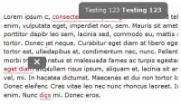
The tipVisible contains the tipTitle and tipIcon divs, floated to the left inside it. These are the only divs that are visible to the user when the page loads. In the jQuery step of the tutorial, you will see that we are also binding an event listener for the click event on tipVisible, which slide-opens the content.
styles.css – Part 2
/* Three color themes */
.green .tipIcon{ background-color:#61b035; border:1px solid #70c244; }
.blue .tipIcon{ background-color:#1078C7; border:1px solid #1e82cd; }
.red .tipIcon{ background-color:#CD3A12; border:1px solid #da421a; }

.plusIcon{
 /* The plus icon */
 width:13px;
 height:13px;
 background:url('img/plus.gif') no-repeat center center;
 margin:4px;

 /* Defining a CSS3 animation. Currently only works in Chrome and Safari */
 -webkit-transition: -webkit-transform 0.2s linear;
 -moz-transition: -moz-transform 0.2s linear;
 transition: transform 0.2s linear;
}

.slideOutTip.isOpened{ z-index:10000; }

.slideOutTip.isOpened .plusIcon{
 /* Applying a CSS3 rotation  to the opened slideouts*/
 -moz-transform:rotate(45deg);
 -webkit-transform:rotate(45deg);
 transform:rotate(45deg);
}

/* Special rules for the left and top - opening versions */

.openLeft .tipIcon{
 /* Floating the title and the icon to the right */
 margin:0 0 0 8px;
 float:right;
}
.openLeft .tipTitle{ float:right; padding:0 0 0 5px; }
.openLeft .slideOutContent{ margin-top:22px; }
.openLeft.openTop .slideOutContent{ margin-top:0; }

.slideOutContent{
 /* Hiding the div with the slide out content: */
 display:none;
 padding:10px;
 font-size:11px;
}

/* Hiding the original paragraphs if they have not been replaced (JS disabled): */

.main > p{ display:none; }
The default version of the slideout opens to the bottom-right. You can change this by assigning the openLeft or openTop class to the original p you add to the page (remember that the classes of the p tags are copied to the structure of the slideout). You can also change the color of the icon to blue or red by also assigning the respective class names.
A number of CSS3 rues are used here. Along the usual border-radius (for rounded corners) and box-shadow (for a outer-glow effect), I added the transform:rotate(45deg) property, which rotates the plus sign when the slideout is opened.
If you view the example in Safari/Chrome (or version 3.7 of Firefox, which is yet to be released), you can even see that the rotation is animated. This is done with the CSS3 transition property, inside which we specify the property that is going to be animated, the duration of the effect and the type of the animation.
Lastly, we use the .main > p to hide the p tags that are directly inside the main div, so if JavaScript is disabled, you will not see the paragraphs. You could alternatively style and incorporate them in your design for a proper fallback solution.
Step 3 – jQuery
When the page loads, jQuery loops through all the paragraph elements in the main div, and replaces them with the markup of the slideouts. It later binds event listeners for the click event and slides open the content in the direction that was specified with the class names when the event occurs. Lets see how this works.
script.js – Part 1
$(document).ready(function(){
 /* The code here is executed on page load */

 /* Replacing all the paragraphs */
 $('.main p').replaceWith(function(){

  /*
   The style, class and title attributes of the p
   are copied to the slideout:
  */

  return '\
  <div class="slideOutTip '+$(this).attr('class')+'" style="'+$(this).attr('style')+'">\
   \
   <div class="tipVisible">\
    <div class="tipIcon"><div class="plusIcon"></div></div>\
    <p class="tipTitle">'+$(this).attr('title')+'</p>\
   </div>\
   \
   <div class="slideOutContent">\
    <p>'+$(this).html()+'</p>\
   </div>\
  </div>';
 });

 $('.slideOutTip').each(function(){

  /*
   Implicitly defining the width of the slideouts according to the
   width of its title, because IE fails to calculate it on its own.
  */

  $(this).width(40+$(this).find('.tipTitle').width());
 });

 /* Listening for the click event: */

 $('.tipVisible').bind('click',function(){
  var tip = $(this).parent();

  /* If a open/close animation is in progress, exit the function */
  if(tip.is(':animated'))
   return false;

  if(tip.find('.slideOutContent').css('display') == 'none')
  {
   tip.trigger('slideOut');
  }
  else tip.trigger('slideIn');

 });
As of version 1.4 of the jQuery library, the replaceWith() method can take a function as a parameter. This is really handy, as it allows us to dynamically generate the markup. The this points to the element, so we can easily get the values of the different attributes and the contents of the paragraph.
script.js – Part 2
$('.slideOutTip').bind('slideOut',function(){

 var tip = $(this);
 var slideOut = tip.find('.slideOutContent');

 /* Closing all currently open slideouts: */
 $('.slideOutTip.isOpened').trigger('slideIn');

 /* Executed only the first time the slideout is clicked: */
 if(!tip.data('dataIsSet'))
 {
  tip .data('origWidth',tip.width())
   .data('origHeight',tip.height())
   .data('dataIsSet',true);

  if(tip.hasClass('openTop'))
  {
   /*
    If this slideout opens to the top, instead of the bottom,
    calculate the distance to the bottom and fix the slideout to it.
   */

   tip.css({
    bottom : tip.parent().height()-(tip.position().top+tip.outerHeight()),
    top  : 'auto'
   });

   /*
    Fixing the title to the bottom of the slideout,
    so it is not slid to the top on open:
   */
   tip.find('.tipVisible').css({position:'absolute',bottom:3});

   /*
    Moving the content above the title, so it can
    slide-open to the top:
   */
   tip.find('.slideOutContent').remove().prependTo(tip);
  }

  if(tip.hasClass('openLeft'))
  {
   /*
    If this slideout opens to the left, fix it to the right so
    the left edge can expand without moving the entire div:
   */
   tip.css({
    right : Math.abs(tip.parent().outerWidth()-(tip.position().left+tip.outerWidth())),
    left : 'auto'
   });

   tip.find('.tipVisible').css({position:'absolute',right:3});
  }
 }

 /* Resize the slideout to fit the content, which is then faded into view: */

 tip.addClass('isOpened').animate({
  width : Math.max(slideOut.outerWidth(),tip.data('origWidth')),
  height : slideOut.outerHeight()+tip.data('origHeight')
 },function(){
  slideOut.fadeIn();
 });
script.js – Part 3
 }).bind('slideIn',function(){ // Binding the slideIn event to .slideOutTip
  var tip = $(this);

  /* Hide the content and restore the original size of the slideout: */

  tip.find('.slideOutContent').fadeOut('fast',function(){
   tip.animate({
    width : tip.data('origWidth'),
    height : tip.data('origHeight')
   },function(){
    tip.removeClass('isOpened');
   });
  });

 });

}); /* Closing $(document).ready() */
The closing of the slideout consists of running an animation which returns the element to its original size (saved with the data() method) and removing the isOpened class.
With this our contextual slideouts are complete!
You might also like
Tags
accordion accordion menu animation navigation animation navigation menu carousel checkbox inputs css3 css3 menu css3 navigation date picker dialog drag drop drop down menu drop down navigation menu elastic navigation form form validation gallery glide navigation horizontal navigation menu hover effect image gallery image hover image lightbox image scroller image slideshow multi-level navigation menus rating select dependent select list slide image slider menu stylish form table tabs text effect text scroller tooltips tree menu vertical navigation menu