 Subscribe
 Follow Us
Yoyo hover effect jQuery and CSS3
 13 years ago
 12305
12305 2139
2139
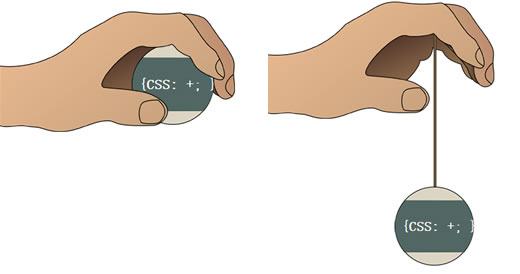
Haven’t you ever just wanted a yoyo on your webpage? A beautiful, animated, spinning yoyo that slides down like a real yoyo would?
The HTML
There is very little HTML markup, so it is pretty easy to understand.
Each <div> tag is going to contain a separate background-image and eventually the divs will be absolutely positioned. This means we will need to include a container that will ultimately be relatively positioned. We are also going to include a string <div> (I’ve never seen a functional yoyo without a string before).
<div id="container">
    <div id="hand-back"></div>
    <div id="hand-front"></div>
    <div id="string"></div>
    <div id="yoyo"><a href="#">{CSS: +; }</a></div>
</div>
The CSS
#container {
 height: 550px;
 width: 331px;
 position: relative;
}
#hand-front {
 background: url(../images/hand-front.png) no-repeat left top;
 height: 169px;
 width: 331px;
 position: absolute;
 left: 0;
 top: 20px;
 z-index: 400;
}
#hand-back {
 background: url(../images/hand-back.png) no-repeat left top;
 height: 99px;
 width: 190px;
 position: absolute;
 left: 128px;
 top: 43px;
 z-index: 100;
}
#string {
 background: #79694c;
 border: 1px solid #3b2f1d;
 height: 20px;
 width: 2px
  position: absolute;
 top: 47px;
 left: 243px;
 z-index: 200;
}

#yoyo {
 background: url(../images/yoyo.png) no-repeat center center;
 height: 150px;
 width: 150px;
 position: absolute;
 left: 169px;
 top: 47px;
 z-index: 300;
}
#yoyo a {
 color: white;
 display: block;
 font-size: 20px;
 font-weight: bold;
 line-height: 150px;
 margin-left: 27px;
}
#yoyo a:hover {
 text-decoration: none;
 text-shadow: 0 0 15px #000;
}
.rotate {
 -webkit-animation-duration:1.1s;
 -webkit-animation-iteration-count:infinite;
 -webkit-animation-name: yoyo;
 -webkit-animation-timing-function:linear;
}
@-webkit-keyframes yoyo {
 from {-webkit-transform:scale(1) rotate(0deg);}
 to {-webkit-transform:scale(1) rotate(360deg);}
}
Most of this CSS is just giving the background, height, position, width and z-index to the corresponding ID which creates our desired image out of the multiple images we have and the ‘#yoyo a’ is just styling and positioning the {CSS: +; } link.
The interesting part is the .rotate class. This is the awesome CSS3 that is causing the yoyo to spin in Webkit based browsers (Chrome and Safari). Unfortunately there is no pure CSS way to get an object to spin like this in other browsers.
The jQuery
I’ve used the jQuery easing plugin to give the yoyo a more visually appealing animation effect.
$(document).ready(function() {

 $("#container").hover(function(){
  $("#yoyo").addClass("rotate");
  $("#string").stop().animate({height: '400px'}, {duration:1000, easing: 'easeOutBack'});
  $("#yoyo").stop().animate({top: '400px'}, {duration:1000, easing: 'easeOutBack'});
   }, function() {
  $("#yoyo").removeClass("rotate");
  $("#string").stop().animate({height: '20px'}, {duration:600, easing: 'easeInOutExpo'} );
  $("#yoyo").stop().animate({top: "47px"}, {duration:600, easing: 'easeInOutExpo'} );
 });

 $("#yoyo a").hover(function(){
  $("#yoyo").toggleClass("rotate");
 });

});
Explanation:
Line 1 – When the DOM is ready
Line 3 – When you hover on the #container
Line 4 – Add the class of .rotate to #yoyo
Line 5 – Animate the current height to 400px within the duration of 1000 milliseconds (1 second) and use easing ‘easeOutBack’
Line 6 – Animate the current ‘top’ property to 400px within the duration of 1000 milliseconds and use easing ‘easeOutBack’
Line 7 – When the object is not being hovered
Line 8 – Remove the class of .rotate from #yoyo
Line 9 – Animate the current ‘height’ property to 20px within the duration of 1000 milliseconds and use easing ‘easeInOutExpo’
Line 10 – Animate the current ‘top’ property to 47px within the duration of 1000 milliseconds and use easing ‘easeInOutExpo’
Line 13 – When you hover over #yoyo a
Line 14 – Toggle the class .rotate
You might also like


Tags
accordion accordion menu animation navigation animation navigation menu carousel checkbox inputs css3 css3 menu css3 navigation date picker dialog drag drop drop down menu drop down navigation menu elastic navigation form form validation gallery glide navigation horizontal navigation menu hover effect image gallery image hover image lightbox image scroller image slideshow multi-level navigation menus rating select dependent select list slide image slider menu stylish form table tabs text effect text scroller tooltips tree menu vertical navigation menu