 Subscribe
 Follow Us
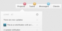
jQuery and CSS3 Awesome Slide Down Box Menu
 13 years ago
 131175
 27901
27901
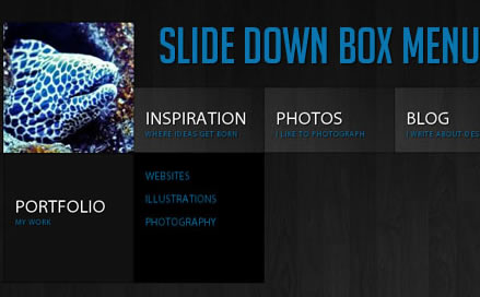
we will create a unique sliding box navigation. The idea is to make a box with the menu item slide out, while a thumbnail pops up. We will also include a submenu box with further links for some of the menu items. The submenu will slide to the left or to the right depending on which menu item we are hovering.
The Markup
For the HTML structure we will be using an unordered list where each menu item will contain the main link item and a div element for the submenu:
<ul id="sdt_menu" class="sdt_menu">
 <li>
  <a href="#">
   <img src="images/1.jpg" alt=""/>
   <span class="sdt_active"></span>
   <span class="sdt_wrap">
    <span class="sdt_link">Portfolio</span>
    <span class="sdt_descr">My work</span>
   </span>
  </a>
  <div class="sdt_box">
   <a href="#">Websites</a>
   <a href="#">Illustrations</a>
   <a href="#">Photography</a>
  </div>
 </li>
 ...
</ul>
If there is no submenu, the div can simply be left out. The image will not be shown in the beginning since we will set its width and height to 0 in the CSS.
Let’s take a look at the style.
The CSS
We will start by styling the unordered list:
ul.sdt_menu{
 margin:0;
 padding:0;
 list-style: none;
 font-family:"Myriad Pro", "Trebuchet MS", sans-serif;
 font-size:14px;
 width:1020px;
}
Genrally, we want to remove any default text-decoration and outline for all the link elements in our menu:
ul.sdt_menu a{
 text-decoration:none;
 outline:none;
}
Our list items will be floating left and have the position relative since we will want to use absolute positioning for the elements inside. If we wouldn’t set that, absolute positioned elements would be relative to the whole page:
ul.sdt_menu li{
 float:left;
 width:170px;
 height:85px;
 position:relative;
 cursor:pointer;
}
The styling for the main link element where we have our two spans for title and description will be styled as follows:
ul.sdt_menu li > a{
 position:absolute;
 top:0px;
 left:0px;
 width:170px;
 height:85px;
 z-index:12;
 background:transparent url(../images/overlay.png) no-repeat bottom right;
 -moz-box-shadow:0px 0px 2px #000;
 -webkit-box-shadow:0px 0px 2px #000;
 box-shadow:0px 0px 2px #000;
}
Notice the z-index: we will be defining a stacking order for all the important elements, so that the right ones stay on top.
We are using a background image that creates a glass like effect with a semi-transparent gradient. When you use some background pattern (like the wood in the demo) it creates a beautiful effect. Make sure to try out different textures – it just looks amazing!
You can also play with the shadows – changing the values to 2px 2px 6px #000 inset will give you a very nice effect.
The image will be styled as follows:
ul.sdt_menu li a img{
 border:none;
 position:absolute;
 width:0px;
 height:0px;
 bottom:0px;
 left:85px;
 z-index:100;
 -moz-box-shadow:0px 0px 4px #000;
 -webkit-box-shadow:0px 0px 4px #000;
 box-shadow:0px 0px 4px #000;
}
We want to animate the image to come up from the bottom, that’s why we position it absolutely using “bottom” as reference point. We also add some neat box shadow. The first two values are zero, making the shadow spread evenly around the image. We used this as well in the link element. This even shadow can be used as a trick, whenever you want to create a light border effect. The advantage is that shadows are not really there – you don’t need to consider it in your width or height calculations in elements. The current disadvantage is that CSS3 is not supported in IE.
The wrapper for the title and description spans will have this style:
ul.sdt_menu li span.sdt_wrap{
 position:absolute;
 top:25px;
 left:0px;
 width:170px;
 height:60px;
 z-index:15;
}
If you have some larger texts, you will need to adapt these values. Make sure that the adapted values fit well with the animation values in the JavaScript, too.
Next, we define the style for the gray box that slides down. We give it a height of 0 and position it already in a way that we just need to increase its height in the animation:
ul.sdt_menu li span.sdt_active{
 position:absolute;
 background:#111;
 top:85px;
 width:170px;
 height:0px;
 left:0px;
 z-index:14;
 -moz-box-shadow:0px 0px 4px #000 inset;
 -webkit-box-shadow:0px 0px 4px #000 inset;
 box-shadow:0px 0px 4px #000 inset;
}
The common styles for the spans and links in the boxes will be the following:
ul.sdt_menu li span span.sdt_link,
ul.sdt_menu li span span.sdt_descr,
ul.sdt_menu li div.sdt_box a{
 margin-left:15px;
 text-transform:uppercase;
 text-shadow:1px 1px 1px #000;
}
The title and description will be styled as follows:
ul.sdt_menu li span span.sdt_link{
 color:#fff;
 font-size:24px;
 float:left;
 clear:both;
}
ul.sdt_menu li span span.sdt_descr{
 color:#0B75AF;
 float:left;
 clear:both;
 width:155px;
 font-size:10px;
 letter-spacing:1px;
}
The submenu box will initially be hidden under the gray box. We will then animate it to the right or to the left depending on where we are. If we, for example, hover the last element, we want to animate that submenu box to the left, in all the other cases we want to animate it to the right.
ul.sdt_menu li div.sdt_box{
 display:block;
 position:absolute;
 width:170px;
 overflow:hidden;
 height:170px;
 top:85px;
 left:0px;
 display:none;
 background:#000;
}
ul.sdt_menu li div.sdt_box a{
 float:left;
 clear:both;
 line-height:30px;
 color:#0B75AF;
}
The first link in the submenu should have a top margin:
ul.sdt_menu li div.sdt_box a:first-child{
 margin-top:15px;
}
ul.sdt_menu li div.sdt_box a:hover{
 color:#fff;
}
And that’s all the style! Let’s add the magic!
The JavaScript
When we enter with the mouse on a list element we enlarge the image, and show both, the sdt_active span and the sdt_wrap span. If the element has a submenu (sdt_box), then we slide it to the side. If the element is the last one in the menu we slide the submenu box to the left, otherwise to the right:
$(function() {
 $('#sdt_menu > li').bind('mouseenter',function(){
  var $elem = $(this);
  $elem.find('img')
    .stop(true)
    .animate({
    'width':'170px',
    'height':'170px',
    'left':'0px'
    },400,'easeOutBack')
    .andSelf()
    .find('.sdt_wrap')
    .stop(true)
    .animate({'top':'140px'},500,'easeOutBack')
    .andSelf()
    .find('.sdt_active')
    .stop(true)
    .animate({'height':'170px'},300,function(){
   var $sub_menu = $elem.find('.sdt_box');
   if($sub_menu.length){
    var left = '170px';
    if($elem.parent().children().length == $elem.index()+1)
     left = '-170px';
    $sub_menu.show().animate({'left':left},200);
   }
  });
 }).bind('mouseleave',function(){
  var $elem = $(this);
  var $sub_menu = $elem.find('.sdt_box');
  if($sub_menu.length)
   $sub_menu.hide().css('left','0px');

  $elem.find('.sdt_active')
    .stop(true)
    .animate({'height':'0px'},300)
    .andSelf().find('img')
    .stop(true)
    .animate({
    'width':'0px',
    'height':'0px',
    'left':'85px'},400)
    .andSelf()
    .find('.sdt_wrap')
    .stop(true)
    .animate({'top':'25px'},500);
 });
});
And that’s it! We hope you liked this little menu and find it useful!
P.S. It looks very juicy in Google Chrome!
You might also like
Tags
accordion accordion menu animation navigation animation navigation menu carousel checkbox inputs css3 css3 menu css3 navigation date picker dialog drag drop drop down menu drop down navigation menu elastic navigation form form validation gallery glide navigation horizontal navigation menu hover effect image gallery image hover image lightbox image scroller image slideshow multi-level navigation menus rating select dependent select list slide image slider menu stylish form table tabs text effect text scroller tooltips tree menu vertical navigation menu