 Subscribe
 Follow Us
Spin Social Media Share with CSS3
 12 years ago
 17783
17783 4611
4611

This is a neat effect which spins the social icons with the help of a CSS transform and transition when you hover over them.
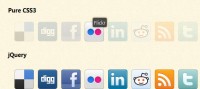
Let’s start with the structure of the social media icons. Which is nothing more than a list with an extra span to contain the icon itself because we want to include the full logo alongside the icon.
<ul id="social" class="group">

    <li class="twitter"><a href="http://twitter.com/tkenny"><span></span>twitter</a></li>
    <li class="dribbble"><a href="http://dribbble.com/tkenny"><span></span>dribbble</a></li>
    <li class="lastfm"><a href="http://www.last.fm/user/KennySim"><span></span>last.fm</a></li>
    <li class="spotify"><a href="http://open.spotify.com/user/tkenny"><span></span>Spotify</a></li>
    <li class="ember"><a href="http://emberapp.com/tkenny/"><span></span>ember</a></li>
    <li class="inspectelement"><a href="http://inspectelement.com"><span></span>Inspect Element</a></li>

</ul>
CSS
Here’s the CSS focusing only on the code that perform the transitions which is all we need for the purposes of this tutorial.
li a span {
    -webkit-transition: -webkit-transform 0.4s ease-out;
    -moz-transition: -moz-transform 0.4s ease-out;
    transition: transform 0.4s ease-out;
}
li a:hover span {
    -webkit-transform: rotateZ(360deg);
    -moz-transform: rotateZ(360deg);
    transform: rotateZ(360deg);
}
We want the transition to happen on the icon contained in the span tag. we place it there as a global style which will activate on any behavourial property such as :hover or :active. We could associate it with the hover if we wanted to.
Let’s look at the transform code first. This is ending position of where we want the icon to be and in this case we actually want it to spin around in 360 degrees around the Z-axis which is the axis that extends away from the screen.
Without the transition, nothing appears to be happening. Rotating by 360 degrees obviously is going to cause the icon to come ‘full circle’, visually back to the same position it started from but the browser recognises it as a separate position. By adding the transition property, we’re telling the browser to essentially animate between two points. The default starting point for the rotation is 0 degrees and the second point on hover is 360.
transition: transform 0.4s ease-out;
The first part of the transition is what property we want transitioned which of course is the transform. You can also define all or separate properties with commas. The 0.4s is the duration and ease-out is the timing function.
Very simple to implement. Currently works in WebKit browsers (Chrome and Safari) and Firefox 4. Have fun.
The article source:http://inspectelement.com/articles/spin-those-icons-with-css3/
You might also like


Tags
accordion accordion menu animation navigation animation navigation menu carousel checkbox inputs css3 css3 menu css3 navigation date picker dialog drag drop drop down menu drop down navigation menu elastic navigation form form validation gallery glide navigation horizontal navigation menu hover effect image gallery image hover image lightbox image scroller image slideshow multi-level navigation menus rating select dependent select list slide image slider menu stylish form table tabs text effect text scroller tooltips tree menu vertical navigation menu