 Subscribe
 Follow Us
ShineTime – A New jQuery & CSS3 Gallery With Animated Shine Effects
 14 years ago
  14702
14702  2653
2653
 n/a
n/a
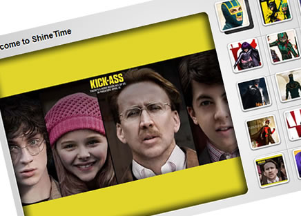
This is a animated Shine Effect with jQuery & CSS3 and then use it to create your very own Shiny Gallery ‘ShineTime’.This effect is useful in making your user interface elements look like they’re a real polaroid photo (or made of glass) and the best part is, it’s not that difficult to achieve.
The Animated ‘Shine’ Effect
The idea behind a Shine Effect is to give your graphics the appearance of being on a glossy surface that have just had a light beam pass over them. This can make them appear to be made of glass and can increase the visual experience your end users see.
Before we get into any code, lets go through the basic concepts behind the effect. We want to pass a light-beam (in this case an image simulating a shine) past our image when the user hovers over it. Now because I wanted to style up today’s gallery so that each thumbnail appeared to float out of it’s container, the steps to achieving the below animation are as follows:
- 1.Change the margins of the thumbnail element so that it floats away from it’s container
- 2.Set the background-position of your “shine” graphic to be –1 * (it’s total width)
- 3.Animate your background-position to value of the total width. Effectively we’re hiding the gloss off-stage and then animating it across the image.
Now, because ShineTime is going to also apply this effect to the caption holder component (see the demo), I needed to come up with a much larger shine graphic for this that cleanly executes the desired effect without being slow or making the text unreadable. Using an image about 20% longer than the container in each direction at a layer below the text made this possible.
Designing ShineTime
Graphics-wise, there are a few important things to note about ShineTime. I wanted to give this demo an extra-depth of design detail so the following techniques were applied to create the final main-photo area:
- 1.CSS3 is used to create the rounded-corner borders around the main container div. It is also used on the indented shadow layer (which you can see below). In order for the caption container to also fit this design spec, it’s bottom rounded corners use CSS3 to keep everything looking like it’s inside the same box.
- 2.Layering is heavily used in this demo to achieve a photographic-depth effect. The choice to do this using an image rather than CSS3 was in order to preserve the effect displaying in browsers like IE6.
- 3.Normally, image galleries are based on UL/LI elements which are wrapped together using jQuery & CSS to turn them into something pretty. Here, because the actual image needs to be behind a few other layers so that it can have (a) Rounded corners and (b) the photo-effect, it’s necessary for all images to be loaded using the background-image property of the ‘largephoto’ div (take a look at the HTML code to see what I’m talking about)
- 4.CSS3 is finally also used on the ShineTime Header. Whilst I’ve included Cufon for a little added cleanliness to my typographic elements, in the header it’s simply used for adding an indented feel to the text to give the background that extra ‘metallic’ feel to it.
The Code
Finally, for the part you’ve been waiting for: the code.
HTML (Sample)
<!-- Each entry takes the form -->
<!-- start entry-->
<div class="thumbnailimage">
<div class="thumb_container">
<div class="large_thumb"> <img alt="thumb" class="large_thumb_image" src="images/thumbnails/sample1.jpg">   <img rel="Just because I can't code,
doesn't mean I can't kick your ass!" class="large_image" src="images/large/sample1.jpg" alt="">
<div class="large_thumb_border"> </div>
<div class="large_thumb_shine"> </div>
</div>
</div>
</div>

       <!--end entry-->

<!-- whilst the main image container itself looks like-->
<div id="containertitle">Welcome to ShineTime</div>
<div class="mainframe">
<div id="largephoto">
<div id="loader"> </div>
<div id="largecaption">
<div class="captionShine"> </div>
<div class="captionContent"> </div>
</div>
<div id="largetrans"> </div>
</div>
</div>
CSS
body { background-color:#333; margin:0 auto;
background-image:url('images/interface/bgnoise.png');}
#container { width:793px; height:498px; margin:0 auto;
background-image:url('images/interface/back_noise.png');
background-color:#111; margin-top:40px;}
#container .mainframe { width: 500px; height:498px; float:left}
#container .thumbnails { float:left; width:293px; height:498px;
background-repeat:no-repeat; background-image:url('images/interface/total_grid.png');
background-position:9px 70px; }
.thumbnailimage { float:left; padding:7px;}
.large_thumb {float:left; position: relative; width:64px;
height:64px; padding:0px 10px 0px 0;}
img.large_thumb_image {position:absolute; left:5px; top:4px;}
.large_thumb_border {width:64px; height:64px;
background:url('images/interface/thumb_border.png'); position:absolute; }
.large_thumb_shine {width:54px; height:54px;
background:url('images/interface/shine.png'); position:absolute;
background-position:-150px 0; left:5px; top:4px; background-repeat:no-repeat;}
.thumb_container { width:64px; height:64px;
background-image:url('images/interface/thumb_holder.png'); }
#largephoto { width: 444px; height:370px; background-color:#333333;
margin-top:68px; margin-left:40px; -moz-border-radius: 10px;
-webkit-border-radius: 10px; border-left: 1px solid #fff;
border-right: 1px solid #fff; border-bottom: 1px solid #fff; }
#largetrans { width: 444px; height:370px;
background-image:url('images/interface/main_bg_trans.png');
-moz-border-radius: 10px; -webkit-border-radius: 10px;}
.large_image { display:none}
#containertitle { position:absolute; margin-top:35px;
margin-left:40px; font-family:Arial, Helvetica, sans-serif;
font-weight:bold; text-shadow: 0px 1px 2px #fff;}
#largecaption {  text-align:center; height:100px;
width:100%; background-color:#111; position:absolute; width: 444px;
margin-top:270px; -moz-border-radius-bottomleft: 10px;
-moz-border-radius-bottomright: 10px; -webkit-border-bottom-left-radius: 10px;
-webkit-border-bottom-right-radius: 10px;
display:none; color:#fff; font-size:30px;
font-family:Arial; letter-spacing:-1px; font-weight:bold}
#largecaption .captionContent { padding:5px;}
#largecaption .captionShine { background:url('images/interface/bigshine.png');
 position:absolute;  width: 444px; height: 100px;
 background-position:-150px 0;background-repeat:no-repeat;}
#loader { width:150px; height:150px;
background-image:url('images/interface/loader.gif');
background-repeat:no-repeat; position:absolute;}
JavaScript
 $(document).ready(function()
  {

  /*Your ShineTime Welcome Image*/
  var default_image = 'images/large/default.jpg';
  var default_caption = 'Welcome to ShineTime';

  /*Load The Default Image*/
  loadPhoto(default_image, default_caption);

  function loadPhoto($url, $caption)
  {

     /*Image pre-loader*/
     showPreloader();
     var img = new Image();
     jQuery(img).load( function()
  {
   jQuery(img).hide();
   hidePreloader();

        }).attr({ "src": $url });

     $('#largephoto').css('background-image','url("' + $url + '")');
  $('#largephoto').data('caption', $caption);
  }

  /* When a thumbnail is clicked*/
  $('.thumb_container').click(function()
  {

    var handler = $(this).find('.large_image');
    var newsrc  = handler.attr('src');
    var newcaption  = handler.attr('rel');
    loadPhoto(newsrc, newcaption);

  });

  /*When the main photo is hovered over*/
  $('#largephoto').hover(function()
  {

  var currentCaption  = ($(this).data('caption'));
  var largeCaption = $(this).find('#largecaption');

  largeCaption.stop();
  largeCaption.css('opacity','0.9');
  largeCaption.find('.captionContent').html(currentCaption);
  largeCaption.fadeIn()

   largeCaption.find('.captionShine').stop();
         largeCaption.find('.captionShine').css("background-position","-550px 0");
         largeCaption.find('.captionShine').animate({backgroundPosition: '550px 0'},700);

   Cufon.replace('.captionContent');

  },

  function()
  {
     var largeCaption = $(this).find('#largecaption');
  largeCaption.find('.captionContent').html('');
  largeCaption.fadeOut();

  });

     /* When a thumbnail is hovered over*/
  $('.thumb_container').hover(function()
  {
         $(this).find(".large_thumb").stop().animate({marginLeft:-7, marginTop:-7},200);
   $(this).find(".large_thumb_shine").stop();
         $(this).find(".large_thumb_shine").css("background-position","-99px 0");
         $(this).find(".large_thumb_shine").animate({backgroundPosition: '99px 0'},700);

  }, function()
  {
     $(this).find(".large_thumb").stop().animate({marginLeft:0, marginTop:0},200);
  });

  function showPreloader()
  {
    $('#loader').css('background-image','url("images/interface/loader.gif")');
  }

  function hidePreloader()
  {
    $('#loader').css('background-image','url("")');
  }

  });
You might also like


Tags
accordion accordion menu animation navigation animation navigation menu carousel checkbox inputs css3 css3 menu css3 navigation date picker dialog drag drop drop down menu drop down navigation menu elastic navigation form form validation gallery glide navigation horizontal navigation menu hover effect image gallery image hover image lightbox image scroller image slideshow multi-level navigation menus rating select dependent select list slide image slider menu stylish form table tabs text effect text scroller tooltips tree menu vertical navigation menu