 Subscribe
 Follow Us
apple.com-like breadcrumb using simple CSS
 13 years ago
  15040
15040  2838
2838
 n/a
n/a
breadcrumbs
In its simplest form it usually looks like this:
You are here: Home > Sample page 1 > Sample page 2 > Current page
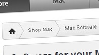
But we are going to enhance this simple form and to create a breadcrumb that is similar to the one on apple.com.
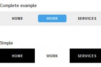
Let's create something that looks like this
As you can see on the screenshot above, breadcrumb has a soft gray gradient and a separator that looks like a right arrow. Those are the only two images that we are going to use: background gradient and a separator. The design we want to create looks like on the image below.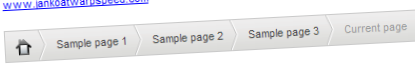
So what would be the best way to create a breadcrumb? Personally I think it's the best to use unordered list (UL element). So we can have a HTML structure like this:
<ul id="breadcrumb">
    <li><a href="#" title="Home"><img src="home.png" alt="Home" class="home" /></a></li>
    <li><a href="#" title="Sample page 1">Sample page 1</a></li>
    <li><a href="#" title="Sample page 2">Sample page 2</a></li>
    <li><a href="#" title="Sample page 3">Sample page 3</a></li>
    <li>Current page</li>
</ul>
In the example above we have unordered list that has four list items. Each list item has a link that will point to a single page in the path, except for the last one. There is no need to point to a current page since user is already viewing it.
If you try to see this example in a browser you would see a simple bulleted list. So we have to use some CSS here to make things right.
First we'll style UL element:
#breadcrumb
{
    font: 11px Arial, Helvetica, sans-serif;
    background-image:url('bc_bg.png');
    background-repeat:repeat-x;
    height:30px;
    line-height:30px;
    color:#9b9b9b;
    border:solid 1px #cacaca;
    width:100%;
    overflow:hidden;
    margin:0px;
    padding:0px;
}
There are some attributes here that I would like to explain.
- We applied a background image to entire UL element in order to cover the entire breadcrumb area.
- Next, we set the height to 30px because that is the background image height.
- We also set line height to 30px. That will make the text appear centered vertically.
- We set the light gray color for any text inside breadcrumb. Since links will use other settings, this is going to be a color only for a current page.
- The last two lines resets the default UL settings.
Next thing we have to do is to style our list items.
#breadcrumb li
{
    list-style-type:none;
    float:left;
    padding-left:10px;
}

#breadcrumb a
{
    height:30px;
    display:block;
    background-image:url('bc_separator.png');
    background-repeat:no-repeat;
    background-position:right;
    padding-right: 15px;
    text-decoration: none;
    color:#454545;
}

.home
{
    border: none;
    margin: 8px 0px;
}
Again, I will explain these three classes. We first styled each LI element inside unordered list:
- We set list-style-type:none for each LI element in order to remove bullets
- Also, we set float:left so that our list items appear next to each other.
- We added 10px left padding to move text from the left edge of each list item
Each link inside list item will have this settings:
- 30px height and display:block will make entire list item area clickable.
- background related attributes will set the background image for each link which is separator image. It will be placed on the right side of each link.
- 15px padding will move separator to the right
The last class (home) will set the attributes for home icon.
The last thing we have to do is to add some hover effect on links:
#breadcrumb a:hover
{
    color:#35acc5;
}
Conclusion
If you review the code carefully, you can notice that you can create a variety of designs by changing background and separator images. Try and see the results!
You might also like
Tags
accordion accordion menu animation navigation animation navigation menu carousel checkbox inputs css3 css3 menu css3 navigation date picker dialog drag drop drop down menu drop down navigation menu elastic navigation form form validation gallery glide navigation horizontal navigation menu hover effect image gallery image hover image lightbox image scroller image slideshow multi-level navigation menus rating select dependent select list slide image slider menu stylish form table tabs text effect text scroller tooltips tree menu vertical navigation menu