 Subscribe
 Follow Us
Jquery Awesome-Filled Navigation Menu Use Sprites
 13 years ago
 18713
18713 3902
3902
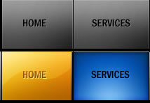
CSS sprites can dramatically increase a website’s performance, and with jQuery, we can implement awesome transition effects easily. Let’s get started.
Step 1
Create an html file, and add the following code:
<html>
<head>
<link rel="stylesheet" type="text/css" href="style.css" />
<script type="text/javascript" src="jquery.js"></script>
<script type="text/javascript" src="jquery.easing.1.3.js"></script>
<script type="text/javascript" src="sprite.js"></script>
<title>Awesome Menu</title>
</head>

<body>
<div id="nav">
<ul id="navigation">
 <li ><a class="home" href="#"></a></li>
 <li ><a class="services" href="#"></a></li>
 <li ><a class="portfolio" href="#"></a></li>
 <li ><a class="about" href="#"></a></li>
    <li ><a class="contact" href="#"></a></li>
</ul>
</div>
</body>
</html>
Here we have created a simple html file, which consists of an unordered list – our navigation bar. Before moving forward, let’s take a look at a couple of files we’ll now be importing:
- style.css is the external CSS file in which we will be styling our navigation list.
- We’ve imported jQuery for the animation on hover.
- The jQuery easing plugin is also used, which we’ll review later.
- It’s good practice to create an external js file for our work, so we also do that in “sprite.js.”
Step 2
Create an external .js file, called sprite.js, and paste in the following code.
$(function(){

     $('#navigation li a').append('<span class="hover"></span>');
           // span whose opacity will animate when mouse hovers.

     $('#navigation li a').hover(
             function() {
          $('.hover', this).stop().animate({
   'opacity': 1
   }, 700,'easeOutSine')
         },
            function() {
        $('.hover', this).stop().animate({
   'opacity': 0
   }, 700, 'easeOutQuad')

 })
     });
When the DOM is loaded, we inject a span into our anchor tag; this span will actually animate. Then, using the hover function for the anchor tag, we animate the opacity of the span. To create a smoother animation, we will use the easing equation. I am using ‘easeoutsine’ and ‘easeoutquad’; feel free to try an alternative combinations, if you wish.
Step 3
Now comes the CSS part. Create the style.css file.
First, we align the list.
body{
background:#000000; }

#navigation
{
margin-left:250px;
}

#navigation li
{
float:left;
}
We’ve only moved the menu in the center a bit.
Step 4
Style the anchor tag; its background will be our sprite image.
#navigation li a
{
background-image:url(images/sprite.jpg);
display:block;
}
The display style must be set to block; otherwise, nothing will be displayed.
In the next step, we will give each of them the proper positioning.
 .home
 {
 background-position:0px 0px;
 width:102px;
 height:70px;
 }

 .services
 {
 background-position:-102px 0px;
 width:110px;
 height:70px
 }

 .portfolio
 {
 background-position:-212px 0px;
 width:108px;
 height:70px
 }

 .about
 {
 background-position:-320px 0px;
 width:102px;
 height:70px
 }

 .contact
 {
 background-position:-422px 0px;
 width:103px;
 height:70px
 }
Here, we’ve set the background positioning, and width of each anchor tag. The values may vary, and it requires a bit of time to get perfect.
Step 5
#navigation a .hover {
 background:url(images/sprite.jpg) no-repeat;
 display: block;
 opacity: 0;
 position: relative;
 top: 0;
 left: 0;
 height: 100%;
 width: 100%;
 }

 #navigation a.home .hover {
 background-position: -0px -72px;

 }
 #navigation a.services .hover{
 background-position: -102px -72px;

 }
 #navigation a.portfolio .hover {
 background-position: -212px -72px;
 }
 #navigation a.about .hover {
 background-position: -320px -72px;
 }
 #navigation a.contact .hover {
 background-position: -422px -72px;
 }
Now we will define the CSS for the span; this is the same sprite image which is used above. The height and width are made 100% so that it occupies the whole anchor block. The background of each span tag is adjusted, and finally our work is complete.
Note that it takes time to get the position and width tuning right; you may end up with slightly different values for these attributes – and that’s perfectly okay!
Full Tutorial
You might also like


Tags
accordion accordion menu animation navigation animation navigation menu carousel checkbox inputs css3 css3 menu css3 navigation date picker dialog drag drop drop down menu drop down navigation menu elastic navigation form form validation gallery glide navigation horizontal navigation menu hover effect image gallery image hover image lightbox image scroller image slideshow multi-level navigation menus rating select dependent select list slide image slider menu stylish form table tabs text effect text scroller tooltips tree menu vertical navigation menu