 Subscribe
 Follow Us
jQuery CSS3 Overlap that Menu
 13 years ago
 12892
12892 1958
1958
If you have ever wanted to do something a bit different with your main navigation, how about having your items overlap each other? Using position: absolute; on our links allows us to do this.
The first step is to create the (semantically correct) unordered list that we will style with CSS to become our menu:
<ul id="navigation">
  <li><a href="#" class="one">1</a></li>
  <li><a href="#" class="two">2</a></li>
  <li><a href="#" class="three">3</a></li>
  <li><a href="#" class="four">4</a></li>
 </ul>
NB: Each list element has a unique class – this will be used later.
Before designing our menu, we want to get the basis of our CSS styling in place and to build the foundations for our masterpiece. To achieve a style similar to Smriyaz, we will need to hide our list’s bullets, make the text none visible (I will be using background images in this example – which will also feature the link’s text), and make the items appear in-line from left to right. Your CSS should look as such:
ul#navigation {
  list-style-type: none;
  margin: 0;
  padding: 0;
  position: relative;
 }
 ul#navigation li {
  margin: 0;
  padding: 0;
 }
 ul#navigation li a {
  display: block;
  text-decoration: none;
  text-indent: -9999px;
  position: absolute;
  top:  0;
 }
By applying the main styling to our a tags, we have a bigger clickable area. You will also notice that our list has position: relative, meaning our absolutely positioned links are relative to the list rather than the rest of the page.
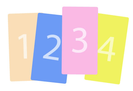
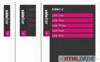
Now that this is in place, we can start looking at the look of each link. Below is an image of something I put together, very similar to our featured Ingredient’s but kept to the bare minimum for example purposes.
You will need to slice and save each image as a PNG-24 file to allow for the transparency. Do not worry about IE6 lack of transparency support – I will cover that later!
The next step to creating our overlapping navigation would be to take each link and style them according to our design. Remember the unique class we gave to each list element? This is where they are going to come in handy.
For each link we want to set a height, width, background image and its position. You may have noticed that when setting the top: 0; on our links, they all sit on top of each other – in this step we will be correcting that.
Here is my CSS:
ul#navigation li a.one {
  background: url('images/1.png') no-repeat;
  left: 0;
  height: 225px;
  width: 125px;
 }
 ul#navigation li a.two {
  background: url('images/2.png') no-repeat;
  left: 75px;
  height: 233px;
  width: 140px;
 }
 ul#navigation li a.three {
  background: url('images/3.png') no-repeat;
  left: 175px;
  height: 223px;
  width: 121px;
 }
 ul#navigation li a.four {
  background: url('images/4.png') no-repeat;
  left: 250px;
  height: 235px;
  width: 146px;
 }
And violia! Your navigation should now look like we had designed it to look like!
By default, the menu items overlap in order of the list items. 1 being on the bottom and 4 being on top. If you wish to change this, we use a CSS value called z-index. The z-index property takes numeric values, the higher the number meaning the higher the item appears on the page in terms of layers.
Hover States?
The one thing I felt that the featured ingredient, Smiriyaz, was lacking was a hover states on the links. Hover states are quite easy to achieve, and I thought it would be quite nice for a menu like this, for the item to pop up when hovered over. To achieve this we simply need to change the ‘top’ value on a:hover:
ul#navigation li a:hover {
  padding: 0 0 20px 0;
  top: -20px;
 }
I add the extra padding to the bottom of the link for the effect to work in Internet Explorer browsers. This also prevents a ‘juttering’ bug if you happen to be hovering on the bottom of the link.
If you wish to be a bit more specific with your hover states, you can specify hover states for each link using the classes we gave them. I decided to give my a.four link a different background on hover:
ul#navigation li a.four:hover {
  background: url('images/4-hover.png') no-repeat;
 }
Source File
Finally, I mentioned earlier about Internet Explorer 6 being unable to support PNG transparency. Whilst this is true, with some simple CSS code, we can fix that. However, this will make your stylesheet not validate.
For each item we will need to add the following code, taking note of the underscore (_) before the properties – meaning only Internet Explorer 6 will apply these styles.
_background: none;
  _filter: progid:DXImageTransform.Microsoft.
   AlphaImageLoader(src='images/4.png', sizingMethod='crop');
Here is an example of one link with the styling:
ul#navigation li a.four {
  background: url('images/4.png') no-repeat;
  left: 250px;
  height: 235px;
  width: 146px;
  _background: none;
  _filter: progid:DXImageTransform.Microsoft.
   AlphaImageLoader(src='images/4.png', sizingMethod='crop');
 }
Our navigation should now overlap each other and have a hover state to indicate to the user which link they are currently about to link.
You might also like
Tags
accordion accordion menu animation navigation animation navigation menu carousel checkbox inputs css3 css3 menu css3 navigation date picker dialog drag drop drop down menu drop down navigation menu elastic navigation form form validation gallery glide navigation horizontal navigation menu hover effect image gallery image hover image lightbox image scroller image slideshow multi-level navigation menus rating select dependent select list slide image slider menu stylish form table tabs text effect text scroller tooltips tree menu vertical navigation menu