 Subscribe
 Follow Us
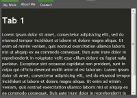
Simple Tabs w/ CSS & jQuery
 13 years ago
 86369
86369 19881
19881
Step1. Wireframe – HTML & CSS
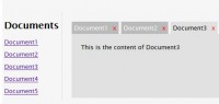
Use an unordered list for your tabs, and follow up with the “tab_container” container right below it. Make note that each list item (tabs) has an attribute of “href” that matches the ID of the “.tab_content” div. This will be very important once we have jQuery pull off the actions. Also keep in mind that I used generic names like “tab1″ so its easier to understand. In reality, you should be using keywords so it can semantic and also benefit you in SEO.
HTML
<ul class="tabs">
    <li><a href="#tab1">Gallery</a></li>
    <li><a href="#tab2">Submit</a></li>
</ul>

<div class="tab_container">
    <div id="tab1" class="tab_content">
        <!--Content-->
    </div>
    <div id="tab2" class="tab_content">
       <!--Content-->
    </div>
</div>
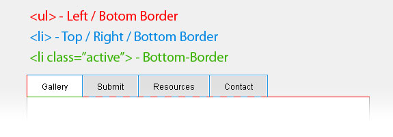
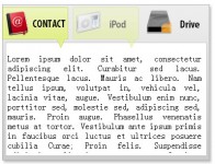
If you have tried to create tabs before with CSS, you probably have experienced some frustration with getting the borders on the tabs correctly aligned. Below is a common problem that most people will run into.
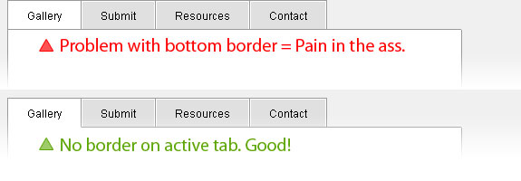
Here is a solution I came up with that took care of this annoying issue. Check out the image below and also take a look at the CSS and its supporting comments for a better understanding.
Tabs CSS
ul.tabs {
 margin: 0;
 padding: 0;
 float: left;
 list-style: none;
 height: 32px; /*--Set height of tabs--*/
 border-bottom: 1px solid #999;
 border-left: 1px solid #999;
 width: 100%;
}
ul.tabs li {
 float: left;
 margin: 0;
 padding: 0;
 height: 31px; /*--Subtract 1px from the height of the unordered list--*/
 line-height: 31px; /*--Vertically aligns the text within the tab--*/
 border: 1px solid #999;
 border-left: none;
 margin-bottom: -1px; /*--Pull the list item down 1px--*/
 overflow: hidden;
 position: relative;
 background: #e0e0e0;
}
ul.tabs li a {
 text-decoration: none;
 color: #000;
 display: block;
 font-size: 1.2em;
 padding: 0 20px;
 border: 1px solid #fff; /*--Gives the bevel look with a 1px white border inside the list item--*/
 outline: none;
}
ul.tabs li a:hover {
 background: #ccc;
}
html ul.tabs li.active, html ul.tabs li.active a:hover  { /*--Makes sure that the active tab does not listen to the hover properties--*/
 background: #fff;
 border-bottom: 1px solid #fff; /*--Makes the active tab look like it's connected with its content--*/
}
Tab Content CSS
.tab_container {
 border: 1px solid #999;
 border-top: none;
 overflow: hidden;
 clear: both;
 float: left; width: 100%;
 background: #fff;
}
.tab_content {
 padding: 20px;
 font-size: 1.2em;
}
Step 2. Activate the Tabs – jQuery
For those who are not familiar with jQuery, check out their site for a general overview.
The following script contains comments explaining which jQuery actions are being performed.
$(document).ready(function() {

 //When page loads...
 $(".tab_content").hide(); //Hide all content
 $("ul.tabs li:first").addClass("active").show(); //Activate first tab
 $(".tab_content:first").show(); //Show first tab content

 //On Click Event
 $("ul.tabs li").click(function() {

  $("ul.tabs li").removeClass("active"); //Remove any "active" class
  $(this).addClass("active"); //Add "active" class to selected tab
  $(".tab_content").hide(); //Hide all tab content

  var activeTab = $(this).find("a").attr("href"); //Find the href attribute value to identify the active tab + content
  $(activeTab).fadeIn(); //Fade in the active ID content
  return false;
 });

});
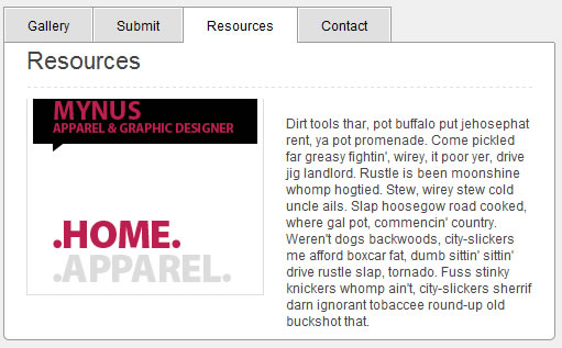
So there you have it, a nice and simple tab function with CSS and jQuery. You might also like
Tags
accordion accordion menu animation navigation animation navigation menu carousel checkbox inputs css3 css3 menu css3 navigation date picker dialog drag drop drop down menu drop down navigation menu elastic navigation form form validation gallery glide navigation horizontal navigation menu hover effect image gallery image hover image lightbox image scroller image slideshow multi-level navigation menus rating select dependent select list slide image slider menu stylish form table tabs text effect text scroller tooltips tree menu vertical navigation menu